
Most of the other postcards could be inappropriate, so I went with something more tame for this assignment.
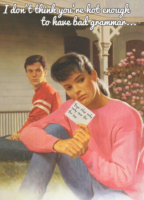
Before I made this, I was chatting with my friends, and we decided that even if someone is attractive, when they have bad grammar–they lose any appeal they had.
So I grabbed this cover and got to work in Adobe Photoshop CS6!
The first thing that I did was put the text on the note. I wanted it to be a guy’s handwriting, so I used the font Christopher Hand. Then I simply tilted the text box.
I originally had black text, but it didn’t look right. It looked like it wasn’t part of the original picture. So I played around with the Layer Properties. I tried Multiply, Lighten, etc., but none of them were giving me what I wanted.
While I was playing with the opacity for the text, I found that 75% lightened the text enough to where it looked like it was written, possibly in pencil on the card.
After that, the real text of the message needed to be put in.
The font wasn’t hard to decide on. I used Pacifico, the same font that the creator of this theme used.
The text color is #D9D9D9, and the stroke is #545252. I then scrolled through the Layer Properties and found that Linear Light was the best one for this application.
And there you have it!

Add a comment