
I spent a lot of time indoors this week, studying for midterms and doing work for my internship and volunteer positions. That being said, I didn’t get to check out many outdoor examples of design except for while I was driving, and taking pictures while driving isn’t the safest thing in the world.
Fortunately for me, basically everything you use in your day-to-day life incorporates designs, so I was certainly not lacking for examples to photograph.
Here’s what I came up with:
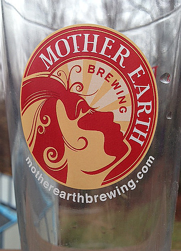 This was my example of unity, which pays attention to the relationship between individual parts and the whole of the design (from here). In the design, which is the company’s logo, the image of the woman’s face creates half of the entire thing, while the way in which the font is shaped reflects it. I considered whether I should use this as “balance” instead, but decided on unity because of the way the individual parts (the color, the woman’s face, and the words all create one shape). The name of the company, “mother earth,” carries connotations of unity and wholeness as well, so it worked well to tie it all together.
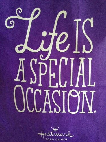 This next one was my example of “typography” in design. This is a Hallmark bag, so every customer who purchases something receives this. The colors they use for the font and the background are an excellent place to start when explaining how typeface is used to send a particular message. The white stands out on a color generally associated with fun, and using white as opposed to a darker color makes the message seem vibrant before you even read what it says. The use of one font for one word and a different for the rest brings attention to the main part of what the company is trying to say: life. When you think of life, you think of all the ups and downs that come with it; what are those ups and downs called? Well, the extremes (particularly the extreme ups) are oftentimes “special occasions.” The birth of a child. The marriage of two people in love. A birthday. By using a fun, informal font with different letter sizes and the occasional fancy embellishment of a letter (the second “o” in the last word), the implication is that they are drawing emphasis on the happier special occasions. By telling the viewer that “Life is a special occasion,” and placing the company name below that, the implication is that Hallmark has something for all of life’s special occasions and for life in general.
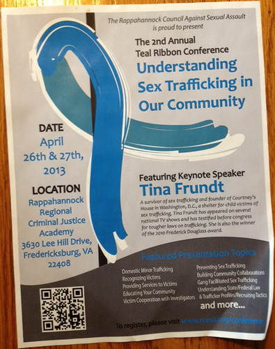
My example of how color can be used in design is the flyer we are using at the organization I volunteer for. Every year, the Rappahannock Council Against Sexual Assault (RCASA) has a Teal Ribbon Conference. For that reason, the woman who designed the flyer placed an emphasis on using teal as the attention-grabbing color for the flyer. Not only does it reflect the event’s title, but she placed the teal, which is a bright color, on a light grey background, making it “pop” even more.
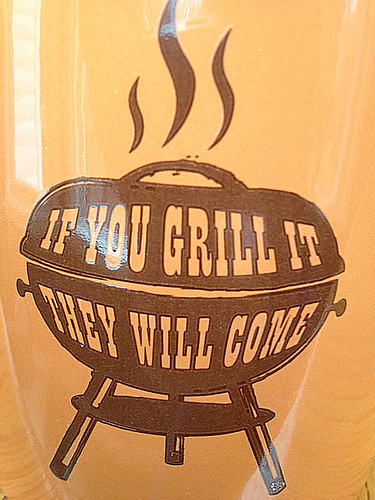
My fourth picture is an example of use of space. This is the side of a cup I bought for my dad, and it says “If you grill it, they will come,” which is a nod to the movie Field of Dreams (1989). It is an example of use of space because the image itself is a grill, and rather than framing the text around it or making the text some sort of caption or title, the text was incorporated into the image.
I’m trying to work on making my text frame my images instead of just showing up above or below them. Still working on making it look good though, but this was just to get the hang of editing the photo settings and figuring out where to put the image in the text. Hopefully next week I can work on fine-tuning my skills.

Add a comment