Touch the firehose of ds106, the most recent flow of content from all of the blogs syndicated into ds106. As of right now, there have been 92514 posts brought in here going back to December 2010. If you want to be part of the flow, first learn more about ds106. Then, if you are truly ready and up to the task of creating web art, sign up and start doing it.

  1. Christina Hendricks

    This small patch of pond

    by
    ds106 daily create for June 18, 2014: “Go out into your yard (or jump the fence into your neighbor’s yard) and find an interesting piece of ground. Zoom in with your camera’s lens, and take a picture. Share your square piece of Earth with the world.” So it was kinda late by the time I […]
  2. Christina Hendricks

    Mama and Boo Ghost at the aurora

    by
    I decided to combine the ds106 daily create for June 6, 2014: “Make a picture of yourself in a place you’ve always wanted to go but haven’t been yet” with my participation in the summer ds106 experience over at https://thebergerons.wordpress.com/ So here is the Boo Ghost and me as Mama Ghost at an aurora. I’ve […]
  3. Christina Hendricks

    Summer in the Trailer

    by
    A few people are getting together to do a ds106 project for fun this summer–creating a fictional family that is getting together for a family reunion in August. We’re also going to go through the ds106 open syllabus and make gifs, images, audio, video, etc. We’re doing all our stuff on one site: http://thebergerons.wordpress.com I […]
  4. Christina Hendricks

    Springtime photoblitz

    by
    For the online digital storytelling course called DS106, week 3 (last week) was all about telling stories in photos. I managed to do one of the assignments for that week, just yesterday: a photoblitzing safari. For this assignment, one has 15 minutes to take pictures, trying to fit as many of the following categories as […]
  5. Christina Hendricks

    Springtime photoblitz

    by
    For the online digital storytelling course called DS106, week 3 (last week) was all about telling stories in photos. I managed to do one of the assignments for that week, just yesterday: a photoblitzing safari. For this assignment, one has 15 minutes t...
  6. Christina Hendricks

    For week 2 of the GMU #ds106 course that’s being taught…

    by


    For week 2 of the GMU #ds106 course that’s being taught this Spring by Alan Levine, one of the assignments given was to analyze an advertisement as a short story. We were to choose an ad from this YouTube search and analyze it in 5 second increments.

    I went a little bit down the list and just decided to watch this one. I was instantly hooked because of the little kid who looks about the size of my 6-year-old son. I can imagine him doing exactly this. That’s probably why I’m drawn to this one and decided to analyze it!

    It’s not clear whether the kid is a boy or a girl, and I just thought of him/her as a boy because I imagined my son…but there’s a reason we might think of her as a girl (see below, under 0:15-0:20).

    Here’s my 5-second-interval play-by-play.

    1. 0:00 to 0:05

    — We are introduced to the character. The camera starts off on her feet and slowly moves up her body to her head. We get a sense that she’s a small-ish child.

    — She’s moving along a white corridor, which is vaguely reminiscent of a white interior to a spaceship. There is a bright light behind her.

    — Then the camera angle switches to the rear and we see her cape swishing after her as she goes down the hall. Now the bright light is in front of her—she’s walking towards it.

    — Throughout, the “Star Wars Theme” is playing. Wonder how much they had to pay to use that music?

    2. 0:05 to 0:10

    — There is a quick cut and suddenly Darth Vader is walking slowly towards an exercise bike as the music builds. There is a bright light coming from a large window behind both Vader and the bike. We get a shot from the side as she takes a couple of steps. She is on the left of the bike.

    — Then the camera angle switches to being ahead and somewhat above her, accentuating her small size as she purposefully puts out her hand towards the exercise bike.

    — At first I wasn’t sure just what the heck she was doing. But after a few more seconds it became clear.

    3. 0:10 to 0:15

    — Quick cut to Darth Vader standing in front of a dog in a dog bed, lying down. Vader is to the right of the dog in the video. Again with the forceful hand gestures, this time two hands purposefully aimed at the dog.

    — Quick cut to closeup of the dog’s face, still lying down in the dog bed. The dog doesn’t raise its head, but only lifts its eyebrows and ears a little (do dogs have eyebrows?). It’s clear that the dog could pretty much care less.

    — Back to the original camera angle of Vader and the dog, and Vader lowers her hands in a kind of dejected fashion.

    4. 0:15 to 0:20

    — Quick cut to a much more forceful gesture in front of the washer and dryer—stepping forward with one foot as well as using both hands. This lasts just one second or so. The step is in time to the music as it builds even more. The camera is slowly panning inwards.

    — Quick cut to a side view of Vader standing at the foot of her bed, with a doll sitting on the edge of the bed. Vader is to the left of the doll. This time she puts one hand out, then the other, again in time to the music. The room is decorated in somewhat girlish colours, and the doll suggests a girl as Vader. But then again, this is pretty sex-stereotypical of me to assume. But assume I am.

    — Quick cut to a closeup of the doll’s face, which of course remains impassive. The camera is slowly panning in towards the doll. The doll cares even less than the dog.

    5. 0:20 to 0:25

    — Cut back to the side view of Vader and the doll on the bed, with the camera still panning inwards. Vader lowers her hand dejectedly and slumps her shoulders and head, giving what looks like a heavy sigh.

    — Cut to a side view of a hallway; the dog passes by with Vader walking close behind, holding her hands out towards the dog. Clearly she’s trying to get the dog to do something, and the dog just wants to get away.

    6. 0:25 to 0:30

    — Cut to Vader sitting at a kitchen counter, moving her hands as if to do something, but we can’t see what. She’s aiming at something outside of the view of the camera.

    — Cut to a bigger picture of the same scene, and her mother pushes a plate towards Vader as she moves her hands along with the plate—as if trying to move the plate herself.

    — This is the only place I noticed so far where there is another sound besides the music—the sound of the plate going across the counter is layered on top of the music.

    — Vader visibly crumples her body again, putting her hand to her helmet as if disappointed.

    7. 0:30 to 0:35

    — Cut to a view of a driveway and a car pulling into the driveway.

    — Cut to Vader with her head in her hand. The dog barks, and she lifts her head, as if she knows what the dog barking means.

    — Cut back to the driveway, and Vader’s dad gets out of the car with a briefcase. We hear the sound of the car door close. He walks toward the house with his arms outstretched a bit.

    8. 0:35 to 0:40

    — Camera angle from behind the father, with just one of his hands visible in the shot (the one with the briefcase), outstretched a bit. We can hear birds.

    — Vader comes running out of the house, shakes her head at her dad with her hands out in front of her (the same gesture she’s been doing); we get a bit more of the dad in the shot and see both his arms fall.

    — Cut to an interior shot of the car, looking at the dashboard and through the windshield at Vader, who stops in front of the car. Nice way of getting the dash into the ad!

    — We also see the dad walking towards the house through this view though the dash. It’s clear he’s just going inside and letting his daughter be.

    9. 0:40 to 0:45

    — Side view of Vader standing in front of the car. This is similar to the side shots of her standing in front of the dog and the doll, though she’s back on the right this time.

    — We catch a bit of the dad’s body walking out of the camera to the left, apparently into the house while Vader stands in front of the car with her hands outstretched.

    — The music builds to a climax as she moves her hands backwards to push them forward again.

    — Cut to a closeup shot of Vader from the side; the music falls as she pushes her hands forward; the music suddenly gets much quieter. Clearly something is going to happen.

    10. 0:45 to 0:50

    — Cut to a rear-side closeup of Vader and the car. Only the front grill and headlights of the car are visible, with the car logo clearly prominent.

    — Vader stands still with her hands aimed at the car, as the music goes quietly forward, with her cape billowing in the wind a bit behind her.

    — Suddenly the signal lights flash and the car starts. She jumps back, visibly startled. The music stops completely.

    — Cut to a closeup of the remote for the car, held in a hand. A thumb moves away from one of the buttons.

    — The music from the beginning starts up again as we see the dad and mom at the kitchen window, the dad’s arm at an angle that one would use if one had the remote in one’s hand.

    11. 0:50 to 0:55

    — We see the mom only from behind and the dad only from the side, but the dad lifts his eyebrows just a bit and they both turn back towards the window. A wonderfully subtle gesture that says it all.

    — Cut back to Vader and the car in the driveway, but this time with more of Vader and less of the car in the shot. She turns forcefully from the side to a frontal view, unsteady on her feet a bit, as if to be looking into the kitchen window.

    — Cut to a wider view of Vader and the car in which we see the whole car again, from the side-front view. It’s a very typical view of a car in a car ad. It’s like there’s a “car-in-a-car-ad” angle, and this is it. There is a subtle light on the front of the car that looks like it could be the beginnings of sunset.

    — She turns forcefully back towards the car, using her hand to move her cape out of the way in a kind of strong, “I did it” gesture. She is master of the car.

    12. 0:55 to 1:00

    — Cut to a title screen with information about the car.

    — A circular cut (I’m sure there’s some other word for it) with the sound of a light saber—the title screen becomes the car logo as the cut moves around a circle.

    — Music fades quickly.

    Some overall thoughts

    I thought I’d try to analyze this commercial  according to some of the ideas in this post about JCVD’s ad with Vovlo involving the splits, and a little bit using the "story spine" idea from Ken Addams.

    — The beginning, and all the way through to 0:40, is the beginning part of the story spine, the “once upon a time.” The character and her routine are established. She tries and tries, but the force isn’t working for her. This is the storyline.

    — This also establishes empathy—we feel bad for the poor kid who can’t use the force like she wants to. She is really trying, over and over. And what’s more, she tries harder with each attempt. As the music builds, she uses one hand (with the bike), then two hands (dog), then steps forward with two hands (washer and dryer), then does one hand forcefully and then the other with one foot forward (doll). But it just isn’t working. And then the ultimate embarrassment—her mom has to push her sandwich towards her. Head in hand, indeed.

    — The “then one day” part of the story spine is when she stands in front of the car and the music changes. There is a clear sense of anticipation for a second or two as the music completely changes to much quieter and she stands still. Then the car starts and she jumps backwards. This is clearly the surprising revelation in the JCVD post. We know something is going to happen from the music, but we’re not sure what.

    — I don’t know if there’s a sense of admiration and awe in the audience at this point (JCVD post), but there is certainly a sense of awe in Vader!

    — And by the end, she has achieved “mastery”—she has mastered the force.

    — There isn’t the full story spine here, since there isn’t a “because of that, and because of that,” and then a “since that day” ending. But we can get a sense as viewers of what she thinks the future will bring—success in using the force. We can also get a sense that she might end up being disappointed again, which is a bit of a downer. 

    I really enjoyed doing this assignment. I caught so much more by focusing on each 5-second interval. I noticed the change in music, the change in camera angles, the fact that Vader tries harder with each attempt and that the music builds as she does so.

    I was impressed by the way the story is told in such a short time period, while still showcasing the car as the main point of the ad. Having the view of Vader through the inside of the car was pretty darn cool as an idea to get the interior shot of the car in the ad without breaking up the story. All that was needed from the dad was a short, small, subtle gesture of the eyebrows, mirroring to some extent that of the dog earlier in the ad.

    I was able to notice how the side views of Vader and other things are switched: when she approaches the bike she’s on the left, when she’s standing in front of the dog she’s on the right, when she’s standing in front of the doll she’s on the left, when she’s standing in front of the car she’s on the right. I would never have noticed this balance without stopping every 5 seconds.

    I got quite a great respect for telling stories within one minute through this assignment and the things we watched/read for it. Amazing what can be done in a short period of time!

  7. Christina Hendricks

    Reading a video ad

    by
    For week 2 of the GMU #ds106 course that’s being taught this Spring by Alan Levine, one of the assignments given was to analyze an advertisement as a short story. We were to choose an ad from this YouTube search and analyze it in 5 second increments. I went a little bit down the list […]
  8. Christina Hendricks

    The shape of things falling apart

    by
    I’m participating in the open online digital storytelling course called DS106, which is happening on a shortened, 7 week schedule until about mid-May. For the first week, we were asked (among other things that I didn’t have time to do because I’m still teaching right now) to think about the shapes of stories. Two things […]
  9. Christina Hendricks

    Radio Show Archives

    by
    Radio Show Archives:
    GIFaChrome 12/13/13 Product Launch on DS106Radio   Show Archives ds106 Radio Archive for GIFaChrome Launch ds106 Radio Archive for GIFaChrome Launch (featuring Alan Levine, Christina Hendricks, Dav…

    As if just doing the GIFaChrome project weren’t enough during the Headless version of ds106 in the Fall of 2013 (see the previous post for a description and rundown of what we did), we also decided to have a radio show product launch of the GIFaChrome camera. Quite a few people did amazing audio for this radio show, all of which you can hear at the Radio Show Archives link given at the top of this post.

    Here I will just say a few things about the audio that I did for the radio show. I can’t believe how quickly all this came together—we basically did the entire project and the radio show in 1.5 weeks. I managed to squeeze out two audio projects in just a couple of days.

    Roxy Louridge archival audio

    I had the idea early on in the project that we could say we’ve found some old audio from the very first creator of the GIFaChrome film. I cam up with a story, the name (clearly a play on Rochelle Lockridge, or Rocky Lou, the CEO for GIFaChrome), and the name of Roxy’s dog, Corlin (a play on the GIFaChrome mascot, Colin Dog, who lives with Mariana Funes). The only problem was that I wanted to have it be scratchy, as if it were from an old phonograph recording that was heavily damaged such that the audio gets completely covered over by the “scratch noises” at crucial parts. Rochelle said she could use an effect in Garage Band to simulate this, and voila….

    GIFaChrome commercial

    I also scripted and recorded a commercial with my 6-year-old son for the GIFaChrome camera. I recorded his and my sections separately and then edited them together using Audacity. He never really quite understood what he was talking about when he said his lines, but he was a good sport!

    I got the music for this commercial from Kevin McLeod’s free music site, incompetech.com (all music there is licensed CC-BY). The piece I used is called "Friendly Day."

    In addition to these two audio pieces I did for the radio show, I acted as co-host for the GIFaChrome launch with Alan Levine. This was our second time co-hosting a radio show for the Headless 13 ds106, as we also worked together hosting a three-hour show during which we played all the group radio shows for this course. You can find the whole show, broken up into pre- and post-show discussions of each, here.

    But back to the GIFaChrome launch. The idea for this radio show was to have a party atmosphere, as if we were broadcasting from a live party during which the camera would officially be launched. Alan Levine has a great summary of the radio show launch and how he managed a number of the audio effects, including the party sounds. Alan had all the audio pieces on his computer and designed the script for the show. The whole show, as well as the various pieces, can be heard from Alan’s post about the show. As usual, I just sat back on the Skype and talked while he handled the technical end of things. But I have learned enough in ds106 by now that I should be able to run a radio show with multiple people on Skype at the same time. It’s not just a straightforward thing, but I just need to try and ask people along the way and eventually I’ll get it to work. Sitting around wishing I could do it is going to get me nowhere.

    Afterwards, we had a Headless 13 ds106 radio campfire, in which anyone who wanted to join in could call Alan on Skype and discuss their Headless experience. Alan has an archive of that radio discussion as well. I had to leave partway through, as that day was insanely busy for me, but it was great to be able to reflect on how this whole Headless thing worked, with others. 

    And speaking of reflecting on the Headless thing, that is what I do in the next post!

  10. Christina Hendricks

    Radio Show Archives

    by
    See the Radio Show Archives at the GifAChrome site–we did a good deal of audio for GifAChrome! As if just doing the GIFaChrome project weren’t enough during the Headless version of ds106 in the Fall of 2013 (see the previous post for a description and rundown of what we did), we also decided to have […]
  11. Christina Hendricks

    Hendricks DS106 2014-01-01 12:48:00

    by
    GIFaChrome…what the…? That’s what I thought when I first saw a tweet leading me to a blog post or G+ post about the GIFaChrome. I had been participating off and on in the “headless 13” edition of ds106 during the Fall of 2013. I’ll be writing another post very soon reflecting on the course as […]
  12. Christina Hendricks

    GIFaChrome…what the…?

    by


    GIFaChrome…what the…?

    That’s what I thought when I first saw a tweet leading me to a blog post or G+ post about the GIFaChrome. I had been participating off and on in the “headless 13” edition of ds106 during the Fall of 2013. I’ll be writing another post very soon reflecting on the course as a whole and it’s “headless” nature. Here I want to focus on GIFaChrome.

    I was only able to drop in and out of this iteration of ds106, given that I was teaching full time and doing a good deal of service work and research on top of that. It was an insanely busy term. So I missed a few things during the course, though I usually tried to at least look at most of the stuff people were making, even if I didn’t comment on it.

    But at one point I felt I had missed something. Rochelle Lockridge was talking about a GIFaChrome camera and 106 film, and I had no clue what was going on. I figured that I blinked and missed the story, and tried hard to look back at G+, Twitter, blog posts to find the missing pieces. Turns out, though, that the story had yet to unfold. It was an idea that was put together through the collaboration of many people, including Rochelle, Mariana Funes, John Johnston and Alan Levine. The story evolved and changed from hour to hour, as people put in new ideas and created new artworks.

    Mariana created an animated glitch gif with the new GIFaChrome camera, and John Johnston came up with the GLITCHaChrome camera idea. He also created a nifty little app that makes glitch giffing easy! (linked in the previously-linked post of his). Pretty soon several more glitch gifs popped up and found their way into the GLITCHaChrome frame (such as some by Janet Webster, Vivien Rolfe), including some in our collaborative gif story over at Giffi.us.

    At some point around this time the weekly post came out explaining what we’d be doing for the last two weeks of the headless ds106: a final story project.  I knew that even though classes had finished for me by this time, I would still be too busy with marking essays and final exams to put together a whole story on my own. And, as I had volunteered for those last two weeks, the extent of my being “in charge” was to ask the other people who had also volunteered if we should suggest to people that they might do their project in a group. From there, Mariana suggested we work on developing the GIFaChrome story further, and invite anyone who wanted to join in to help. Sounded great to me!

    Mariana and Rochelle put together a couple of Storify stories to explain what the GIFaChrome project is, its very short history, so that anyone who wanted to join in could potentially find their way into the project without being too lost. We had a Google Doc where we brainstormed ideas on what to add to the story. We decided to create a GIFaChrome website, a wikipedia page, an Amazon product page, several testimonials from beta testers, commercials, and more. You can see it all by perusing the GIFaChrome page/

    We wanted to include a previous riff-a-gif flash mob project that had started as a daily create and turned into a riff on Alice in Wonderland. It became the GIFaKidChrome, thanks to Mariana (at least, I think this was her idea!). And John Johnston came out with another emerging technology, "Layercake," that allows gifs to move out of the frame.

    Alan Levine had a pipeline to a mysterious source that was leaking information about GIFaChrome: here is a stolen schematic diagram for the camera, here is an amazing announcement of a breakthrough technology that allows the GIFaChrome to tunnel back into a person’s past when visiting the website, and here is a video by a competitor camera company, Hasselhlof.

    Mariana and Rochelle…what didn’t they do for this project?! They made numerous gifs, turned Mariana’s dog Colin into the GIFaChrome mascot (and Vivien Rolfe made a lovely movie poster for Colin’s next movie…see the bottom of that page!), got Jonathan Worth to agree to be a spokesperson for GIFaChrome, sending us an audio testimonial (see the front page of the website), and more I don’t even know about. Rochelle created the GIFaChrome website, and spent who knows how long creating blog posts and pages for all the things that everyone else was creating, more stuff every hour! Mariana put together a board on Pinterest where intrepid reporter Rita Skeeter tried to undermine the GIFaChrome by spreading nasty rumours.

    A couple of us had fun with Mozilla’s Xray Goggles that one can use to change web pages. Jess Hobbs made an Amazon product page for the GIFaChrome, and I tried my hand at making a Wikipedia article for it. I learned that you really can’t do much more than delete and paste things into pages with Xray goggles, as it doesn’t allow you to create new sections or radically change the page. I also had trouble with the footnotes (which I couldn’t really fix with the method discussed in this blog post, because every time I saved the page it had a new URL so my footnotes kept getting broken).

    I also made a gif that I put into the GIFaChrome film frame, a gif of my son as a ghost—as described here (in which I wrote a testimonial by the “boo ghost” for the GIFaChrome) and here (in which I explain the process of what I did to get the gif into the GIFaChrome film frame). I also recorded audio of my son to go with the gif; the original audio, in which he’s making his oooooo-ooooo-booooo sound is on the first post linked in this paragraph, and for an audio testimonial I interviewed him and Rochelle Lockridge artfully edited the interview to come up with the audio you can hear here. 

    I did a few other audio works for our radio show product launch, and I’ll discuss those in a separate post.

  13. Christina Hendricks

    How I got the boo ghost into the GIFaChrome film

    by

    image

    The past two weeks have been a blur. For the last two weeks of the Headless13 installment of ds106, several of us have been working together on a group project around a fictional camera called GIFaChrome.

    How did this come about? While I was utterly swamped with work, I one day noticed a tweet or two referring to blog posts or G+ posts that had to do with something called “GIFaChrome.” Here is a page with a few Storify stories that explain how it all unfolded. The short story is that Rochelle Lockridge came up with the idea of putting an animated gif into a film frame and lots of people added in their ideas from there, including that there should be a camera that takes images and turns them into gifs (I think that was Mariana Funes’ idea). Then came the idea of putting glitched gifs into the frame, and so GLITCHaChrome was born (can’t recall the provenance of that one). John Johnston developed "LayerCake," which allows for images to move OUT of the frame! There is also GIFaKidChrome, which makes animated gifs from the audio of children’s stories—that one was the product of spontaneous riffing on an image that originally came from a daily create assignment, a spot of riffing I was so sorry to miss but loved watching unfold.

    I’ll do another blog post soon reflecting further on this GIFaChrome project and the Headless 13 course as a whole. This post is dedicated to explaining how I did the gif at the top of this post. This was meant to be part of the GIFaChrome story, as a testimonial from a beta tester (see my previous post)

    For a daily create earlier in the course we were asked to make an image of another ds106 participant as a ghost. I was trying to do one of someone else when my son heard about what I was doing and insisted he wanted to be in the picture. Thus, he is the ghost.

    Making a gif from the original image

    Here’s the image I started with, which I made in GIMP. Here’s a link to it on Flickr, in which I explained briefly how I made it. 

    image

    When I made this image in GIMP I had two separate layers, the one with my son as a ghost and the background forest layer. That made it easy to create a gif out of the image.

    Before duplicating layers, I used the “blur” and “smudge” tools around the outside of the ghost layer so it didn’t look quite so “cut out” but more blended into the background a bit.

    1. I first duplicated the image of my son as a ghost several times so I could have multiple layers to move around.

    2. I wanted the ghost to “glow” a little, so what I did was select a layer, go to Color->Brightness-Contrast and played with the contrast a bit. Then I did the same only a little more for the next layer, and again for the next layer, then I started dialing it down gradually by the same amount for the next few layers so it would pulse a bit.

    3. Then I moved each ghost layer a little bit to try to make the movement look smooth and somewhat ghost-like. At first I had the ghost move around in a circle, but my son nixed that: “Ghosts don’t move in circles, mommy. They move up and down.” Okay, so I started over and made it move up and down (and a little bit side to side too, even though that wasn’t what I intended at first). I had to keep making various layers visible and invisible (by clicking the “eye” icon next to them) so I could see how the ghost would move when it cycled through each layer. 

    3. In GIMP, if you go to Filters->Animation->Playback you can see what the animated gif will look like. Except that if you just have a bunch of ghost layers and one background layer you’ll just see the ghosts move and then the flash of the background. To see the finished product as it would really look, I had to duplicate the background so I had as many background layers as ghost layers, and put a background layer under each ghost layer.

    image

    Then I had to control-click on each ghost layer and choose “merge down” so that each ghost layer merged with the background layer under it. Then, when going to Filters->Animation->Playback I could see what it would really look like.

    5. The problem was that if I didn’t like the movement and wanted to re-do it, I was unable to do “undo” for enough times to get the layers unmerged. I was able to use “undo” for most of the layers, and then it just wouldn’t go back any further. So I’d have to close the file and start over, which kinda sucked because then I had to re-do the glow again from step 2. Boo.

    6. Finally I had a nice looking gif, but the file was too big. So I first used the “crop” tool to crop the image to approximately a square, and then went to Image->Scale image to get it to about 450px x 450px.

    Putting the GIFaChrome frame around the gif

    Rochelle Lockridge provided a GIFaChrome template on her blog, which I downloaded. It was a photoshop file, but turns out that opened in GIMP just fine.

    Here’s what I did to get my gif into the frame.

    a. I first opened the GIFaChrome frame template in GIMP, and tried to use File->Open as layers to open up my GIMP xcf file with the gif I had just made. But what it kept doing was opening it up in one of the “layer groups” in the template file, which wasn’t going to work for animation. The screenshot below shows the various layer groups in the template files.

    image

    I realized I’d have to somehow get these groups into one layer so I could copy that layer and put it above each of the layers in my animated gif. 

    b. I discovered how to do this. First, I control-clicked on the top layer in one of the layer groups and chose “Merge layer group,” which put all the parts of the layer group into one layer.

    image

    That gave me four layers instead of four layer groups. Then I had to get all those layers into one layer so I could duplicate the whole thing easily. I just control-clicked on each layer and chose “merge down” until I had one layer.

    c. Then when I did File->Open as layers and opened the GIMP xcf file with my ghost gif in it, it simply opened all those layers onto new layers, not in any layer group. Perfect! 

    d. Of course, the frame layer was not the right size for my animated gif layers, so I had to scale the frame layer down so it would fit.

    e. I duplicated the frame layer enough times to put one above each gif layer, and then used control-click on each frame layer and chose “merge down” (just as in step 3, above). Voila! I had layers that would animate as a gif just fine. 

    On the GIFaChrome website, this gif has sound attached, I think through the way John Johnston explains here. I don’t think I can do this on Tumblr, though maybe through the “html” function it would work. At any rate, it’s his own voice to go along with the image!

  14. Christina Hendricks

    This is a guest post by the boy ghost in the image above, who…

    by


    This is a guest post by the boy ghost in the image above, who has chosen to remain anonymous.

    I am so thrilled about my beta test of the GIFaChrome camera! I was able to get a version of the camera from my friend Ina, and she kindly agreed to take an image of me that shows my real nature. If you hover over the right side of the image above you can see an arrow pointing to the old image Ina took of me, a boring old still image. It does me no justice, as you can tell when comparing it to my GIFaChrome image. Whoever heard of a ghost that doesn’t glow and move?

    This camera is so easy to use: all you do is point and click and a beautiful animated gif appears. It’s like magic! You don’t even have to have full material substance to work the thing, as I have been able to play around with it myself (though I still need practice, and this pic by Ina is the best image so far). 

    The only thing that is missing from the GAC image is my lovely “booooooo-oooooooo-oooooo” sound that I tend to make when floating in this way. But those people over at GIFaChrome are so clever, I expect this will be available in a software update soon!

    The GIFaChrome launches December 13, 2013. To pre-order yours, go to the GIFaChrome website!

    Here is my ooooooo-oooooooo-booooo sound, just so you know what a lovely voice I have!

  15. Christina Hendricks

    Using X-Ray goggles to remix a website for the first time

    by

    I’m working with some other people in the Fall 2013 Headless version of ds106 on a final project in which we are creating a website and various media around an artificial product called the GIFaChrome camera. One thing I volunteered to do is to use Mozilla’s X-ray goggles to remix a wikipedia page to make it talk about the GIFaChrome. 

    This has been pretty easy so far, mostly because I have some basic html (I mean basic, like I can do a link and sometimes, if I look it up, I know how to insert an image). 

    Here’s what I’ve got so far. I can do the text, and I can even figure out how to replace the images (though I haven’t done that yet). I even managed to make one of the footnotes go to the right page (originally when you clicked on the footnotes they went to the original page rather than the remixed page). What I did is link the footnote to simply the remixed page plus “#References”: http://clhendricksbc.makes.org/goggles/clhendricksbcs-remix-of-kodak-stereo-camera-wikipedia-the-free-encyclopedia-4#References

    This made the footnote jump to the end of the page. Score! Except that I will have to change these links once the page is fully done because the link is to the page as it is now, and each time I save it it becomes a new link (with a new number at the end: 4, 5, 6, etc.). So we’ll see if this actually ends up working in the end.

    The thing I’m struggling with at the moment is the table of contents. When you click on the TOC links, they go to the original page contents, and the same for the footnotes. My html skills are not good enough to figure out how to fix this so that the TOC links go to the remixed website contents and the same for the footnotes. 

    The problem with the TOC is that when I use the X-ray goggles I just get this: 

    image

    This doesn’t give me a link to any page, so I can’t change the link. But when I click on the link in the remixed page it goes to the “description” section of the original page, not the remixed page.

    Probably I shouldn’t worry about this and maybe just take the TOC and out entirely, but I’d love it if I could fix it!

    Any ideas?

  16. Christina Hendricks

    ds106 dailycreate for December 5, 2013: “Create a visual…

    by


    ds106 dailycreate for December 5, 2013: “Create a visual that might accompany one of the mashed up headlines from @twoheadlines.”

    The original tweet: https://twitter.com/TwoHeadlines/status/407970369447161856

    Star Wars Joins Instagram With A Apple Inc. Selfie

    — Two Headlines (@TwoHeadlines)

    So this is supposed to be Vader taking a selfie but it’s Jar Jar that appears as his own image instead of Vader, like Vader is actually Jar Jar. Now that I think about it later, though, it just looks like he’s watching Jar Jar on the ipad. D’oh. My idea was a little too complicated to come out well in a visual image. Oh well…it took me long enough to get this done at all I’m not going to go back and fix it now.

    The process (in GIMP)

    I got the Vader image from the GIF Fight tumblr from August 2013—I had remembered this image from last summer. You can see the cool gifs people made with this image on the GIF Fight tumblr arhive for Aug 2013.

    I then got an image of an ipad from Flickr; it took awhile to find one that was in approximately the right angle. Here’s the one I used: "iPad car mount," by Jan Hammershaug, licensed CC-BY.

    Lastly I had to figure out what should be on the ipad screen. I tried to find a good Yoda image that was openly licensed, but no dice. So why not Jar Jar Binks? Here’s the image I used: "Jar Jar Binks at SGTTC2010," by Parka, licensed CC-BY-SA.

    I first put the ipad in Vader’s hand by scaling it to the right size and then selecting around it by going to Select->Float, then Layer->To New Layer to get the ipad onto a new layer. I then deleted the rest of that image with the ipad. 

    I got Vader’s finger in front of the ipad the same way: I selected around the finger, floated the selection, then put it on a new layer so I could put it in front of the ipad.

    Then I selected around the original image that was inside the ipad frame, did Select->Float and then Layer->to new layer to get that image out of the ipad frame. I then deleted the new layer with the image that was originally inside the ipad frame.

    Finally, I had to crop the Jar Jar image and scale it so it would be small enough to fit inside the ipad frame.

    Now I had layers in this order:

    1. finger

    2. ipad frame

    3. Jar jar

    4. the rest of the vader image

    But of course, the Jar Jar image wasn’t at the right angle to look like it was actually on the ipad. That’s when I discovered the “perspective” tool in GIMP, which lets you warp a layer so it takes on a new perspective. I played with this a bit, moving various corners various amounts to see what it looked like, until I got the perspective looking pretty good.

    I also had to play around with scaling the Jar Jar layer so that it didn’t stick out the sides of the ipad frame but still fit within it. In the end I had to use the paintbrush tool to cover over some parts of the image that were a little too small for the frame and some of the background was showing through. But it works okay.

    I’m amazed I got this to look pretty much like I pictured it when I thought of it.

    This image is licensed CC-BY-SA: https://creativecommons.org/licenses/by-sa/3.0/

  17. Christina Hendricks

    I hate it when spiders just sit there

    by
    [I usually do my ds106 stuff on Tumblr, but animated gifs over 1 MB become just gifs there, and I couldn't make this one small enough without changing it substantially. Damn Tumblr.] So there’s a new visual assignment for ds106 called “Illustrating odd autocompletes.” I think it’s pretty self-explanatory, especially with the example I’ve made […]
  18. Christina Hendricks

    #ds106 Design Safari

    by

    Week 6 of the Headless ds106 course is about design. When I did ds106 in May/June of 2013, for the “ds106zone” edition of the course, I ended up pretty much skipping design week. Well, I did one assignment during that week, which I really struggled with. I didn’t do many of the suggested readings or watch suggested videos. I just wasn’t that into it.

    Why? I think I have some kind of mental block when it comes to design, and I believe it has mostly to do with lack of confidence. I feared, when I started ds106 earlier this year, that I just wasn’t very creative and thus would suck at doing this stuff. That turned out to be totally false (as I kinda guessed it would), but somehow I still have that sense with design. It’s even more deeply ingrained for some reason that I just don’t get it and maybe never will. Okay, that’s also complete bullshit and I need to get over it.

    So this week I decided I would spend as much time as I could (which admittedly isn’t very much right now) doing readings on various design principles—here is the document I was working from. I decided also to do the “design safari” (see the above link for the week 6 announcement). The idea is to take photos of various objects that illustrate four of the design principles discussed for this week (either as examples of good design, or bad).

    I found this activity really, really fun and informative. It helped me understand the design principles much better than I did just by reading about them. Here’s what I managed to do.

    Color

    I have to admit this was the part of the design document linked above that I had the hardest time with. I kind of understand the idea of the colour wheel, and the differences between hue, saturation, value, chroma, but I found it difficult to determine just what might make for a good use of colour versus a bad one.

    This post was helpful—it pointed out that colour can be used to group related things, such as how “repeating colors on elements like page headings gives an immediate visual cue that those headings are related.” The post also noted that “a small dose of color that contrasts with your main color will draw attention.” I’ve been doing this already, in my slides for lectures/presentations—drawing attention to the main points by using a contrasting/bold colour next to otherwise grey or black text.

    So I challenged myself to try to find things that could exemplify a good (or bad) use of colour.

    I found a new building on the University of British Columbia campus that had some fairly striking colour (well, at least, compared with most of the buildings on campus).

    image

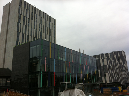
     https://secure.flickr.com/photos/clhendricksbc/10220221885/

    There’s a good deal of construction going on around this building, thus the mess in front of the building. I think this building really stands out in contrast to those next to it, which are shades of grey (as is the sky, which is unfortunately a common look to the sky here in Vancouver, BC).

    Here’s a bright yellow staircase inside the same building.

    image

     https://secure.flickr.com/photos/clhendricksbc/10220340543/

    As I was looking at this building, I was struck by how much I was thinking of such bright colours being connected to children. Maybe it’s because I have a 6-year-old, and most of his toys are really brightly coloured. Why are bright colours so prevalent amongst children’s toys and environments designed for children, but less so for other environments or objects? Or maybe it’s just the sorts of things I come across in my life that don’t have bright colours. And my own preference is for more muted colours, in my own wardrobe and indoor environment.

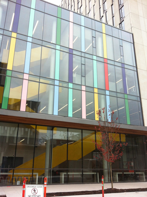
    Perhaps unsurprisingly (?) This building is an “art centre” of some sort (not sure what exactly it is). But one of the new buildings of the Business school on campus also has some pretty bright colours, so maybe the fact that this building has to do with art makes little difference.

    Is this a good use of colour? Honestly, I have no idea. Are the colours used complementary in some way? Should they be? Why are these particular colours used, and why are some colours on top of others—what guided that choice? No clue. All I can go by is what seems pleasing to me, and I do like this one. I think the contrast of the colour and the dark-ish glass is nice, and the colours are spaced in a way that seems balanced.

    Here’s another example of colour, but one that also connects, to some extent, with the form/function relationship.

    image

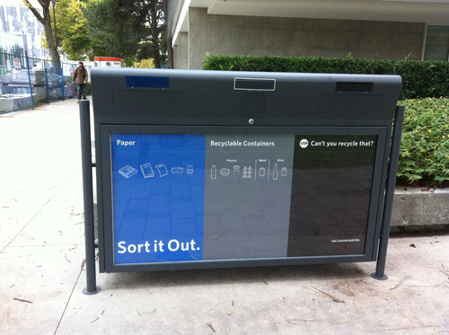
    https://secure.flickr.com/photos/clhendricksbc/10220342543/

    Sustainability is a big theme on the UBC campus, and this is one of the new bins one sees around campus, suggesting that we “sort” what we’re throwing away (in some buildings, and more and more as time goes by, there is also a place for compostable items).

    I felt that the use of colour for this wasn’t terribly effective. The blue really stands out, which is fine—it’s for sorting paper in order for it to be recycled. The black is for trash, that which cannot be recycled or composted. Interestingly, there is no indication of that on the bin—it just says “stop: can’t you recycle that?” Okay, I guess most people can figure that out, and black does kind of fit the “not as good as the other stuff” category, or the “don’t put stuff here” category (consider whether it can be recycled).

    But the grey I don’t think works. It is for “recyclable containers”—bottles, cans, plastic containers. But it just fades into the background. It seems like something I should ignore. I think it’s a poor choice for this “sort it out” campaign, as I don’t really pay attention to what’s in grey. Not a big deal, but I think another colour may have been more effective.

    I spent last year in Melbourne, Australia, and I thought they had an effective way of using colour to distinguish rubbish bins from recycling bins. Rubbish bins in parks, building, even in our apartment, were green, while recycling bins in the same places were always yellow (or rather, had yellow lids). Okay, Australia has yellow and green as national colours, so it makes sense, but the continuity was really helpful too. One wouldn’t have to think too much when tossing stuff, because the colour signalled where to put things right away.


    Balance

    According to this article, "Balance is an equilibrium that results from looking at images and judging them against our ideas of physical structure (such as mass, gravity or the sides of a page). It is the arrangement of the objects in a given design as it relates to their visual weight within a composition." The article was really helpful in explaining the idea of balance, both symmetrical and asymmetrical, with simple graphics.

    According to the article, “Symmetrical balance occurs when the weight of a composition is evenly distributed around a central vertical or horizontal axis. Under normal circumstances it assumes identical forms on both sides of the axis. When symmetry occurs with similar, but not identical, forms it is called approximate symmetry.”

    Here’s an example of “approximate” symmetrical balance. It has such balance on the horizontal axis, with the male and female figures, as well as on the vertical axis, with the “R” beginning both words.

    image

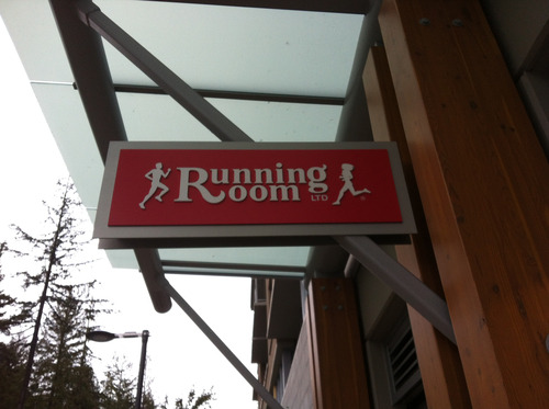
    https://secure.flickr.com/photos/clhendricksbc/10220090194/

    There is also “radial symmetry,” in which elements are arranged equally around a central point, such as here, in the UBC Museum of Anthropology logo:

    image

    Of course, on their website (from which this screenshot was taken), they cut off two of the radially symmetrical forms in the middle, which is actually a kind of symmetry itself.

    This poster may exemplify asymmetrical balance—it approximates radial symmetry, but departs from it at the top left. (Sorry—photo not in focus!)

    image

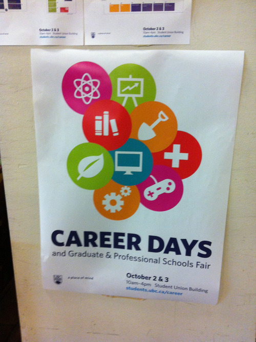
    https://secure.flickr.com/photos/clhendricksbc/10220089164/

    I prefer this kind of asymmetry to one in which the circles would be perfectly symmetrically arranged around the middle blue one—that would be less interesting. Is it balanced, though? The article linked above states that “involves the arranging of objects of differing size in a composition such that they balance one another with their respective visual weights.” The two top circles are not balanced by anything else in the image. Somehow this doesn’t bother me in the design, though. Maybe balance doesn’t always need to be achieved?

    Colour stands out here too, of course. Several of the colours are pretty close (red, orange, pinkish), which makes the green and blue stand out. I don’t think there is any particular reason for those icons to stand out in this poster, given what it’s for, but it does show how contrasting colours do draw attention.

    Minimalist design

    I’m not certain exactly what makes a design minimalist, except that it has very few elements and tries to distill meaning or a message down into a kind of small package (for lack of a better way of putting it at the moment). I had a hard time finding minimalism as I was walking around the city and the campus, but I think this would count.

    image

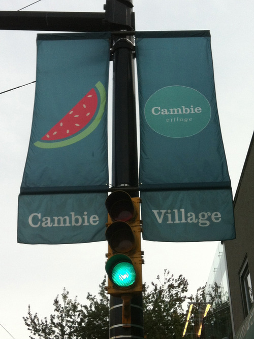
    https://secure.flickr.com/photos/clhendricksbc/10220228395/

    You see these flags all around various cities these days, including Vancouver, marking particular neighbourhoods. This is the most minimalist set of such flags I’ve seen. They all had just one simple image on them, along with “Cambie Village” in a circle. 

    The main problem I found with this is that I couldn’t for the life of me figure out why there’s a picture of a watermelon as being somehow connected to this neighbourhood. Is this a place to get fresh fruit? To spend a nice sunny day in the summer? I have no clue, and in that sense I think this design is not as good as it might be. I wish I could remember what some of the other images were, but alas.

    Here’s another minimalist design.

    image

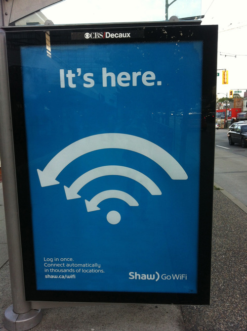
    https://secure.flickr.com/photos/clhendricksbc/10220140824/

    Quite distilled down, definitely. Though I’m not sure why there are arrows going to the left. Maybe pointing to the copy at the bottom left? Maybe having to do with “Go” in the “GoWiFi” tagline? But the “it’s here” works well, I think: meaning, (1) it’s arrived, and (2) you can find it here, there, and lots of other places.

    Rhythm

    I got this one wrong when I was first walking around taking photos. I was thinking it was just design elements that indicated movement and flow. But according to this site, “Rhythm is the repetition or alternation of elements, often with defined intervals between them. Rhythm can create a sense of movement, and can establish pattern and texture.” Oops. Got the movement part right, but not the repetition part, when I took the following picture.

    image

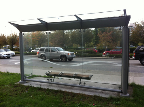
    https://secure.flickr.com/photos/clhendricksbc/10220248766/

    Not the best shot, because the “wave” on the glass of this bus shelter gets kind of lost with the street behind it. Still, I thought it gave a sense of movement, and maybe even rhythm, but I didn’t remember the idea of repetition.

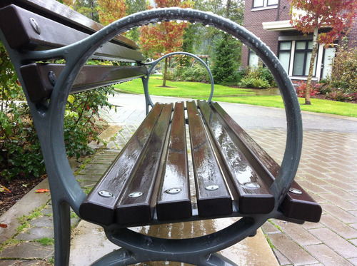
    But hang on, look at the bench from the side.

    image

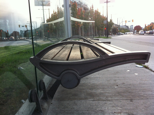
    https://secure.flickr.com/photos/clhendricksbc/10220247576/

    Rather a similar movement, I thought. I wasn’t taking this one because I was thinking of repetition, but because I noticed that the bench had a similar kind of wave form. But hey, it’s a type of repetition, right? Wall and bench of the same bush shelter?

    Typography

    My favourite suggested resource from design week was this page, which is about typography for lawyers, but really has lots of useful information about typography itself and various font examples, for anyone.

    Still, while out walking around, I didn’t find many great typography examples (or even bad ones)…just ones that didn’t stand out much one way or another. Of course, I could have gone looking on the web, but I wanted to do this assignment outside mostly because I spend way too much time on my computer anyway.

    There is a new Student Union Building being built on the UBC campus, and while that’s happening the old one is still open and (mostly) fully functional. There’s quite a campaign going on to let people know that, and it has retro feel, supposedly because it’s the “old” SUB (I’m guessing here). 

    Here’s a sign that uses a font reminiscent of retro “we are open” signs, at least so far as I remember.

    image

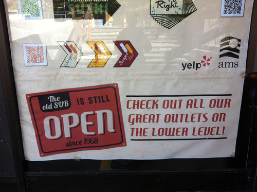
    https://secure.flickr.com/photos/clhendricksbc/10220339563/

    And the font for “Last Call” on this sign is suitably retro as well. It is very much familiar to me, but I can’t place it. I mean, it seems to have the right feel, but I’m not sure why, where I’ve seen it before.

    image

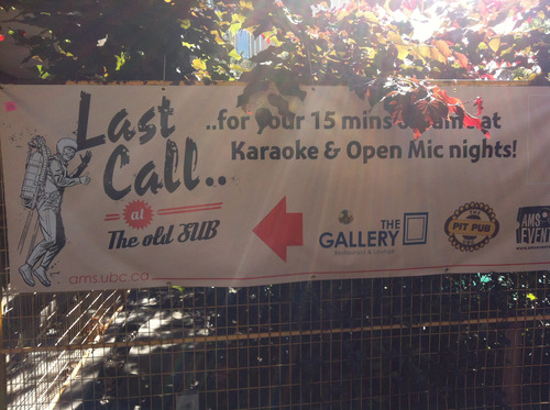
    https://secure.flickr.com/photos/clhendricksbc/10220087634/

    A number of these signs, like this one, are posted on the barriers around the construction site. The new not yet here, the old still beckoning.

    Well, that’s certainly plenty for one design safari. It took me over a week to finish this blog post, and probably it’s far too long for anyone to read through the whole thing. 

    This was an excellent way to learn some design principles, and I’m so glad I took the time to do it this time around.

  19. Christina Hendricks

    Rainy day photoblitz

    by

    Week five of the Headless ds106 course is about telling visual stories in photos. One of the assignments we could do is a “photoblitz,” in which we take as many photos as we can in 15 minutes, trying to adhere to several suggestions for them amongst a list of possibilities (see previous link for the photoblitz assignment).

    Today, Saturday, was the first chance I had to take the time to do this, and, of course—it being Vancouver, BC, after all—it was raining. But actually, this ended up being pretty cool in terms of photos, I thought. Okay, no shadows to play with, but some nice effects nonetheless. The hardest part was holding an umbrella while taking pictures. I used my phone just to see what it could do, which made the one-handed photo-taking easier. Sure, I could have just worn a raincoat, but I was going out later and had a fancy wool coat on. So umbrella it was.

    As usual, I’m not thrilled with my phone photos. The focus is not great, usually, especially with the somewhat low light there was today. But some of the images turned out okay.

    We were to start and end with images of something that shows the time, so we could capture the 15 minutes that way. So here’s the first image:

    image

    We were asked to pick our best five to upload to Flickr with the “ds106photoblitz” tag, and I did five not counting the “time” images.

    This one follows the suggestion to “take a photo dominated by a single color.”

    image

    I wrote this about this image when I posted it on Flickr:

    "These planters are in a pool of water in front of a building, where the rest of the outside landscape seems very "natural," with water, pebbles, plants, etc. They stand out, though they don’t look quite as bright as they do in the image. That’s one of the reasons I like this image. They seem to shout at me here."

    The red looks almost artificial, almost too much, really in-your-face. But I didn’t do anything to the photo after taking it—this is how it came out. And I like it this way.

    Here is a photo that “represents the idea of “openness.”

    image

    I liked that there were two open circles in this image, as well as converging lines (another one of the suggestions—two in one!). I think the rain makes the lines stand out even more due to the reflections in the water.

    Here’s where you can find this image on Flickr.

    This photo “emphasizes mostly dark tones or mostly light ones”:

    image

    This one emphasizes both light and dark tones, though when I took it I was thinking of it in terms of dark ones. There were a lot of dark tones around me today, but as I wrote when I posted this one on Flickr:

    "I was happy to find a place to take a photo where there was one thing that stood out as different from the rest. I love the colour of this tree as well as that of the greenery behind it, and especially how the two contrast."


    As I noted already, with the rain today there were no interesting shadows. Except I made some with the phone by taking pictures of the trees against the grey sky. So here’s my interpretation of “take a photo of an interesting shadow.”

    image

    I thought I might have to play around with the colour saturation on this one, but it looks pretty good on its own, like a b/w image even though it’s colour. I took several of these with different trees, and most did look like they were green trees against a grey sky. This one had both the most interesting tree “shadows” and almost looked like shadows.

    Here is this image on Flickr.

    The last image is one taken from “an unusal angle.” The iPhone makes this easy with the ability to take pictures with a forward-facing camera. held it under some flowers:image

    This one I did adjust using some settings in iPhoto. I played with the exposure, saturation and tint, to get more of the effect of transparency in the petals, and to make the colour stand out more. I also like the placement of the flowers in the frame of the image, though I’m not sure why, exactly. I just think it looks good.

    I don’t know if altering the photos is part of the photoblitz idea, but here’s the original for comparison:

    image

    I like the new one much better! (I also cropped it to cut out the line at the bottom.)

    Here’s the enhanced version on Flickr.

    I finished a little bit late, as you can see (didn’t watch my watch carefully enough!). But it was pretty close to 15 minutes.

    image

    I was also cold and wet by this time, and I spent the next hour or so in a coffee shop, watching the rain pour as I prepped a lecture on Epicurus!

  20. Christina Hendricks

    Rapping, scratching and popping the Headless week 4 audio

    by

    Link to audio mp3 (be patient—it may take a little time to download!): http://rockylouproductions.com/FileUpload/DS106/DS106_Headless13_AudioWk4_Review.mp3

    Rochelle Lockridge and I had a great time recording a podcast this past weekend, talking about some of the fantastic audio that had been made the past week by participants in the Headless ds106 course.

    Rochelle has already done a great blog post explaining how we managed to do the podcast itself, recording both video and audio. We initially posted it on YouTube because neither one of us had an extra 50 minutes of space available on Soundcloud, and I can’t upload files that big onto either one of the blogs I have right now (dammit—yet another reason to get my act together and get my Word Press install from my domain from reclaim hosting up and running. Yep, on my thousand-mile-long to-do list). I had no idea, actually, that Rochelle was recording video as well as audio, and I spent the first few minutes not looking very excited—it’s that face you have when you are just listening to something and aren’t interacting visually with someone.

    I love how Rochelle was able to put together chicken gifs made by John Johnston (see his posts with those gifs here and here) into the beginning and end of the video, moving along in time to the music, which was the Mel Blanc and Sound Effect Man- Chicken Farm Song.

    I wanted to give a tribute in some way to John Johnston’s chicken podcasts that he’s been doing for the Headless ds106 lately, and this was a great way to do so! You can hear his chicken podcasts by looking at this category on his blog.

    The audio we talked about

    Rochelle has already given the links to each of the works we discussed, on her blog post about this podcast, but I’ll put them at the end here too, just so I have them for future reference!

    To find the audio I just searched Twitter, Google+, and the ds106 Headless blog flow for audio assignments from last week, checked that they were licensed to reuse, and if they weren’t I asked if we could play them.

    I also wanted to point to Mariana’s blog post in which she suggests the radio show she wants to do with Talky Tina, for which she made the ds106radio bumper we talked about in the podcast. You can find that post here.

    And I said something false about the ds106 rap by Stefanie Jeske. Somehow I heard that she said “It’s about us” in the rap, which isn’t quite right, but hey…that’s what my brain made out of part of her rap, because, I guess, that’s what it’s about for me!

    Some tips/suggestions

    Licensing and downloading—Soundcloud

    Many people had made their works CC-licensed in some way, but hadn’t made them downloadable from Soundcloud. One of the great things about ds106, in my experience, is having people take what I’ve made and make new things from it—it’s like the ultimate validation, and it’s also like having a conversation with the other person. So if you’re willing to have that happen, or to have your work showcased in an audio or visual presentation of some kind, please do make it available to download!

    On Soundcloud, it just requires ticking a box when you’re uploading your audio (you can go back and edit and do it later, too). Same thing for adding a CC license to your work on Soundcloud—you have to do that on purpose, as the default is blank, which means all rights reserved. And if it’s all rights reserved, then we can’t use it for this sort of purpose without your permission.

    Amplifying if the audio is too soft/low, in Audacity

    At one point in the podcast we talked about ways to make your audio louder if it’s too quiet. Rochelle suggested just duplicating tracks so you have two of one of them if it’s not very loud (though you need to make sure they’re lined up perfectly!).

    Rochelle posted on her blog post about our podcast the sound effects story she did where she had to double the mosquitos track, but I’ll add it in here too, just for future reference.

    I talked about using the “Amplify” effect in Audacity, and I thought I’d clarify something about that here.

    In Audacity, you can select a portion of or a whole a track, go to Effects->Amplify, and choose how much you want to amplify the sound. Here’s what it looks like in a screenshot:

    image

    I wasn’t sure if you could choose to make the new peak amplitude 0 or not, but yes, that’s what the default is—unless you change the numbers, it will make the new peak amplitude 0, which basically (if I understand it correctly) means that it will be as loud as possible without clipping—without having some of the audio cut out because it’s too loud. I usually go just a bit below that, but not because I know for a fact there’s any good reason to do so. There probably isn’t.

    Of course, if you want to allow clipping, you can do that with the Amplify effect.

    You can also put in a negative number in the top box in order to de-amplify (there must be a word for that)—to reduce the size of the waveforms and how loud it sounds.

    Noise removal in Audacity

    I also mentioned that it’s possible to do noise removal in Audacity, which is especially useful if you have a track that has a good deal of ambient noise (like a refrigerator, wind, computer fan), or if you have had to amplify a track to get it to be loud enough, but have also amplified the ambient noise too (Rochelle says doubling tracks can help avoid this problem).

    How this works in Audacity is explained nicely in this Audacity wiki page: http://wiki.audacityteam.org/wiki/Noise_Removal

    It’s a bit tricky because you have to first select the section with only the sound of the noise you want to remove, then go to Effects->Noise Removal and click “Get noise profile,” as in the screenshot below. This lets Audacity figure out what the sound is that you want to remove.

    image

    Then you select the whole track, go to Effect->Noise Removal again and then that time you can click “OK” (which, if you notice, is greyed out in the screenshot above, because I hadn’t gotten the noise profile first). You can play around with the settings in the bottom of the noise removal dialogue box if you know what you’re doing, but I don’t so I leave them as is.

    Since you need a few seconds of just the noise you want to remove in order for this to work, it’s really helpful to make sure you wait a few seconds when doing a recording before you start speaking, playing music, what have you.

    This is a good idea for other reasons too—if you need to insert some “silence” into another part of the track for some reason (as may need to happen if you have to edit some things out, change some things around), it’s useful to have the right “silence” to insert—that which fits with the rest of the recording. You can add in pure silence using Audacity (using Generate->silence), but it won’t sound like the empty bits in the rest of the track.

    Sometimes you get a bit of a weird effect with this noise removal thing, as you’ll still get some of the noise during the “talking” part of the audio, but it will be more or less gone in the “silent” part, and you can kind of hear it go in and out. You can mask this if you want, and even perhaps remove the need for noise removal altogether if you add some nice background noise (like maybe a recording of being outside with birds, or a street scene), or use music behind dialogue.

    Thank you!


    Thank you to everyone who created audio this week! I’m so sorry if we missed any (we were aiming for just one from each person, so some people had more than one thing we didn’t include here), but we really tried to find it all.

    And a big thank you to Rochelle for recording and editing this podcast during one of my busiest weekends ever. It wouldn’t have happened if it were just up to me!

    Links to the audio we discussed

    1. John Johnston: ds106 radio bumper dub number two:  http://johnjohnston.info/106/ds106-radio-bumper-dub-number-two/


    2. Mariana Funes: “Audio Giffing”  http://theds106shrink.tumblr.com/post/61671781287/audio-giffing


    3. Mikhail Gershovich,ds106 radio bumper: http://thisevilempire.com/blog/?p=931&cpage=1


    4. Sally Wilson, “ds106 bumper” http://vibrantoutlook.wordpress.com/2013/09/17/first-foray-into-radio/


    5. Cathleen Nardi, “Uncork at the cellar” ds106 radio bumper  https://soundcloud.com/cathleen-nardi/uncork-at-the-cellar-ds106


    6. Ary Aranguiz: sound effects story, “Invasion”  http://alltheworldisamooc.blogspot.ca/2013/09/ds106-week-4-audacious-audio.html


    7. Dave Barr, “The Banana Peel”–sound effects story  http://gr8kree8.wordpress.com/2013/09/19/the-banana-peel-assignment-ds106/


    8. Mariana Funes, sound effects story: “happily ever after…maybe”  https://soundcloud.com/mariana-funes/happily-ever-after-may-be


    9.  Kevin Hodgson, “Sound Effects Poem: A Life in Draft”  http://dogtrax.edublogs.org/2013/09/18/sound-effects-poem-a-life-in-draft/


    10. Stefanie Jeske, “Stefanie’s ds106 rap”  http://stefaniejeskestory.blogspot.ca/2013/09/stefanies-ds106-rap.html


    11. Hayfa Majdoub, “What is Philosophy? https://soundcloud.com/hayfam/audio-recording-on-wednesday#t=0:00

    And bumpers at the beginning and end:

    Rocky Lou’s ds106 radio bumper mashup: https://soundcloud.com/rochelle-lockridge/ds106-bumper-mashup

    Ary Aranguiz, ds106 radio Bumper1: https://soundcloud.com/ary-aranguiz/ds106bumper1

  21. Christina Hendricks

    Remembering and misremembering The Story This animated gif is…

    by


    Remembering and misremembering

    The Story

    This animated gif is for the second week of the Headless ds106 for Fall 2013, in which we were asked to do a gif of a scene from one of our favourite (or least favourite) movies.

    I immediately thought of Memento, a film I really, really liked when it came out back in 2000. I had seen it a couple of times over the years, but decided to watch it again for this assignment. I found that I had forgotten much of the film, which is not unusual for me—I am not sure that I have a memory “problem” (and certainly nothing on the scale of Leonard Shelby, in the film), but I do have an uncanny knack of forgetting things quickly and easily and regularly. Not just the usual things, like where I put my keys, or what I had for breakfast (though, since I usually have the same thing every day, that’s pretty easy), but things like novels I’ve read, films I’ve watched, how stressed I was last time I taught courses in a certain way—a convenient one for when I’m planning new courses and have all these grand ideas about what to do and I forget how much time all that is going to take.

    I do often find that I can re-watch a movie, or re-read a book after a couple of years and it’s almost like new again. Or at least, it has a tinge of the familiar, and a few things will really stand out as recognized, but for the most part it’s like having a new experience. Which is both troubling (what’s wrong with my brain?) and enjoyable (hey, I get to enjoy this story all over again!).

    The main character in Memento, Leonard Shelby, is played by Australian Guy Pearce, whom I watched last year in two “tele-movies” filmed in my neighbourhood in Melbourne, where I was living at the time (here’s the trailer for one of them). He’s also pretty famous for his role in The Adventures of Priscilla, Queen of the Desert (trailer). When I first saw Memento, I didn’t make the connection to the Priscilla film, and didn’t realize Guy Pearce was Australian. Watching Memento this time around, I now have a sense of him as an Australian actor, so it was interesting listening to him speak with an American accent.

    The main premise of Memento is that Leonard Shelby has a memory issue: after an attack that caused some neurological damage, he is unable to make new memories. Or rather, he can make some, but they disappear after a short time (it’s not clear in the film how long he can retain his memories, but something on the order of 15-20 minutes maximum, I think). After they disappear, he finds himself somewhere and doesn’t know where he is, why he’s there, or what he’s doing. He does, however, remember everything that happened before the attack.

    To compensate for this problem, he often tattoos important things on his body, things he decides he must tell himself. He also tells himself things by writing notes to himself, but the really important ones are tattooed.

    One of his memories from before the attack is of a man named Sammy Jenkins, who suffered the same problem that Leonard now does. Leonard was a claims investigator for an insurance company, and he denied Sammy’s wife’s insurance claim because tests indicated that physiologically, Sammy should be able to make new memories; the issue seemed to be psychological, and Sammy didn’t have insurance coverage for psychological issues (oh the joys of the U.S. medical and insurance system).

    One of the great things about the film is that it is presented in nearly as disorienting a way as Leonard’s life must be—there are fairly short scenes that jump around in time, leaving the viewer disoriented and wondering what is going on. It starts at the end of the story, and while parts of it move backwards from there, other parts move forwards. It’s very difficult to get a handle on what is happening at any given time, until towards the end, when essentially you’re back at the beginning.

    There is a lot more going on in the film, but that’s enough to explain this animated gif. I took parts of two different scenes: one where Leonard sees the tattoo on his hand telling him to remember Sammy Jenkins, and one that is a vignette of Sammy Jenkins in a psychological institution of some sort, watching someone go by.

    Now, why does Leonard need to remember Sammy Jenkins? The idea given directly in the film is that Sammy couldn’t do well with his condition because he didn’t have a good system for writing notes and organizing them so that he could have a semblance of continuity in his life. But as the film progresses, and especially in the scene where Sammy is sitting in the institution watching someone go by, one begins to wonder if Leonard’s memory of Sammy is correct. Specifically, is Leonard mixing memories of his own life with those of Sammy? Sammy ended up inadvertently doing something very horrible; was it actually Leonard that did this?

    "Remember Sammy Jenkins" is tattooed on Leonard’s hand, in a place where he’ll see it often (as opposed to under his shirt or pants, for example). It’s clearly important. But several times throughout the film Leonard is shown rubbing at this tattoo, as if trying to get it off. Trying to not remember. And perhaps he is trying to not remember what he himself has done by remembering it as Sammy Jenkins doing it instead.

    At one point in the film, Leonard decides to consciously lie to himself, to write himself a note that he knows at the time is wrong, but he wants his later self to believe it and to act on the basis of it as if it’s true. Which, of course, throws all of Leonard’s notes to himself into question—how much of what he now believes as true may be his own fabrication? Not to mention a fabrication by others who are using him for their own purposes.

    Beyond these interesting aspects of the film, it also raises larger issues about memory and our understanding of our lives and the world around us. Sure, Leonard’s memory is faulty, but so is all memory to some degree. And though he knows at one point he is lying to himself to make himself think differently in the future, later he won’t realize that’s the case.  And isn’t such a thing perfectly possible for those of us with “normal” memory, if even less consciously? How much do we alter our own memories without even realizing it?

    I have fairly frequently been told I seem to selectively forget certain things, usually negative ones, and imagine the past was better than it really was. But I actually rather prefer it that way.

    The process

    I found several clips of the film on YouTube, and downloaded them using Clip Converter. I selected the parts of the two separate clips I wanted using MPEG Streamclip, and then imported them into GIMP (see this tutorial for how to make an animated gif with MPEG Streamclip and GIMP).

    I had way too many layers/frames (they are both the same in GIMP) at this point…my animated gif needed to be 1MB or less to animate in Tumblr, and I knew I’d be way over that. So I just deleted every other layer, which is a nice way to save file size and still keep the animation pretty smooth. I also took out a few more layers at the beginning of each clip—anything that didn’t seem essential.

    One thing I always run into with GIMP is that the animation works backwards—it starts from the bottom of the layer stack and goes up. So you have to rearrange the layers if you want it to go in the right order (sometimes this doesn’t matter, depending on the gif, but for this one it does). When I first started I moved layers one by one, but recently discovered that there’s an easier way to do it: go to “Layer” on the top menu, then “Stack,” then “Reverse layer order.” Voilà! Easy.

    The file was still too big when I exported as a gif, so I had to make it even smaller by making the “canvas” even smaller (the dimensions of the whole gif). I just kept using the square selection tool and selecting smaller pieces, then going to “Image,” then “crop to selection,” then exporting as gif to see if it would be small enough. Even though the image was already b/w, I switched it to greyscale instead of RGB (“Image,” then “mode,” then “greyscale”). Not sure that made much of a difference, really.

    Finally, while I wanted the tattoo clip to go a bit more slowly than normal, I wanted the Sammy in the institution scene to go quickly. The bit at the end of that clip goes by very, very quickly in the film—so much so that I had to watch it a few times to be sure what was going on. Can’t do that in a theatre! I didn’t want to slow it down too much, though it is slower than in the original film.

    I managed these differences in speed two ways:


    1. For the institution clip, I set the rate of each layer specifically: at the end of the name of each layer I put “(125ms)”, which tells GIMP to have that layer run for 125 milliseconds. I did that for all the layers in that clip.

    2. For the rest, I just set a layer rate for the whole gif when exporting it; there’s an option to set the rate for all unspecified layers, which I set at 200 I think (maybe a bit more).

    I had a lot of fun with this, and have been waiting several days to find the time to blog it. Glad I finally did!

  22. Christina Hendricks

    DS106 Daily Create for Aug. 31, 2013 (yep, a couple of days…

    by


    DS106 Daily Create for Aug. 31, 2013 (yep, a couple of days late!): “This is TDC 601! That is 106 backwards! Draw something 106ish backwards.”

    This one was challenging for me—I could make a video or a gif of something going backwards, but I was struggling with how to make a still image of something backwards. Okay, maybe draw the back of a kitchen monster that people created for TDC595.

    But then I thought…what is something ds106ish? well, me! and you! So why not take an image of me backwards? Thus the mirror.


    My original idea was to have my camera showing the ds106 logo on the camera itself, and then take a photo of that. Ha! In what universe did I think it would be possible for my phone to be using one application (to show the ds106 logo (on the web) and then also use the camera app at the same time? Not.

    So I took the photo using the camera app (of course), and then did a screen shot of the ds106 logo from the ds106 page.

    I opened both in GIMP as layers, and made a layer mask for the image of me so that the part inside the phone would be transparent and I could put the ds106 layer under that so it’d show through.


    1. First, I drew a selection around the phone display with the “lasso,” or “free select” tool, so I could go around my finger on the camera button.

    2. I then did Selection->invert, which makes everything around the camera display selected, which is needed for the next step.

    3. Layer->create layer mask, which made the phone display transparent and everything around the phone display in the image show up.

    4. Scale the size of, and position the ds106 layer so it’s in the right place, peeking out through the transparent hold in the layer of me above it.

    5. Because the dividing line between the two images around the camera display was pretty sharp and harsh, I used the blur/sharpen tool to do a little blurring around the edge of the camera display. I think I did bit much of that, but no time to go back and fix it.

    6. I also played a bit with the brightness and contrast and other settings under “color” for the ds106 layer—I wanted it to look a bit like it was glowing, shedding light on my finger and out beyond the display screen. That was a hard effect to get, and it’s not quite what I was hoping for, but upping the brightness did help.

    P.S. tumblr sometimes bums me out. I don’t set my images to be as wide as this column, b/c that does weird things to them. But now it made this one have white lines a the vertical edges for some reason. Boo.

    It’s not really a drawing, but I have yet to feel comfortable enough with drawing to do many of those. It’s one of the parts of ds106 I just need to force myself into to get more confident about it. Everything else I love doing; drawing, well, not so much.

  23. Christina Hendricks

    Ahhhhhh! The hand! The hand! This is for August Animated GIF…

    by


    Ahhhhhh! The hand! The hand!

    This is for August Animated GIF challenge #10: Monster Chiller Horror Theatre 3D style GIF. It is also a new animated GIF assignment on ds106. The idea is to find a 3D style movie scene and somehow

    find your own way to emphasize the moving of a thing out of the screen and into your face in a GIF.

    I found this scene from a 3D Dracula movie trailer on YouTube.

    I wanted to try to emphasize the hand moving out of the screen somehow, and came up with the idea of selectively colourizing it. I discovered that if I selected the hand with the lasso, or free select tool, and then inverted the selection (so everything but the hand was selected), then I could go to Colors -> Desaturate, and it would make what was selected b/w (everything but the hand) but not what was unselected (the hand).

    I did a few layers that way, but then realized that what would be really cool is if it started off in full colour and gradually went to b/w except for the hand…like the hand was really coming out at you while the background was fading into, well, the background.

    So for the layers that would be first in the gif, I kept the first two full colour, and then gradually desaturated the next few: 20%, 40%, 60%, 80%, then one at 90% b/c I wanted another step there. How I did this was to free select around the hand, invert the selection, then use Colors -> Hue-Saturation, and chose the amount of desaturation for each layer. Then the last layers of the gif were full desaturation.

    What took the longest, of course, was doing the lasso/free select tool around the hand on each layer. There were a couple of layers where the hand didn’t move very much, so I could keep the selection from one layer and use that for the next layer too, for desaturation purposes. But for most of the layers (12 total, 10 desaturated to some degree) I had to do a new free select around the hand each time.

    I actually started off with twice as many layers as I ended up with, and deleted every other layer to end up with half as many. That saved a lot of time, and made the gif file smaller. Desaturating most of the image made the gif file smaller too.

    I realized too late that I wanted to have more of the full colour and gradual desaturation layers, so the desaturation was more gradual. But I’d have to re-do all the free selecting to change the saturation level on any of the layers. So instead I just slowed down the first few layers by putting the time in milliseconds I wanted them to last after the layer name (e.g., “full colour (300 ms)”). Then when I exported as a GIF, I chose something like 200 ms for all the layers that weren’t otherwise specified for length. The first few layers go a bit slower than the last ones that way. It’s not quite the effect I wanted, but it’s close. If I were to do it over again I’d have more full colour layers, and do the desaturation more gradually, over more layers, with just a couple at the end fully desaturated.

    Finally, I used a new trick I learned from Alan Levine’s comment on my last post, as well as Talky Tina’s reply on Twitter: dithering. When I was done with the layers, I went to Image -> Mode -> Indexed (because GIFs get indexed when exported anyway), and chose the fullest number of possible colours (256 for a GIF) and clicked the check box for dithering. I played around with several dithering options, and just used the first, which is called “Floyd-Steinberg (normal).” And I didn’t get the colour banding I’ve been getting on my other GIFs! Sure, the quality isn’t perfect, but it’s an animated GIF, after all.

    I had a lot of fun with this one, even if it took me awhile to finish because of the hand lassoing of most of the layers!

    And I think my favourite part is that—ha ha!—Dracula never gets to grab the woman. He keeps trying and trying and he never does it. A nice twist on the fact that these horror creatures continually attack women. Not this time. In your FACE Dracula!

  24. Christina Hendricks

    Why are my GIFs so pixelated?

    by

    This title is a bit of a misnomer. It’s a question I’ve asked, directly and indirectly, on this blog for the last couple of posts. And I think I’ve finally found the answer, so really it’s not so much why my GIFs are pixelated that I’m wondering at this point, …

  25. Christina Hendricks

    How I feel when I have too much coffee. I was making this GIF…

    by


    How I feel when I have too much coffee.

    I was making this GIF this morning at a coffee shop while working on another GIF that I still have yet to finish. That one will be posted soon.

    August Animated GIF challenge #11 is making a wiggle stereoscopic GIF. Seemed pretty easy—take a photo from two different angles and make a GIF so it wiggles. But this, like all digital storytelling, is an art. And I have a lot to learn. This one does not look like 3D like these sorts of things are supposed to. Rather, it looks like a jumping bunch of confusion.

    I should have made the angles between the two images less—I should have taken the photos without moving so much in between. Lesson #1. I wanted the coffee cup to wiggle but not the computer so much. But the coffee cup wiggles too much and the keyboard of the computer wiggles too much too.

    I should not have had a great deal of the cafe in the background, because what I wanted to stay fairly lined up was the computer screen, which meant that the background in the cafe moved a lot, which was really really annoyingly dizzy-i-fying. Lesson #2. What I did (in GIMP) to help with this was create new black layers on top of each of the two images, then create a layer mask with a selection so that the black layer showed only in the cafe part behind the computer. I reduced the opacity of the black layer to about 90%, then applied the layer masks to the black layers and merged them down onto the two original images. So now the background is blacked out a bit and it’s not quite as distracting. But I could have used more black than this, even. Maybe nearly full black, because the cafe movement is still distracting.

    I should not have had a glare on the computer screen, because that moves too much with the two images as well. Lesson #3.

    And why is my image so pixelated? Really…this has been happening with gifs a lot lately. Is it the gif format?

    But it’s late and I need to go to bed, so, well, it is what it is for today.

    Even though this did not turn out how I would have liked, I learned a lot, which is a good thing too. I want to make another one sometime that looks better, and then I’ll post it to the assignments bank as an example. This one…not so much an example of the right thing to do!

    The GIF on my computer in the image is taking a little while because I have to do something to it layer by layer, which is kind of a pain but I hope it will turn out looking good as a result. Hopefully tomorrow or the next day that one will be done!

ds106 in[SPIRE]