1. whcalhoun

    David Labaree – Targeting Teachers

    by
    David Labaree is a historian and retired Professor of Education at the Stanford Graduate School of Education. This essay is taken from his website (https://davidlabaree.wordpress.com/). He introduces the essay thus:In this piece, I explore a major p...
  2. whcalhoun

    New Demonstrations

    by
    A couple of new quick labs for my students this fall. Thanks physics Twitter!I finally bought zcars and had students do this lab - worked great! Thanks for the idea. We graphed a-t using Desmos and later graphed v-t by hand. We used half-second interva...
  3. whcalhoun

    The Collision that Formed the Moon

    by
    I was poking around YouTube looking at videos about where the Earth's Moon came from. The currently accepted theory is called the Giant Impact Hypothesis. Though details differ, the main idea is that a smaller planet collided with the early Earth, and ...
  4. whcalhoun

    Stacking all the Planets

    by
    You've probably come across this idea that all the planets could fit between Earth and the Moon. The usual representation looks like this image I found on Google:


    It turns out, it's not entirely true. Here's a good article about this, published in Slate a few years ago. The planets can fit, but you have to make a lot of adjustments.

    What got me thinking about this recently was an amazing video I found on YouTube by yeti dynamics (here's YD's channel). He has made a number of what-if? astronomy videos. The video that astonished me was a simulation of the Earth-Moon system with all the planets fitted inside the Moon's orbit. The view is from the Earth's surface, and the speed is greatly increased. It makes your head swim. But there's something spell-binding about these gigantic orbs circling so close to the Earth (that is, if it doesn't give you motion sickness, like it does for my wife).


    What really astonished me is how much work it must have taken YD to construct this. He created his assets (images of planets, background landscape, 3-D modeling) using Blender and 3dsMax, and then used a game engine (Natron) to create the animation.

    I was contemplating this Herculean task when I realized that I already had an application designed for astronomical simulation. It's called Celestia, and I've worked with it for years. It comes pre-loaded with visual assets (and you can simply add more), and the animation programming is done with script files, also included, which are easily modified. Celestia's basic job is to model the known universe, but you can also create alternative worlds, alien star systems, and break the laws of physics.

    So I made a copy of Celestia's basic solar system script, and started modifying. I didn't want to disturb our solar system, so I chose a new Sun - 18 Scorpio, a star about the same size and composition as our own Sun. Then I started modifying the planetary data. First, I created a spreadsheet to help me work out the distances and orbital times (also called periods) for the planets. This is where I had to work out the adjustments I mentioned above to fit (or stack) the planets. Here's the list:
    • Moon is permanently at apogee (greatest distance from Earth)
    • All planetary orbits are circular (zero eccentricity)
    • All planets are perfectly spherical (mean radius)
    • Pluto is included even though it's not a planet anymore (it fit!)
    • All bodies are evenly spaced (1666 km gap)
    • Saturn is tilted 45 degrees so the rings won't slice through other planets
    • Planets are not in their traditional order, but in order by size.

    I took that last point from YD's video. I did try putting the planets in their traditional order, but the visual result was not impressive. This was an inspired move by YD.

    Data was obtained from NASA's Planetary Fact Sheets.

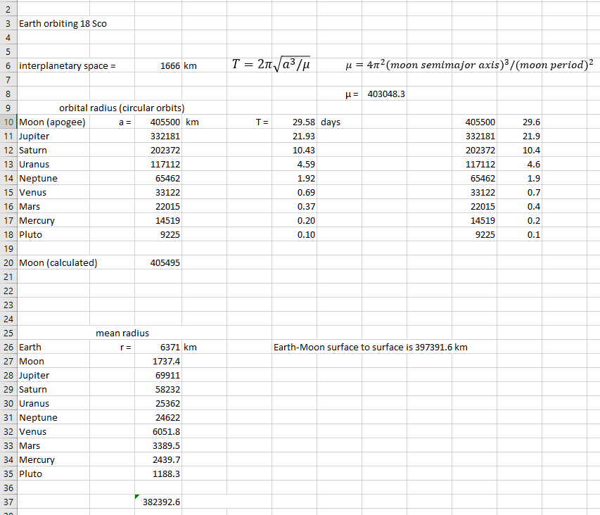
    Here's a copy of my spreadsheet:


    This is a 7½-minute video of the final product recorded from Celestia. I've positioned the viewpoint about 8 miles above the Earth's surface, facing northeast, a 51-degree field of view, with the rate of time speeded up a thousandfold.


    In case you download and install Celestia, here is a link for downloading a version of the script file I created. You can put it in Celestia's Extras folder, and modify as you wish.

    I have shown this simulation to several people. It's quite mesmerizing. As another physics teacher told me, if this is what the sky looked like, we'd never get anything done. My students like it when I project it onto the big whiteboard in my classroom. I'm not sure there is much educational value to it, though. Students seem to recognize that it's "not real," but do understand that the planets would look like that up close. They don't get right away that it's speeded up, and the idea that the planets have been fitted into the Moon's orbit is pretty abstract. Not many people even spot the Moon. Hardly anyone realizes that there's no gravity in the simulation. With gravity, the whole system would collapse pretty quickly. There's no way this could have formed naturally.

    But interesting questions do come up, and students like to guess which planet is which, and they sometimes just watch, like you would watch fish in a fish tank. Lankshear & Knobel, in their book New Literacies, describe the role of the teacher as elicitive. In this case, I suggest that, as a teacher, I am being evocative. And maybe that's OK.


  5. whcalhoun

    Using Desmos for Physics (Part III)

    by
    My inspiration for this project was a Twitter tweet from Brian Frank. In that tweet he showed a photo of a graph sketched out on a whiteboard. It was a graph of a collision between two objects, and it showed the velocity and momentum of the objects before, during, and after the collision, as well as the force the objects applied on each other during the collision.

    Today was momentum transfer in isolated systems using multiple representations. Here is a look. pic.twitter.com/YHECBOl8fn

    — Brian Frank (@brianwfrank) November 2, 2018


    When considering collisions, one usually compares the momentum before the collision to the momentum after, demonstrating the conservation of momentum. Rarely does one consider what is happening during the collision (it's complicated). What happens during the collision is usually saved for a discussion of impulse, where it is revealed that during the collision the objects exert equal and opposite forces on each other (and this is why momentum is conserved). What Brian had done that was exciting to me was to present it all in one beautiful set of graphs: momentum, velocity, and force, for both objects, before, during, and after the collision.

    I decided to model this in Desmos.

    I used as my default view a 6-axis view rather than Brian's 3-axis view. I thought that the 6-axis view would be less confusing for my students. The 3-axis view is more elegant, though, so I built a "switch" into my simulation so you could switch back and forth between views.

    I have also added other kinds of interaction: the masses and initial velocities can be changed; the collision can be switched from elastic to completely inelastic and back; the time duration of the collision can be changed (impulse!); and there's an adjustable scale which is helpful when the lines all start to overlap.

    I added a collision simulation of two balls at the bottom that is timed with the graphs. When the balls collide, they simply overlap, I didn't bother to build a realistic collision model.

    Here's the link to the project: https://www.desmos.com/calculator/outeiufjzt


    You can minimize the panel on the left (click the "Using Desmos for Physics (Part I)
    Using Desmos for Physics (Part II)

  6. whcalhoun

    Using Desmos for Physics (Part II)

    by
    Here is a variation on the Desmos graph I created in my last post. This graph is intended less as a demonstration and more as a student exercise. The five dots are moveable, and define the position curve. Then by clicking on the Speed circle at line 4 ...
  7. whcalhoun

    Using Desmos for Physics (Part I)

    by
    When I discovered Desmos, I knew that both I and my students would love it. Desmos has been called an online graphing calculator, which is literally true, but a description that barely captures the possibilities. I have come to see Desmos as a programmable simulator, using a programming language called math.

    I could see right away that there would be two ways for me to use Desmos in the physics classroom. First, I could create interactive, animated graphs that students could manipulate and play with. Second, students could, with a little scaffolding, create their own animated graphs. These graphs could demonstrate basic graphing concepts, such as finding the slope of a curve, or building a distribution curve for a set of data. They could also demonstrate basic mathematical relationships among various physical quantities.

    But first I had to learn how to use Desmos. The fastest way for me was to find existing graphs that I was interested in, study how they had been built, and then modify and adapt them. When I inevitably "broke" a graph, I was able to find enough information online to figure out where I had gone wrong. It was really fun, and the immediate response by Desmos to any changes was addictive. I also quickly realized that my math skills are pretty rusty. I've done a lot of programming, and you can get away with some sloppiness and inelegance, but straight-out math is pretty unforgiving. If you need to brush up on your math skills, Desmos is the most fun way I can think of to do so.

    This is my first Desmos project: https://www.desmos.com/calculator/nxd7unr4et


    You can minimize the panel on the left (click the "
    Go to line 6 on the left panel (Graph of Slope) and click the circle.

    This graph is based on a graph I've already had the students draw and analyze. Students commonly confuse position (the height of the curve) with speed (the slope of the curve), so the more tools for visualizing the better. In this case, I'm using Desmos as a demonstration tool, but it's pretty easy to have all the students call up the graph on a laptop and show them things they can change. I try to have them guess what might happen with a given change, and then check their guesses. Each instance of the graph is separate from the other instances, so students can modify the graphs without disturbing my original or each other. They also do not need to create an account, or even log in. Hit the link and play!
  8. whcalhoun

    New Physics Curriculum

    by
    I was tasked this year with redesigning the physics curriculum at my school. Our state (MA) just upgraded their framework, so we needed to re-align. For the last decade, the state's framework was nothing more than a shopping cart of physics topics. The...
  9. kirklunsford

    Another Blog Post About CARP. This Time It’s Personal!

    by
    https://www.pressdemocrat.com/news/2187718-181/some-fishermen-complain-that-carpCARP, not referring to a fish, but rather it’s an acronym for Contrast, Alignment, Repetition, Proximity. Sometimes referred as CRAP! Or so I have found by doing a brief se...
  10. emilysmayy

    Colorado Department of Education Online Training: Early Language and Literacies

    by

    This project required a full redesign of existing online training for the Colorado Department of Education (CDE) Early Language and Literacies series to include new interactivity, video, animation, and student assessments within 14 eLearning course modules. The goal of this project was to transform the training modules from hour-long YouTube videos to smaller, more engaging lessons within CDE’s Learning Management… Read more →

    The post Colorado Department of Education Online Training: Early Language and Literacies appeared first on Emily S. May.

  11. emilysmayy

    Precious Pearls Trust Volunteer Training Program

    by

    This project was part of my coursework in my Information and Learning Technology master’s program at the University of Colorado Denver and challenged me to think about what it means to learn in an adult and corporate context. Using the Instructional Design Model, ADDIE, I worked with a partner to analyze gaps and identify needs for a volunteer program. Together,… Read more →

    The post Precious Pearls Trust Volunteer Training Program appeared first on Emily S. May .

  12. emilysmayy

    B2B Tech Social Launch Campaign

    by

    This project was a part of a larger initiative to rebrand the entire worldwide commerce unit at IBM. The social strategy played a critical role in making the transition known –informing and educating clients and prospects across Twitter, Facebook and LinkedIn channels. The announcement was to take place during World of Watson in Las Vegas and my plan encompassed unique… Read more →

    The post B2B Tech Social Launch Campaign appeared first on Emily S. May .

  13. emilysmayy

    Research in Artificial Intelligence (AI) in Online Education

    by

    This project was part of my coursework in my Information and Learning Technology master’s program at the University of Colorado Denver and focused on research in learning design and technology. I split my time between analyzing and evaluating methods for observing instruction, assessing learning and collecting reports to improve instruction with researching limitations and affordances of AI in online education.… Read more →

    The post Research in Artificial Intelligence (AI) in Online Education appeared first on Emily S. May .

UMW Spring 2024 (Bond & Groom)

Welcome to Paul Bond and Jim Groom’s Spring 2024 ds106

Student Blogs

(9 posts)

[feedroll tag=”spring24bond”]

Spread some comment love! Find a random post from this section