
In this week we as a class are emphasizing the idea of “Design”. Much like last weeks theme of visuals this week we are taking a harder look at visuals through new concepts such as color, spacing, minimalism ect. So in this weeks beggining assignment we were asked to quickly review one concept from our assignment document then pick one theme to work with and explore. I chose color because I believe it to be one of the most powerful but often times overlooked aspect of our lives. Color plays a role in everything from advertisement, subliminal messaging, to our natural environment. Before I started this assignment I watched this quick vide on color theory that was posted on our shared assignment document called “Intro to Color Theory“.
For my design safari I went to a museum over the weekend that played mostly with shape and medium but there was also some interesting play with color. So I took a few pictures and edited them to either emphasis or deemphasis color.
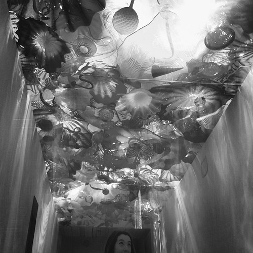
In this first picture I chose to make the entire thing monochromatic because I felt that by playing with the color in a manner that completely subtracted it out from the equation I was able to make my view look more closely at the shapes and the entirety of the photo instead of just the colors
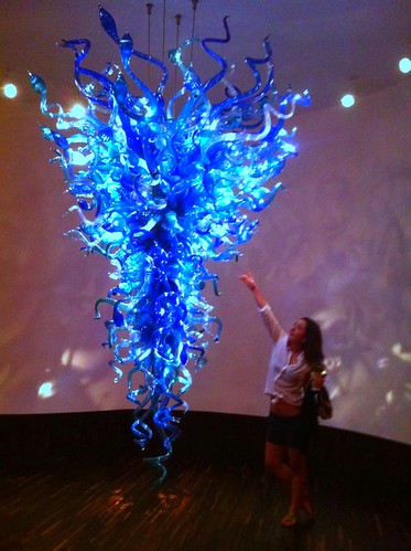
In my second photo of my design safari I also chose one photo I had taken from the museum. It was a piece that was hanging from the ceiling and again though it was a neutral blue most of the emphasis was on the design on the piece and its shape. I tried to change this for my viewer my saturating the color on my photo. I think just making this change I was able to really draw attention from the negative space in the photo and all attention to the color of the piece. Even the outlandish shape of the blown glass art seems to take a backseat to the vibrant blue.
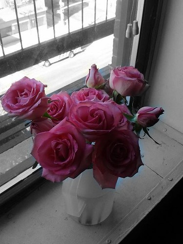
Going from this idea I then chose to take a picture of a bouquet of flowers I found in my friends room. Even though life is not monochromatic I really felt that when I was looking at the photo that all other colors seemed bland compared to the bright, lively pink that really dominates the photos space. I think design wise this really made me want to bring attention to the roses. So again I played with the colors and made everything but the roses monochromatic which I felt really portrayed what I first saw in the photo.
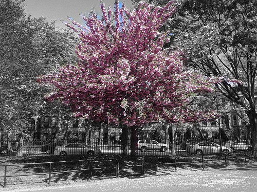
And for my last photo of my design safari I really coouldn’t help but remember this one photo I took almost a year ago of a tree right in bloom back home in Brooklyn. I remember walking to the train going to class and I had to stop (thus making myself late for class) to take a picture of this tree. It was a truly magnificent sight in that when I was looking at it I was almost astonished by how well the pink tree stood out. It almost looked fictitious. So when I was doing this assignment I really felt the need to add this photo. I again wanted to bring to attention the pink in the tree so, I went through a similar process as I did with the roses. What makes this one slightly different is the accidental addition of the blue sky. When I was editing this photo I mistakenly added some of the blue, but I think when looking back at it I don’t want to correct it. Because blue is a complement of red on the color wheel (pink being a shade of red) I think that its not too offensive, and the blue sky sort of brings the viewer back down to the reality of the photo.

Add a comment