
I’m overloaded! I can’t keep up in ds106! That does not matter because so many other people are cranking out the design work. But for a recent blog post I got it my head to make a redo of the classic 1970′s image for “Keep on Truckin’”

Which turned out rather nicely with maybe 30 minutes of PhotoShopping to be “Keep on Reclaimin’”

I ended up doing a few new things inside Photoshop, so I thought it worth ‘splaining.
I usually start by making a ducplicate of the original in PhotoShop, so I have a reference to work from. After opening the original in PhotoShop, I duplicated the layer. In that layer, I went to work with my favorite tool, the clone brush, to use nearby areas to paste out the original text

This means repeated steps of option clicking in the source area to paint over. It did not have to be perfect since the new text would mostly cover it, but a solid fill would not match well either.

With a clean layer I went in search of a typeface…

It is not an exact match, and I do not recall exactly where I got the BillieBoldHand font, but it was chunky and seemed close enough. It does not have to be an exact match!
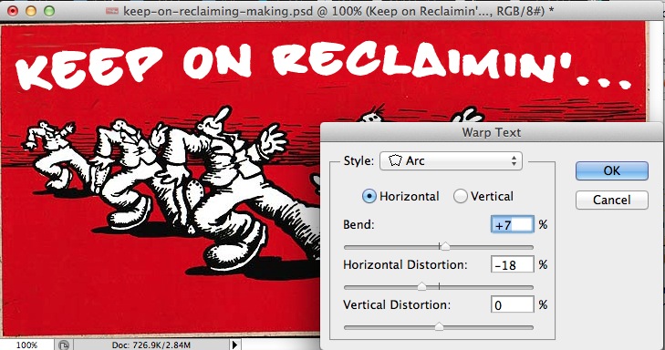
I then use Layer -> Type -> Warp Text to give the text some curvature

using the Arc setting, not much, but enough to make it look less rectilinear
Next, on the text layer, I use Layer -> Layer Style -> Stroke to add a thick outline, set to 5px

This is one of my favorite techniques to make text stand out.
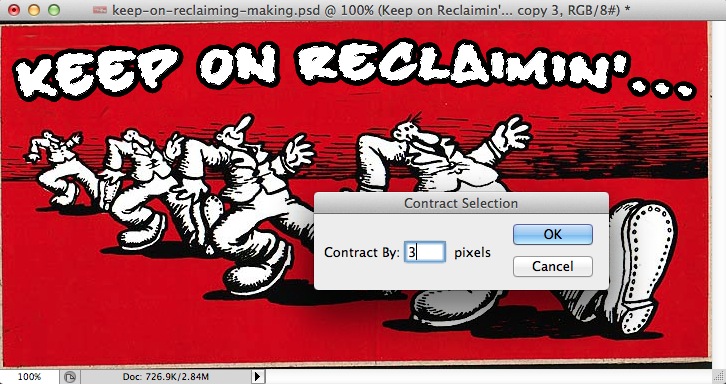
Next I was wondering if I could create that fill effect on the original that looked like shading. BY command-clicking on the layer icon, I am able to create a selection area that includes the shape of the text

I want to male the selection inside the text, so I use Select -> Modify -> Contract to shrink the selection area by 3 pixels
With this selection active I create a new layer to work on, and use the gradient fill tool. With the colors set to default black white, I found a preset that has a striped fill effect (the third one on the third row)
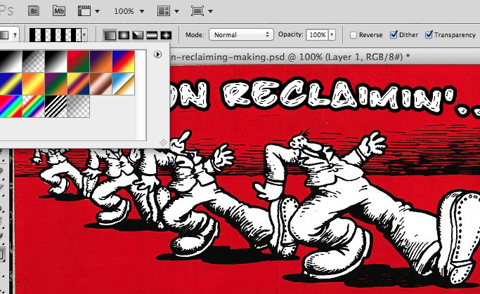
And by experimenting with short drags with the gradient fill tool, it puts this pattern inside the selection area

It is not an exact match for the original but more than close enough for my purposes. And I learned a few techniques to boot.
UPDATE: I put the source PSD file and the special font (TrueType) into a download for ya.
Keep on Designin’

Add a comment