Universal theme. Different
Universal theme. Different
Lighting! I messed around with lighting. It’s interesting to see that having lots of light isn’t actually a good thing. Sometimes light can be too much and wash out a picture but we also constantly battle with getting enough light for pictures. Night pictures can be hard depending on the amount of detail you want in the picture and what ambient light is around. I played around with my lamp to see how natural lighting could make the picture lighter and darker and how the picture changed depending on light.
personal photo (set on saturation)
So many things to work on this week. I really liked the photo/design unit so far. I’d never made a .gif before and it was really cool to make it. I seem to put a theme certain project sets. My minimalist poster and .gif and ted talk were all Legend of Zelda themed. It can be fun to make our projects related to another interest because the ideas are open ended. I’m excited to see what our “first umdst class” project(s) will turn out like.
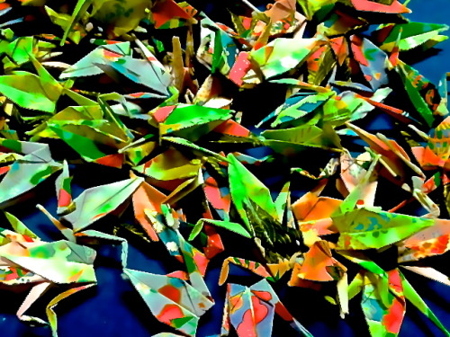
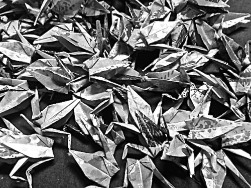
The same thing. I really liked this overall I wanted to explore saturation. I’ve often seen pictures appear washed out or more dull than how they actually are and I wanted to see how color can be put back into photos so they look more vibrant. The color viewed here is fully saturated which makes the color so vibrant. I also increased sharpness, and shadow in this picture. Overall I just experimented to see how different bars can drastically or subtly change a picture. I also unsaturated a picture as well. The same picture can look very different.
Rule of thirds. I tried rule of thirds. This picture turned out okay. I took it with my phone and I was interesting trying to guess where the rule of third points were. I think I guessed correctly.
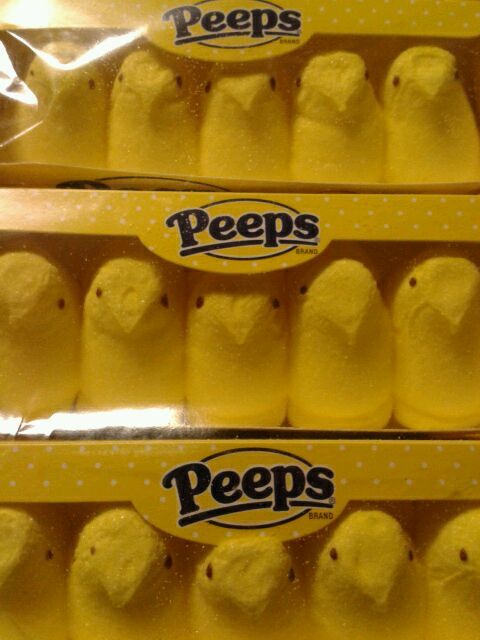
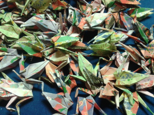
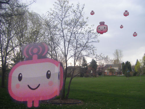
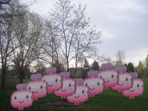
Repeating pattern of my peeps. My easter candy made a great subject for repeating pattern. It reminds me a little of Andy Warhol.
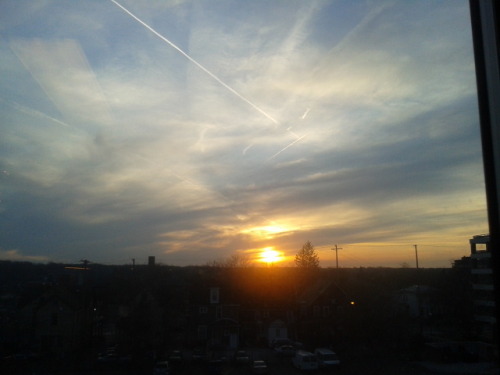
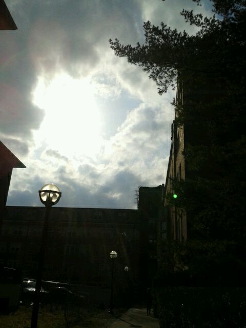
Skyline. So to emphasize the sky I decided to have the skyline very low. I like this picture it’s towards sunset and the sky still had some blue in it. I liked the clouds that day and the sky looks very open in this shot. This view is out of my window using my phone as a camera. I’m glad I didn’t get too much reflection from the window in this shot.
The reading of Jon was very strange. When I first started reading the story I found it very strange and kept wondering what is going on. Did I miss something. The story was interesting thought and reminded me a bit of surrealism. Overall what I liked most was the voice in the story. Several times the writer was amusing with how he described things. It made me laugh a bit at the beginning when he started talking about the MTV show where people were trying to create different poses.
I did have to look up the story to understand the story better as when I read through it on my own it seemed a bit like nonsens. As I looked up the story I did start to notice the critique of commercialism and medication.
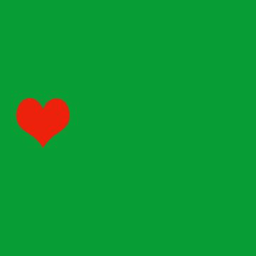
So I made a .gif! I used gifninja.com to make this gif. I didn’t use a video to make this .gif I made 4 5x5 still pictures in photoshop. I simply put one heart on a green background then saved it. Added another and saved it as a separate picture. Then I googled make .gif with stills. gif ninja turned up and I uploaded the the stills in order online. The screen showed the pictures in a preview of the .gif. the major adjustment I made was to the timing but otherwise the maker create the .gif exactly how I wanted it to look. Then I saved it and downloaded. Now I have a .gif. It was easier than I thought it would be.
album cover blog post
This week was interesting in making pictures. One thing I forgot was how time consuming picture editing can be. Even if I know exactly how to do something and it is pretty straight forward, it always seems surprising to see how much time it actually took to create. Overall I rather like the graphics I made for this week.
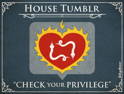
Recently I really liked the minimalist posters from College Humor. I liked them because they felt relevant and accurate as the posters had to do with the general personality of websites. My favorite website is tumblr so I chose it’s poster. The element that makes this particular poster effective is contrast. While the background is blueish-gray the heart which is the main attraction of this poster is bright and contrasts greatly. While being minimilist in nature this particular poster does seem a little more complex and embellished than other minimalist posters but I still think it did a nice job being balancing simplicity with small flourishes. For example the boarder and underlining add detail but don’t make the visual overly complex.There are are a series of posters and each seems to take different elements but they are all effective.
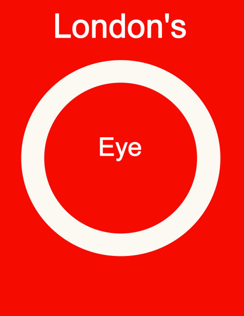
For my minimalist travel poster I made it for London’s eye. I felt red and white would be good for my poster as well as keeping it simple. I didn’t want to use too many colors and red and white seem very British to me. I also used Arial font to keep the poster as simple and clean as possible. I used a plain circle to represent London’s Eye (which is a Ferris wheel.) I placed the eye in the center of the circle to emulate an eye. Overall I liked the project and feel people know what it’s about.
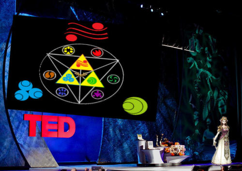
TED talk by princess Zelda. I combined three pictures to make this. I found a picture of Princess Zelda from my Guide book to The Legend of Zelda: Twilight Princess. The graphic are symbols are from the game. The Ted talk stage is from a still of a ted talk. I covered the screen with a graphic which didn’t tilt/line up very well but I tried my best to get it to fit. I don’t really like it but couldn’t find a way to adjust the picture to fit exactly where the screen was. There was another person on the stage which I used the smudge feature to “erase” from the stage and place Princess Zelda over where they were standing. I really liked how that worked because at first I tried to fit my graphic over the person but their hands kept sticking out awkwardly. Smudging the person made it much easier to place a graphic over that didn’t exactly have the same stance. Overall I kind of like how the ted talk turned out because I like TED talks and it would be cool to have one from Princess Zelda.
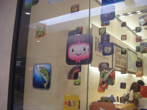
So I wanted to make a collage type picture. I took The smiling guy from this picture I took of an apple store. I used the eraser tool to get rid of as much background as I could. I then copy and pasted him several times into another picture. I wanted to play around with perspective. I did this by taking copies and making them bigger or smaller and arranging them to give the illusion of distance. The background is just a picture I took of my backyard to give the comic invasion look more validity by being in a space that looks obviously real compared to the cartoon. Cartoons are invading. I like how this looks. I need to make sure I pay attention to using the eraser tool carefully.
I really liked The Problem is the Problem album cover. The reason why I chose this one was that I liked the title. The problem is the problem which to me is a little philosophical. People make things out to be much bigger than they are usually the problem is something very specific that then gets expanded upon and grows into something much worse than that specific something. As far as visuals go. The city scape picture is well composed with leading lines and a unique higher up angle. Overall it looks like there could be a filter or some enhancements on it but nothing too obvious. I also like how this is a night picture but that’s mainly because I’m a night owl.
So I finally opened up my old computer and worked on the splash of color project. Wow I forgot how old my computer was. Looking at the screen was weird considering the clarity is so much worse than the new macbook screens. I also forgot how slow the program ran because my computer always had trouble with it and it seemed extra slow. The plus side was that I knew exactly how to produce the effect I wanted for the splash of color I take the magic wand and select the blue area (hair.) I then keep increasing the magic wand tolerance until most of the blue is selected without it also choosing things that weren’t her hair. Then I take that raster and make it a layer by double clicking and choosing make layer. I let the hair be the layer be on top of the rest of the picture. I then select the picture and turn it black and white. Leaving the hair the only thing in color. I noticed that after switching back to my normal computer I hadn’t noticed that certain portions weren’t selected all the way leaving some random portions gray and the rest blue. For future reference I’ll need to inspect the picture more carefully for flaws because I hadn’t noticed them on my old screen but opening them on my new computer the errors seem abundantly obvious.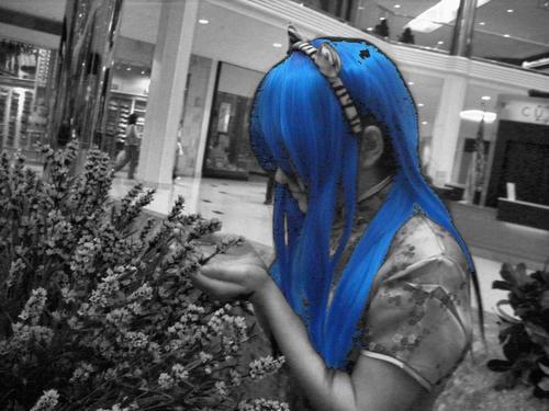
So I decided for my other photo I would try doing “mobile” art. My friends really like Instagram and most of my experience with taking images involves taking pictures with my camera and downloading them onto my computer and editing them from there. My helvetica picture was done in a similar way. I decided I wanted to try out using my phone for the whole process. So I downloaded Instagram for my phone and took some pictures of my DVD collection. Instagram is interesting in that Instagram pictures you know are from Instagram. They are square which is odd considering most photos are rectangles. I played around with choosing different filters which they have a lot of. I chose a redish filter which I think made the picture look rustic despite it being DVDs. What I also found interesting with using my phone as the camera is that it gives me mixed quality for photos. This one when I saw it blown up was a little more grainy than I expected it to be. Overall the camera in my phone is surprising me in how high the quality is because I’m used to taking a “real” camera out when I want to get pictures.
my blog article
my bad photo
my other photo
So sound was both easier and more difficult than I thought it would be. Once I figured out how to get good sound quality it was easier to produce my audio pieces. I also found writing a script and practicing it then recording to more planning but eventually worked out in the long run to save time. I like pictures and photography. I decided to try Instagram a bit for my “other photo project today.” Instagram is very good at making things look a lot better than they are. It’s like magic.
I like the information from the sections we read in How Images Think.
I really like the idea of recognizing how much people interact with technology. I know to a lot of people not having their technology be it their phone or computer they feel like they are missing part of themselves.
I also feel that people do communicate a lot through images and sharing media. I spend a lot of time sharing interests and images with people through my technology be it phone or computer. A lot of my media has to do with sharing pictures on Tumblr or on Facebook. I’ve recently bought books solely based on their visual appeal rather than any other type of content measure.
I think I’m a very visual person in general. I often “judge a book by it’s cover.” I like a lot of things based on the art used and how much I like looking at it rather than sophistication or logic based arguments.
In general people seem to be visual. We do share a lot of visual content with each other.
So for my other audio piece I decided to explain my pen name. What was interesting with this piece that instead of taking whatever audio i could get and having to cut it or not knowing what to expect I wrote a script. For my previous audio pieces when I talked I usually just said whatever I thought and the audio from other people was just in conversation. I wrote myself out a script for what I wanted to say regarding the name Janus and what it means. I found it very helpful to read what I was saying. I decided to that based off what the guest speakers said on monday. I hand’t thought of actually writing out what I’d wanted to say until they talked about reading the scripts aloud. I felt it sounded natural and unlike video I didn’t have to memorize anything.
I put some background music softly on for this piece because I felt having just my voice lacked something. It was interesting trying to get the audio level correct so that the music wasn’t silenced but wasn’t overpowering my discussion the meaning behind Janus.
I once again focused on trying to be in a quite place so that the audio would be clear. It took a little more planning thinking about what I wanted to say but in the long run writing the script saved me time in editing later on.
Overall I like it and think it turned out well.
I did my dating piece on long distance relationships. Overall this piece was a little difficult for me to put together because in the middle of the project my long distance relationship ended. So it was a little hard for me to do the project.
Otherwise I ended up going with a vox pop style piece with my own added commentary. I had some audacity difficulties as some how my files got corrupted and I couldn’t seem to figure out where my audio went. Since I couldn’t find my files on my computer I was lucky enough that I had uploaded the sound files I wanted onto soundcloud as a draft so I downloaded the file and re recorded what I lost and still had the interviews I wanted.
For this piece I really focused on getting clear audio. I made sure my interviews were taking place in a quite area so that I could hear people’s voices. I tried adding in some background music but I didn’t really the the effect so I decided to keep just the voices. I like just having the voices because I feel that since these are personal opinons that having anything extra in the background would be distracting.
A few difficulties but I managed to produce an satisfying audio piece.
I listened to the documentary on infant mortality. I found the information surrounding mortality rates very sad and multi faceted. As an audio piece it was interesting because the information was interesting but also because there were many different textures and transitions. I really like how sometimes there wasn’t any background noise and sometimes there was chatter or music. It helped keep my interested.
In my women’s health class we went over similar information regarding what causes low birth rates and the effect of a persons race, socieconomic status and other factors can have on their health. I like how they had a lot of different sources that weren’t always medical. There were also people talking about their personal experiences as well as facts and figure and medical professionals. I think it humanized the piece.
I also liked how the piece ended. Despite all the facts and figures and the information being very heavy they tried to end on an uplifting note which makes me hopeful for the future rather than thinking nothing is going to change. It was a very specific kind of choice and direction to have as the final note and I’m glad that is the direction they chose.