Touch the firehose of ds106, the most recent flow of content from all of the blogs syndicated into ds106. As of right now, there have been 92512 posts brought in here going back to December 2010. If you want to be part of the flow, first learn more about ds106. Then, if you are truly ready and up to the task of creating web art, sign up and start doing it.

  1. mdvfunes

    Creating distinctions

    by
    So Ryan taught me this week that ‘it is super important to have a contrast of between what you like and what you don’t like when selecting content’. Michael taught me that I need to learn to ‘form an opinion about how choices are made. This is you identifying your tastes.’ Actually they have both been … Continue reading
  2. mdvfunes

    Creative commons licensed (BY-NC-SA) flickr photo by troutcolor:…

    by


    Creative commons licensed (BY-NC-SA) flickr photo by troutcolor: http://flickr.com/photos/troutcolor/15719237262

    What stood out when I first saw it was the texture of the sky and the position of the sky, it is in the ‘wrong’ place. Also, the bright red in the middle and the sharp blue beyond the could - great contrast. The main reason this strikes the viewer is contrast between the colours and the conflict between where we know the sky to be and where it is positioned in the photo. What stands out is that whilst we know there is water there, we cannot see water, only sky and ships that ‘should’ be on the water. The mind is confused.

    The colour of the clouds - pinky red. Fluffy, makes me want to touch them and this seem important as it gives texture to the photo. The top/bottom positioning is inverted and this draws the attention in. A key contrast seems the bright red dot in the mostly blue photo.

    Depth works in a mysterious way to my untrained eye. I see the cloud close to me, land further way and then I see sky even further away. This is not how looking at a scene like this in real life would look - so you are pulled in to resolve the conflict between the ‘seen’ and the ‘real’. It has a surreal feel to it and yet a warmth from the lovely fluffy clouds.

    What is not obvious is where the photo was taken from. No sense of the photographer or what is around him.

    As I look at the photo I feel detachment, a sense of perspective and a sense of my givens being challenged. Literally and metaphorically - the sky does not belong down below and yet my eyes deceive me. My rigid views challenged as I have to stop and take a second look. I would call it ‘The impossible sky’.

    I keep want it to edit the photo and remove the rail at the bottom. I might do that at some point to understand what is making me want to do it. 

  3. mdvfunes

    This is relevant to my #artonthecouch project. What did I think…

    by


    This is relevant to my #artonthecouch project. What did I think of this episode? It was [fill blank with overused superlative of choice] I will write more on this soon. I wanted to post it here so as not to lose it. Some kind soul on Twitter directed me to it, but I found it in a tab at end of the day. Thank you whoever you were. You were…I can’t even…literally…

  4. mdvfunes

    “The wire” a poem by Melinda Albrycht DS106 Art on…

    by


    The wire” a poem by Melinda Albrycht

    DS106 Art on the couch - critique

    When I first heard the poem on sound cloud it was the voice, the depth of the voice that stood out for me the most. I wondered how to do an art critique with audio art. So I went googling. I guessed that music might offer some constructs to comments. 

    From my explorations I get that the tempo of the voice is steady and this is what brings me in. The monophonic nature of the voice has a hypnotic effect and I also notice, on hearing again, that there is a rhythm to Melinda’s voice as she read her poem, it becomes almost a song.

    Is this what people refer to as a melodic voice? When she talks about the losses in the game, one can almost tap to ‘the music’ of her voice.  Repetition is used to great effect in this part of the poem to create the sense of hopelessness in playing this game.

    I found it interesting to compare the written words with the performed words. ‘Look again’ says the text. ‘Look again, player.’ says Melinda’s voice. ‘Player’ added to keep the rhythm in the voice I am guessing.

    The last part of the poem has a different tempo. I am not sure how to interpret that, I just noticed it. I notice the change comes when she says ‘Look again’. May be this looking again gives new information and this is shown by the change in tempo in the quality of the voice and the cadence of the words?

    The voice is used to convey the emotion of the words. The contrast between the possibilities when we play a game is marked with the change in tone. As we are losing the game, the option comes up to win it. But if you think you can win it, think again. Nobody does. Can I win? Will I lose? Can I leave the game? There really is only one choice, if you play on the wire you will always lose. 

    It is that dangerous.

    The poem starts with ‘walking the wire’ and ends with ‘playing on the wire’. A way to bring closure to it? a kind of circle that keep going in a never ending cycle of despair?  

    The poem has a realistic and expressive style.

    Unless you have seen the TV series, ‘The wire’ and what the wire is is hidden from the composition. Yet it stands alone as a description of a kind of life style that leads to the destruction of life. Anyone ‘hanging by the wire’ is in danger. The poem brings up despair and hopelessness blended with a sarcastic ‘gotcha’ flavour - just think again, player.

    And now for the informal critique: I thought it was so bloody good (as we say in the UK, Melinda) that I wished I had written it myself. 

  5. mdvfunes

    “Sketch a Screenshot” by Lauren Brumfield DS106 Art on the couch…

    by


    "Sketch a Screenshot" by Lauren Brumfield

    DS106 Art on the couch - critique

    The similarity between the screenshot and the sketch stands out once you put the two pieces together. Yet what drew my attention to the sketch initially were the colours and the emotion it expressed. It was not until I went to see the original from our DS106 site that I learnt it was a ‘sketch a screenshot’ assignment.

    The contrast between the dark hair and the green clothes say ‘extreme’ to me. The centrality of the subject and the ‘close up’ style say ‘high drama’ to me. As I keep looking the expression of the eyes jumps out at me; the stark sketching lines speak of a ‘stark’ state of mind in the subject. The stark contrast seems to be between green, white, black. This draws attention to the centre of the piece and made me wonder what is wrong with her. 

    As I focus on the centre, I want to pull away from the piece. Too distressing to ‘stay’ in the artwork. Yet, there is nothing else in the sketch to focus on, the background is bare. This seems to be how tension is held - the viewer wants to pull away and yet cannot. 

    A very expressive piece with lots of feeling.

    The background and any sense of why the distress of the subject are hiding from this composition. Leaves viewer wondering why the distress and despair. I imagine potential titles for the artwork might be: Why? Make it stop. I can’t take this no more.

    Once I saw the screenshot, I could see that it has been faithfully reproduced in the sketch. I am not familiar with the series the screenshot came from. I would be interested to learn if what I ‘took’ from the sketch is in any way connected with what was going on in the episode.

    if you want to know why I am doing this and how you can join in, read this post.

  6. mdvfunes

    Art on the DS106 couch: Veggie Tales By Bianca Brown  Click here…

    by


    Art on the DS106 couch: Veggie Tales

    By Bianca Brown  Click here to go to it on Flickr.

    My first critique

    What caught my attention was the bright background blue. Also the contrast between the subject (the cartoon vegetables) and the background. The background seems to take up the largest area in the composition and this is quite striking. I notice the title of the composition and connect that with the subject matter - the cartoon like veggies are smiling and have been anthropomorphised and the composition is titled Veggie Tales. 

    It seems the artist wants the viewer to think that there is a story behind the photo. The Veggies have many tales to tell. Once you notice the background the next thing that jumps out at you is the big smile on the subject, the Veggies. The shape of the Veggies contrasts strongly. One tall and thin and the other round and short. The red, green and blue are being contrasted to grab the attention.

    The two Veggies are connected via the shared green colour. The smile is the also same so the two characters seem ‘related’ in some way. Yet the eyes are different, one round the other oval.  There is no symmetry in colour, I half expected some red in the tall Veggie but it was not added by the artist.

    The over all style is naive . Like a children’s book illustration. The faces of the characters are expressive but clearly imaginary not realistic. The whole thing is very bright but colours are stark not blended. Sharp lines.  The only organic lines are in the top of the tomato which is the colour that is shared by the two characters. 

    The placement of the eyes seems to suggest that they are looking at something off the scene. Whatever it is the characters are looking at is hidden from the scene but seems to be making the characters smile. So that make one interested in what might happen in the next frame.

    The feelings that seem to emerge on looking are: Cheerful, light, simple kids story. What might be other titles for this composition? “The Veggies extraordinary adventures” “The Veggies find their fruit” “The happy Veggies”

    Overall what draws me to it are the simple and clean lines. The shape of the frame rectangular not square, somehow adds interest.

    Narrate your process

    So what was my first critique experience like? Really tough. I got the random daily create and I must admit that I would not normally spend any time looking at variously shaped vegetables. I wanted to keep to my process to find some learning and go against my leanings of wanting to pick something else.

    So, I looked at the submissions for this daily create and picked one that drew my attention. I wanted the process of filling in the art critique Google form to be a discovery about why it had drawn my attention. 

    It worked. I followed the questions as set and kept looking at the piece to answer the questions. The more I looked the more I could see in it even when I had started with a preconception that is was a kind of ‘throwaway’ clip art type image. I would not choose it for my living room, but I understand why it got my attention.

    If you want to know why I am doing this Click here

  7. mdvfunes

    Let’s get the ball rolling Here is the script from…

    by


    Let’s get the ball rolling

    Here is the script from Sarah’s Critique episode of The Art Assignment. I said in my previous post I would post here. Mainly as a quick guide for me to work from when I write my summaries.

    "This week I want to talk to you about something that’s been weighing on my mind lately. And that’s the issue of critique. If you spend any time on the Internet, it’s something you come across frequently. If you’re the victim of Internet trolls or if you are an Internet troll, listen up! There is an etiquette to critique that has been in play for a long time in art schools all over the world. Let’s see if we can learn something from that world and apply it in ours. 

    So here’s how an art critique usually goes: An art student sets up their work to show their teacher, a group of teachers, their friends, their class, or an even bigger group. Then discussion ensues, questions are asked, and criticism is offered. Sometimes things do go awry. Tears are shed and expletives hurled, but it’s usually a civilized affair, and there is an etiquette to these things that I think it would be useful for us to discuss. In relation to The Art Assignment, and to the Internet community at large.

    But first, let’s talk about why we should critique in the first place. Because it’s the Internet, and you can anonymously say whatever you want? I’d say no. Because you like to change the minds of the person you’re critiquing? Definitely no. Critique is often most instructive for the person offering it. In looking at other people’s work, and formulating your opinion of it, you’re learning a great deal.

    I don’t often see people responding to Internet comments by saying, “Gee, thanks! I never thought about it that way! I agree with you now.” But that’s okay, because it’s still a constructive process. It can help shape your beliefs and teach you about different ways of looking and thinking. That being said, here are some important critiquing guidelines:

    1. Be attentive. The Internet has trained us to look at something for a millisecond, and to scan text quickly. Fight that urge. Let something linger on the screen for seconds or even minutes! Look at it once, and then look at it another time later in the day, or the next day, or the next week. I often have instinctual reactions when I first see something but then my opinion changes the longer I spend with it. Or, even a week late when I’m remembering it. Use your faculties and your patience and trust your reactions.
    2. Don’t be lazy. I am a terrible example to follow. When I look at all of the responses that come into The Art Assignment, my head fills with ideas, but then I get a phone call or I’m in a hurry, and I just reblog something or say something tepid, instead of saying substantive about it. I also lean way too heavily on the word “interesting.” It’s value-neutral, which is helpful, but it also says very little. For example: the history of documentary photography is interesting. But The Simpsons is also interesting. It’s not a particularly specific adjective. There are lots of lazy words, and it’s okay to use them sometimes, but try to follow them up with something that has teeth. Insteadbof saying, “This is great!” say, "This is great, because you’ve done A, B, and C, and then surprised us all by adding D!"
    3. Be generous. Try to look at each work of art for what is successful. Performance artist Matthew Goulish tells us in an essay on criticism to look for the “aspects of wonder.” We want to encourage more wonder in the world, right? So when we come across it, let’s celebrate it. Criticism can be an incredible act of empathy. What made someone make that thing? Why did they do it that way? Be sympathetic to the maker, and realize that the mere act of putting yourself and your work out there takes courage.
    4. Find your point of entry. You don’t have to have a Ph. D. in Art History to talk about art. So find your point of connection to a piece, as personal as you’d like it to be. For example, this reminds me of a bathmat, in the best possible way, because its tactility is enticing and it transports me instantly to my friend’s bathroom circa 1997, which had floral wallpaper and smelled like Garnier Fructis shampoo. As it happens, it is a bathmat, and not an artwork, but it could be an artwork. Think about what the thing in question reminds you of, whether it’s from the same discipline, something personal, or something far-flung. Think about the decisions that were made along the way. Maybe it’s the materials used, or not used. Maybe it’s the way it’s been arranged in space, or documented for us to see. Maybe it’s what the maker decided to include or exclude from the frame of the work. What are the skills on display? Maybe the artist is not an amazing draftsperson, but still ended up with a delightfully peculiar, delicately rendered drawing that communicates much more than a perfectly photo-realistic drawing might have done. Maybe the ideas behind a project outweigh the execution. Maybe the execution outweighs the ideas. And if you can’t think of anything declarative to say, ask a question.
    5. Don’t be a jerk. There is a lot you can say about something without declaring it to be good or bad. It can be a productive challenge to try to not make any value judgements while talking about a work. Most art critiques take place in a room where all the individuals have to look at each other’s faces and deal with the immediate consequences of saying something provocative. Pretend you’re in the same room with the person you’re critiquing. Pretend they’re someone you know. I’m not saying to lie or blow smoke; I’m saying don’t be a jerk!

    And finally, why make yourself available for critique? Faced with the reality of all the Internet trolls in the world, it’s completely understandable to stay in your hole and not participate in Internet communities. I totally get that. But the positives of participating in this and other online projects can be real and rewarding. It’s hard to have perspective on your work. And offering it up for review means you might have the chance to see it with fresh eyes, and learn from the experience of others. But it also makes you vulnerable, which can be a miserably crappy feeling, but sometimes a liberating and empowering one.

    If you can try to take your ego out of it, you can learn a great deal. “

    Sound advise for talking online, about art and many other things.

    (Animated by gifadog from Archive.org CC0 footage)

  8. mdvfunes

    So, I recently found out about the Comic Alliance and started…

    by


    So, I recently found out about the Comic Alliance and started following them on Twitter. On their site I found a comic by Andrew MacLean that seems interesting and I was drawn to the style of the illustrations. I wanted to remember the publication date for the future, so sent the link to Pocket for never finding again.

    On a separate event it is Giulia’s birthday and she wants to keep it quiet. 

    Well, this oddly configured mind’  (best description ever, thanks Sandy!) put these two things together and did a quick creative edit for Giulia.

    Happy birthday Mighty Doodler, you will be remembered ‘til the end of time!

  9. mdvfunes

    A Fortune Telling Noir Poster So, Jim talked about the patent…

    by


    A Fortune Telling Noir Poster

    So, Jim talked about the patent pending assignment on his blog. A post on #wire106 the run of #ds106 now at a terminal near you: http://bavatuesdays.com/the-pager-technology-surveillance-and-paranoia/ I went to Tom’s Blog: http://bionicteaching.com/patents-pending/ and he had pretty detailed details on how to do it! Loved it. (This post from sucky iPad so own details will come later)

  10. mdvfunes

    It has been a while since I have written a post here. I have…

    by


    It has been a while since I have written a post here. I have been posting my art (See? calling it ‘art’ not ‘artefact’ anymore :) but not narrating the process. The truth is that narrating process is hard and as I get more into making art, I am less able to run the ‘witness loop’ to be able to accurately explain my creation process. This is, of course, natural when creative flow happens. We ‘lose’ ourselves. What this means is that we lose the judging mind and align in activity. 

    I want to make an effort to narrate this daily create because I believe this to be my graduation assignment!

    There are many goals to set going forward, but for the first time since I started participating in DS106 I have made something that is inherently and standalone pleasing to me. Awesome feeling. I have had glimpses of it when making animated gifs but this time the intensity was different. 

    It started with me scanning the daily create site and seeing what others had done for today. The prompt made me go: meh. I am in the middle of another project for our Summer DS106 Story doing a trailer in the style of a silent movie (something that is proving more challenging than I expected). May be I get one with that and forget about the daily create today. Or may be not.

    I watched a video today that admonished me: ”The most dangerous thought you can have as a creative person is to think you know what you’re doing.” I decided to make an animated gif, I know how to do that. 

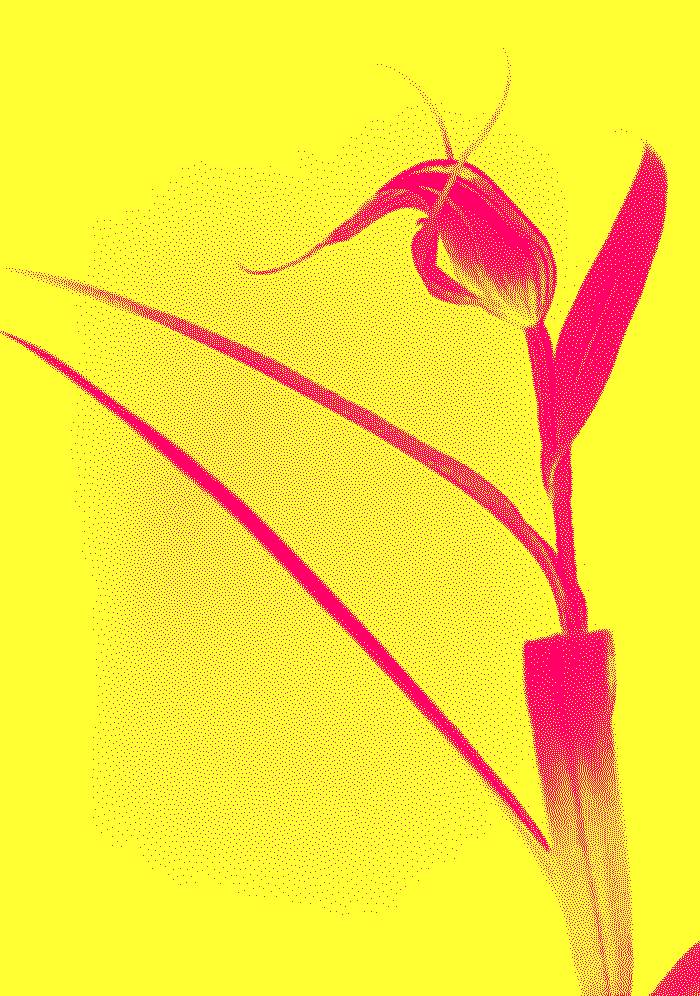
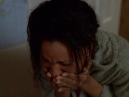
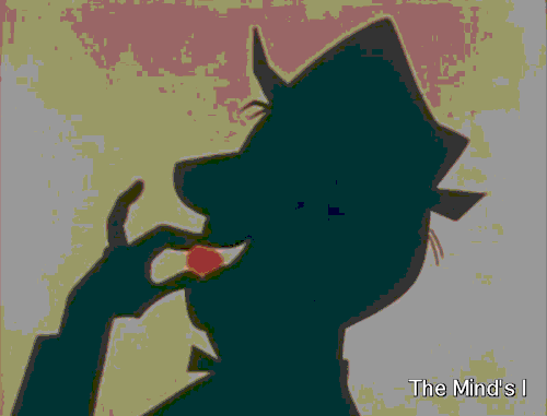
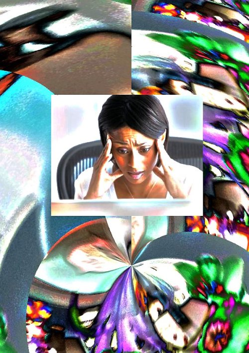
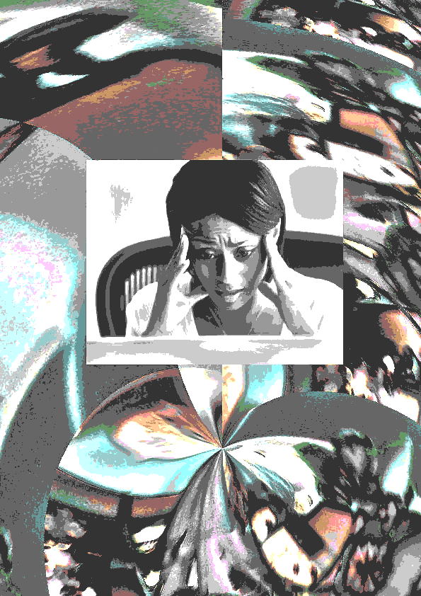
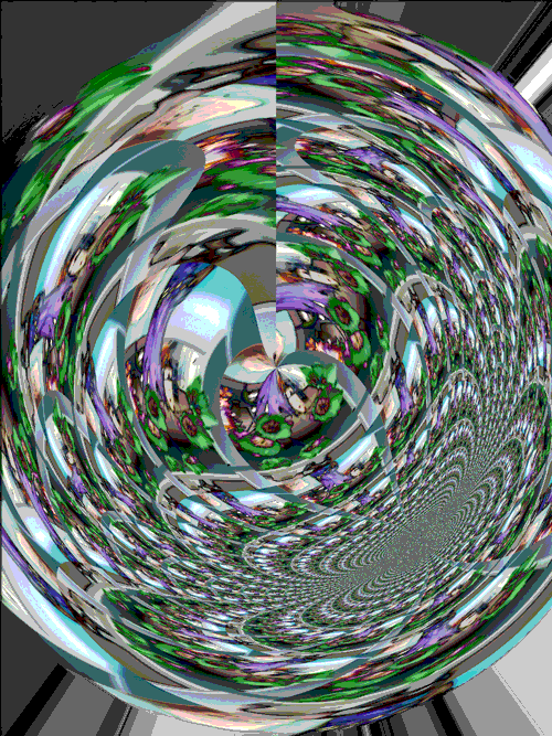
    I had the idea of many hands moving and that gave me the slogan you see in the image. Hands were dancing in my head and I started, predictably for those who know me, to make a gif. 

    Where to find hands? @cogdogblog introduced me yesterday to the most beautiful resource I have found in a long time The Public Domain Review. Looking for images was a great excuse to lose myself there for a while. Actually, I found what I wanted straight away. The physiognomy of hands in 1917. Use these images in Photoshop and make the hands dance whilst the slogan pops up. Boom. Not Boom. I could not keep the background still whilst the hands danced.

    Each time I watched all my layers I could hear a faint voice saying - it looks great as a still image. I ignored it for a while and kept trying to make the hands dance. I knew what I was doing. Until I was willing to suspend knowing. 

    I abandoned the idea of an animated gif and looked at ‘what the marble wanted to be’ as they say Michelangelo thought of sculpture. Not that I am comparing the output, just the process. I spent hours playing with Photoshop selecting, blending positioning the hands. I tried many fonts and colours and then I noted that this was a kind of ‘silent film’ poster. 

    Off I went down another Google rabbit hole. Find a font that suits the silent era. I have never installed a font, I just use what is there and match it as best I can. Lazy creator. This time was different. I wanted to shape the poster as it seemed to want to be shaped. Worked out how to install font and restarted machine. Boom. Like. Now I thought about the inter-title screens in silent films. It needs a frame. I looked and could not find anything. 

    I remembered that Photoshop now has Picture Frame to use. I needed a tutorial for how to use that. I played around until I made something the fitted the style. 

    Boom, my poster for today.

    It really helps not to be struggling so much with the tools. As Ira Glass reminds us ‘our taste is impeccable, it take a couple of years for the execution to start to align with our taste and we know when we are falling short’. Well, today I did not fall short. There is a big difference between quickly getting something done, and losing oneself in the process of creation. I have known that from writing all my life, but this is the first time I experience it with digital art. Thank you daily create for the ‘boring’ prompt today.

  11. mdvfunes

    Well, who would not be inspired seeing little Merlin’s…

    by


    Well, who would not be inspired seeing little Merlin’s photos? Using the colour sampler tool in Photoshop still evades my grasp, but did you know that there is such a thing as a Star Wars Font Generator ? That pesky green font was a worthy adversary, but I got it!

    Please go to Flickr to check permissions. One of Merlin’s photo appears by special permission from Ingrid. Thank you, Ingrid.

    Creative commons licensed (BY) flickr photo by mdvfunes: http://flickr.com/photos/97994829@N03/14400081830

    creative commons licensed (BY) flickr photo by mdvfunes: http://flickr.com/photos/97994829@N03/14400073848

    creative commons licensed (BY) flickr photo by mdvfunes: http://flickr.com/photos/97994829@N03/14577774764

  12. mdvfunes

    The week in doggies! All thanks to a conversation on Twitter. An…

    by


    The week in doggies! All thanks to a conversation on Twitter. An emergent DS106 assignment ‘Remix (in a dog appropriate manner) a Bond movie title and create a poster’. I learnt more about Photoshop from trying to do a good job of these ‘silly posters’ than I have in a long time. 

    Starring: Daphne as Miss Doggy Galore, Gifadog as Colin Bond, Spike as E. Cowfield, Abby as the Digital Diva and Chewy as the werewolf puppy

    'Children and Daphne' by Jim Groom ’Bones are forever’ by Viv Rolfe 'Reeborn' and 'Cop Pup' by Ron L the other posters by the DS106 Shrink.

    Yes, I know the last 2 do not fit the Bond theme. The translation machine (me!) from Twitter to Google Plus was faulty and the assignment got re-interpreted there but Chewy is too cute not to include here. 

    Who knows what else might get remixed. May be we can start #posterfight to complement #giffight ?

  13. mdvfunes

    The joy of DS106 as therapy! Find a CC0 poster anywhere you can,…

    by


    The joy of DS106 as therapy!

    Find a CC0 poster anywhere you can, with CC0 there is no need to keep track of where or when. I found this poster somewhere on the Interwebz with the intention to use it weeks ago but I did not.

    Use a lovely tutorial created by a kind DS106 participant like Jack Hylan to learn a little more about Photoshop and remember another lovely DS106 participant, Rochelle, talking about ‘Skew’ in Photoshop. 

    Sprinkle an interesting Daily Create and adapt to taste.

    I now feel ready to try my next poster 'License to Chew' - a new movie starring Colin Bond, the star of 'Bones are forever'.

    Who needs to pay for a shrink when there is DS106 for your mental Health?

ds106 in[SPIRE]