Touch the firehose of ds106, the most recent flow of content from all of the blogs syndicated into ds106. As of right now, there have been 92511 posts brought in here going back to December 2010. If you want to be part of the flow, first learn more about ds106. Then, if you are truly ready and up to the task of creating web art, sign up and start doing it.

  1. whcalhoun

    David Labaree – Targeting Teachers

    by
    David Labaree is a historian and retired Professor of Education at the Stanford Graduate School of Education. This essay is taken from his website (https://davidlabaree.wordpress.com/). He introduces the essay thus:In this piece, I explore a major p...
  2. whcalhoun

    New Demonstrations

    by
    A couple of new quick labs for my students this fall. Thanks physics Twitter!I finally bought zcars and had students do this lab - worked great! Thanks for the idea. We graphed a-t using Desmos and later graphed v-t by hand. We used half-second interva...
  3. whcalhoun

    The Collision that Formed the Moon

    by
    I was poking around YouTube looking at videos about where the Earth's Moon came from. The currently accepted theory is called the Giant Impact Hypothesis. Though details differ, the main idea is that a smaller planet collided with the early Earth, and ...
  4. whcalhoun

    Stacking all the Planets

    by
    You've probably come across this idea that all the planets could fit between Earth and the Moon. The usual representation looks like this image I found on Google:


    It turns out, it's not entirely true. Here's a good article about this, published in Slate a few years ago. The planets can fit, but you have to make a lot of adjustments.

    What got me thinking about this recently was an amazing video I found on YouTube by yeti dynamics (here's YD's channel). He has made a number of what-if? astronomy videos. The video that astonished me was a simulation of the Earth-Moon system with all the planets fitted inside the Moon's orbit. The view is from the Earth's surface, and the speed is greatly increased. It makes your head swim. But there's something spell-binding about these gigantic orbs circling so close to the Earth (that is, if it doesn't give you motion sickness, like it does for my wife).


    What really astonished me is how much work it must have taken YD to construct this. He created his assets (images of planets, background landscape, 3-D modeling) using Blender and 3dsMax, and then used a game engine (Natron) to create the animation.

    I was contemplating this Herculean task when I realized that I already had an application designed for astronomical simulation. It's called Celestia, and I've worked with it for years. It comes pre-loaded with visual assets (and you can simply add more), and the animation programming is done with script files, also included, which are easily modified. Celestia's basic job is to model the known universe, but you can also create alternative worlds, alien star systems, and break the laws of physics.

    So I made a copy of Celestia's basic solar system script, and started modifying. I didn't want to disturb our solar system, so I chose a new Sun - 18 Scorpio, a star about the same size and composition as our own Sun. Then I started modifying the planetary data. First, I created a spreadsheet to help me work out the distances and orbital times (also called periods) for the planets. This is where I had to work out the adjustments I mentioned above to fit (or stack) the planets. Here's the list:
    • Moon is permanently at apogee (greatest distance from Earth)
    • All planetary orbits are circular (zero eccentricity)
    • All planets are perfectly spherical (mean radius)
    • Pluto is included even though it's not a planet anymore (it fit!)
    • All bodies are evenly spaced (1666 km gap)
    • Saturn is tilted 45 degrees so the rings won't slice through other planets
    • Planets are not in their traditional order, but in order by size.

    I took that last point from YD's video. I did try putting the planets in their traditional order, but the visual result was not impressive. This was an inspired move by YD.

    Data was obtained from NASA's Planetary Fact Sheets.

    Here's a copy of my spreadsheet:


    This is a 7½-minute video of the final product recorded from Celestia. I've positioned the viewpoint about 8 miles above the Earth's surface, facing northeast, a 51-degree field of view, with the rate of time speeded up a thousandfold.


    In case you download and install Celestia, here is a link for downloading a version of the script file I created. You can put it in Celestia's Extras folder, and modify as you wish.

    I have shown this simulation to several people. It's quite mesmerizing. As another physics teacher told me, if this is what the sky looked like, we'd never get anything done. My students like it when I project it onto the big whiteboard in my classroom. I'm not sure there is much educational value to it, though. Students seem to recognize that it's "not real," but do understand that the planets would look like that up close. They don't get right away that it's speeded up, and the idea that the planets have been fitted into the Moon's orbit is pretty abstract. Not many people even spot the Moon. Hardly anyone realizes that there's no gravity in the simulation. With gravity, the whole system would collapse pretty quickly. There's no way this could have formed naturally.

    But interesting questions do come up, and students like to guess which planet is which, and they sometimes just watch, like you would watch fish in a fish tank. Lankshear & Knobel, in their book New Literacies, describe the role of the teacher as elicitive. In this case, I suggest that, as a teacher, I am being evocative. And maybe that's OK.


  5. whcalhoun

    Using Desmos for Physics (Part III)

    by
    My inspiration for this project was a Twitter tweet from Brian Frank. In that tweet he showed a photo of a graph sketched out on a whiteboard. It was a graph of a collision between two objects, and it showed the velocity and momentum of the objects before, during, and after the collision, as well as the force the objects applied on each other during the collision.

    Today was momentum transfer in isolated systems using multiple representations. Here is a look. pic.twitter.com/YHECBOl8fn

    — Brian Frank (@brianwfrank) November 2, 2018


    When considering collisions, one usually compares the momentum before the collision to the momentum after, demonstrating the conservation of momentum. Rarely does one consider what is happening during the collision (it's complicated). What happens during the collision is usually saved for a discussion of impulse, where it is revealed that during the collision the objects exert equal and opposite forces on each other (and this is why momentum is conserved). What Brian had done that was exciting to me was to present it all in one beautiful set of graphs: momentum, velocity, and force, for both objects, before, during, and after the collision.

    I decided to model this in Desmos.

    I used as my default view a 6-axis view rather than Brian's 3-axis view. I thought that the 6-axis view would be less confusing for my students. The 3-axis view is more elegant, though, so I built a "switch" into my simulation so you could switch back and forth between views.

    I have also added other kinds of interaction: the masses and initial velocities can be changed; the collision can be switched from elastic to completely inelastic and back; the time duration of the collision can be changed (impulse!); and there's an adjustable scale which is helpful when the lines all start to overlap.

    I added a collision simulation of two balls at the bottom that is timed with the graphs. When the balls collide, they simply overlap, I didn't bother to build a realistic collision model.

    Here's the link to the project: https://www.desmos.com/calculator/outeiufjzt


    You can minimize the panel on the left (click the "Using Desmos for Physics (Part I)
    Using Desmos for Physics (Part II)

  6. whcalhoun

    Using Desmos for Physics (Part II)

    by
    Here is a variation on the Desmos graph I created in my last post. This graph is intended less as a demonstration and more as a student exercise. The five dots are moveable, and define the position curve. Then by clicking on the Speed circle at line 4 ...
  7. whcalhoun

    Using Desmos for Physics (Part I)

    by
    When I discovered Desmos, I knew that both I and my students would love it. Desmos has been called an online graphing calculator, which is literally true, but a description that barely captures the possibilities. I have come to see Desmos as a programmable simulator, using a programming language called math.

    I could see right away that there would be two ways for me to use Desmos in the physics classroom. First, I could create interactive, animated graphs that students could manipulate and play with. Second, students could, with a little scaffolding, create their own animated graphs. These graphs could demonstrate basic graphing concepts, such as finding the slope of a curve, or building a distribution curve for a set of data. They could also demonstrate basic mathematical relationships among various physical quantities.

    But first I had to learn how to use Desmos. The fastest way for me was to find existing graphs that I was interested in, study how they had been built, and then modify and adapt them. When I inevitably "broke" a graph, I was able to find enough information online to figure out where I had gone wrong. It was really fun, and the immediate response by Desmos to any changes was addictive. I also quickly realized that my math skills are pretty rusty. I've done a lot of programming, and you can get away with some sloppiness and inelegance, but straight-out math is pretty unforgiving. If you need to brush up on your math skills, Desmos is the most fun way I can think of to do so.

    This is my first Desmos project: https://www.desmos.com/calculator/nxd7unr4et


    You can minimize the panel on the left (click the "
    Go to line 6 on the left panel (Graph of Slope) and click the circle.

    This graph is based on a graph I've already had the students draw and analyze. Students commonly confuse position (the height of the curve) with speed (the slope of the curve), so the more tools for visualizing the better. In this case, I'm using Desmos as a demonstration tool, but it's pretty easy to have all the students call up the graph on a laptop and show them things they can change. I try to have them guess what might happen with a given change, and then check their guesses. Each instance of the graph is separate from the other instances, so students can modify the graphs without disturbing my original or each other. They also do not need to create an account, or even log in. Hit the link and play!
  8. whcalhoun

    New Physics Curriculum

    by
    I was tasked this year with redesigning the physics curriculum at my school. Our state (MA) just upgraded their framework, so we needed to re-align. For the last decade, the state's framework was nothing more than a shopping cart of physics topics. The...
  9. whcalhoun

    Space Junk Joyride

    by
    I don't get nearly enough chances to use Celestia in my classroom. I've loved messing around with Celestia for years, but it's the rare student who shares my enthusiasm for astronomy. In class I will use Celestia to demonstrate gravitational orbits - m...
  10. whcalhoun

    High (Voltage) Wire Act

    by
    My brother-in-law Peter visited last year and showed me and my wife some of his favorite short videos on YouTube. When I saw this one featuring a man inspecting high voltage lines, I knew that I would show it to my students. It's a lovely little video ...
  11. whcalhoun

    The Electromagnetic Spectrum

    by
    A couple of years ago, when my team of physics teachers started building instruction around the topic of electromagnetic radiation, I began assembling a list of different common uses of EM radiation. This list would provide a basis of information to us...
  12. whcalhoun

    The Sun in Various Wavelengths

    by
    My physics curriculum has shifted in response to our new state frameworks, and one shift has been a greater emphasis on electromagnetic radiation. I've been having fun concocting new examples and demonstrations (including an "in-house" field trip to ou...
  13. whcalhoun

    A Story About Weather and Teaching

    by
    Physics as StoryI think of physics as a kind of story. It's actually a huge collection of stories, the result of working to understand every physical phenomenon under the sun (and beyond). In the physics classroom I am therefore a storyteller, and I en...
  14. whcalhoun

    Quick Electromagnetism Demo Videos

    by
    One of my students this past year had a medical condition that required him to be out of school for an extended time. In situations like this, I usually aggregate all the instructional material for a unit into a single file called a Portfolio PDF. Note...
  15. whcalhoun

    Notes on Radioactivity & Particle Physics

    by
    Cross-posted from Teaching Is . . .

    BP Tech Applied & Advanced Physics

    Some notes on how we could approach teaching radioactivity/nuclear structure

    Background

    The State of Massachusetts has revised its high-school science curriculum finally. But there is an orphan unit: radioactivity. I think this must be a new unit in the science curriculum, and the State first tried to add it to the Chemistry curriculum. Then to Earth Science. And finally to Physics. Where it truly is simply added, like a wart, to the front of the Physics curriculum. No attempt is made to connect it to anything else in the curriculum.

    Now of course radioactivity is a proper physics topic, and the study of radioactivity led to important developments in modern physics. At BP Tech, where I teach, I always took a bit of the school year to look at basic atomic structure, knowing that students would see it again in chemistry. The problem with just tacking on radioactivity is that explaining radioactivity (as opposed to just describing it) draws you into quantum and particle physics, which could easily eat up an entire semester, or more. I spent a whole year thinking about how to present the topic without getting completely derailed from the rest of the physics curriculum. These notes explain what I came up with, on behalf of the entire physics teaching team at my school.

    Part I

    Here is how I’ve tried to approach atomic structure in the past. After exploring the gravitational field and early into electrostatics (after introducing electric fields and electrons), I take a moment to look at a simple atomic model:


    This model explains several things: the electric neutrality of atoms, the mobility of electrons, where our mass comes from. Later, when talking about electric current, I begin the discussion of how materials are constructed of atoms (or more usually molecules), and how electrons can basically hop from atom to atom. There is a net flow of electrons throughout a circuit but no single electron moves through the entire circuit (hence my distaste for the water model of electric circuits). I also take this moment to show various simulations that try to represent electrons moving through a circuit, and how they are incorrect and misleading.

    Now it might be useful to discuss the residual charge (or residual electric field) of the electrons. Residual charge explains stickiness and friction and why chemical reactions happen and the unusual properties of water. Then when we get to the strong force, the idea of residual force will come into play, and the students will have already experienced the concept.

    So this is as far as I have carried this in the past. We need to dig deeper in order to explain radioactivity.

    Part 2

    The nucleus, made up of protons and neutrons. What holds it together?


    Wouldn’t the protons repel? Yes, of course, and it does happen in nature. Some atoms spit out a proton or neutron now and again. There’s your first taste of radioactivity. So there must be another force that’s really strong but has a tiny range. Call it a nuclear force, because it only operates in the nucleus, and more specifically call it the strong force.

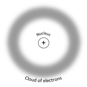
    Two issues: why the tiny range? And why does it apply to neutrons as well as protons? Let’s assume that protons and neutrons are made of something similar, and let’s call these constituent particles quarks. It turns out that protons and neutrons are made of 3 quarks each. And protons and neutrons differ by only one quark. The strong force is what holds the quarks together. Here’s a model of a proton:


    The strong force that exists outside the “boundary” of the proton is the residual strong force. This is what holds protons and neutrons together.

    At this point, I think there is no sense in complicating this picture. You could point out that there are different kinds of quarks, but I wouldn’t even take it that far. And I definitely wouldn’t mention specific force field particles, like gluons. This will just draw you into quantum physics, and really the point here is just to explain radioactivity.

    Exploring the atomic nucleus is tricky (and abstract) enough – too much information will muddy the waters. We’re just building on the concept of force fields (gravity, electricity, magnetism, and now strong nuclear). If you have students who wish to pursue this on their own, here is an excellent website called The Particle Adventure:
    http://www.particleadventure.org/

    Part 3

    So now we’re ready to talk about radioactivity as the result of the instability of large atomic nuclei, like those of uranium, or nuclei with too many neutrons. Basically there isn’t enough residual strong force out on the margins to hold these nuclei together.

    An unstable nucleus will:
    • spit out single neutrons (neutron emission)
    • spit out single protons (rare)
    • spit out a chunk of nucleus made of 2 protons and 2 neutrons (alpha emission)
    • during these processes, the nucleus might also emit very high energy EM radiation (gamma emission)

    All these emission products (particles, if you will) have a LOT of energy. If absorbed by other atoms, this energy can damage molecules and make atoms radioactive.

    At this point, we are welcome to explore further anything we wish about radioactivity, including health effects or nuclear fission/fusion, or mass/energy conversion, or commercial nuclear energy, or what fuels the Sun. We have to keep it short and simple, though, because we’re not quite done.

    Part 4

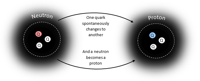
    An unstable nucleus will also spit out – an electron! This is beta emission, and it's really weird. Why is this weird and unexpected? Well, where did the electron come from? Protons and neutrons aren’t made out of electrons!

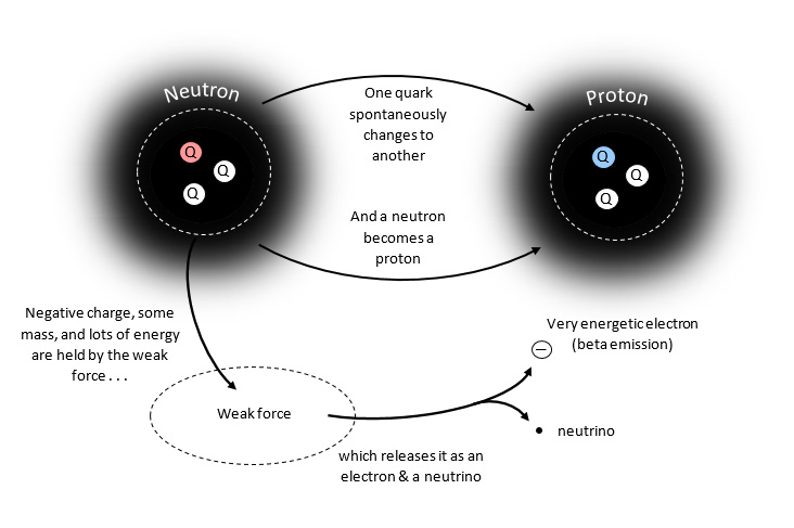
    So there must be another force, another nuclear force. This one is called the weak force. The weak force is odd, though, in that it does not cause anything to happen, it allows something to happen. Here’s the something:


    But there’s leftover negative charge and energy and mass. Where does it go? The weak force temporarily holds the charge, mass, and energy, and then releases it as an electron. So that’s where the beta emission comes from.

    A neutrino is also emitted, but I don’t know how much you want to get into neutrinos, other than to say that they are especially tiny sub-atomic particles with no charge. They are often the result of energy converting into mass.

    So here is what the full interaction looks like:


    Conclusion

    Ultimately all this is to say that there are only four fundamental forces in nature: gravity, electro-magnetism, and the two nuclear forces, strong and weak. And we might not ever have known about the nuclear forces if it hadn’t been for radioactivity.
  16. whcalhoun

    WWW Drive

    by
    All the files I have generated in the course of my Master's Degree program are located on Google Drive. Sometimes this is required because there will be collaborative writing or editing of documents, or because an instructor wishes to leave comments on...
  17. whcalhoun

    Reflection on INTE 6720 – Research in Learning Design & Technologies

    by
    I have known a number of people over the years who were working on their PhD research. But I’ve always been surprised by their inability, or perhaps disinclination, to explain what their thesis was about. Now I think I have a better feeling for what they were going through. I discovered from my literature review that research writing is a very odd bird indeed. What a strange way to write! It’s not at all what I’ve been led to believe in my ordinary college courses what writing a paper means. I would almost say that it is the hardest and most bizarre way to get your point across, but of course I now understand why research is written this way. And I came to actually like writing this way. Plus I can read a research article much more efficiently, now that I know what to expect.

    What I really liked was learning what it meant to have and support an argument. I loved this aspect of the textbook - The Craft of Research. I’m sure I’ll paw through this book for many years, sharpening my arguments.

    As part of a course I took last semester, I conducted a survey in my school using a team of volunteers. I designed the survey materials and protocols, then analyzed the two weeks of data and interpreted it using a published rubric. It was fun, but I have a much better sense now of how such a survey might fit into a bigger research project, and what it would take to write a proper paper to present the research.

    My brother is a newly-printed PhD, and when I showed him what I was doing in this course, he was impressed. “I wish I had a course like that before I started writing my thesis,” he said.

  18. whcalhoun

    Starting again with the balloon

    by
    This project actually started a year ago in another UCD ILT course. It was an experiment in using storytelling to teach a physics concept. I used Twine to build the non-linear story. I only got the story started - the assignment was meant to just intro...
  19. whcalhoun

    Gravity

    by
    This was the assignment for INTE 5680: Create a 30-second video that illustrates a concept using no spoken word. I'm a physics teacher, and always looking for ways to make invisible concepts more visible. So I chose the concept of gravity. Can you tell...
  20. whcalhoun

    A Day in the Life in the Future

    by
    The assignment: produce an Alternative Media Item using a new media tool. I chose ThingLink as my tool for this project. It's a tool for marking up images and video. I think I chose it because I had been thinking of using Zaption for my final project, ...
  21. whcalhoun

    Let’s Make a Rocket!

    by
    After all the reading for this unit, I wanted to create something that really took advantage of a smartphone's strengths while avoiding its weaknesses. Since I'm pretty handy with websites, I created a web app (essentially a single-page website).First ...
  22. whcalhoun

    Lily the Labrador

    by
    Here she is, Lily the Labrador. Is she really from Labrador? Is "labrador" really a word? Find out!So many new tools . . . The video was shot with a hand-held Samsung smartphone, the first time I've ever done that. And the additional audio was recorded...
  23. whcalhoun

    Why CARP?

    by
    Here at the ILT program at UC Denver there is an emphasis on effective design. There is a set of basic design principles taught in each class, summed up with the acronym CARP. It stands for Contrast, Alignment, Repetition, and Proximity. Go ahead and Google it – there are a zillion ways available to describe, explain, and illustrate these principles.

    But why CARP? CARP is certainly shorthand for something – the premise is that by following these principles, your design will be “correct” or “good” in some sense. There must be some fundamental mechanism at work, though, undergirding these principles.

    Consider any document that you design. What are you trying to do with it? You are trying to communicate, at least initially. Perhaps you are trying to sell something, or convince someone of something. In my case, I am always trying to teach something. I need to consider how a person learns and try to align my document with how learning works.

    Engagement


    There are two aspects of learning that I want to address here. One is the broad principle of engagement. Without engagement, your document is effectively ignored. Without the right kind of engagement, your document will be less effective as a teaching medium. Visual clutter and confusion, for instance, creates a kind of anxiety as the eye tries to figure out where to go. This is not conducive to learning. Nor are extraneous visual elements which can be entertaining or decorative but also distracting or confusing.

    Garr Reynolds presents the CARP principles in the first edition (2008) of his Presentation Zen (p. 153). I think it’s telling that he replaces CARP in his second edition (Presentation Zen Design, 2013) with principles related to beauty, balance, and harmony, states of mind conducive to learning (p. 221). Not coincidentally, these principles are applicable to digital modes of presentation, like video, audio, and synchronous eLearning, for which the CARP principles may not apply as readily.

    Coherence and Structure


    The second aspect of learning I want to address is an aspect that concerns me as a physics teacher. It is possible to teach physics as a collection of vaguely related topics and practices, but I prefer to teach physics by constantly referring back to the coherent series of basic concepts on which it is built. When I design a document for my students, I try to be careful about what my design implies. Is it implying a connection where there is none, or is it implying levels of organization that do not, in fact, exist? Or does the design reflect the coherence and structure in physics that I hope my students can sense?

    Microsoft’s PowerPoint is a common document format, a tool that seems to result in notoriously incoherent design. A classic critique of PowerPoint design is Edward Tufte’s essay, The Cognitive Style of PowerPoint (2006). Tufte explains in detail the kind of structural incoherence that can come about when a designer does not pay attention to structural levels of information.

    A designer needs to know that all graphic elements carry information, not just in the literal sense (these letters form a sentence which can be understood) but in a structural sense. When a font changes color, for instance, the brain is alerted to the possibility of a new level of information for the literal text. Consider, for instance, what happens when text in a blog post changes color to indicate that the text is a hyperlink. Or consider, as Tufte does, what it means to create bullet points. Bullets are not just a graphical device for separating text. Bullets are like the headings in an outline. They indicate levels of organization arranged coherently according to some principle or concept. Hinting at organization when in fact what you are presenting is arbitrarily arranged causes confusion. It does not create a frame of mind conducive to learning.

    It can take a lifetime to discover and absorb the principles of how a person learns from a document, and how that learning can be augmented or interfered with by the graphic design. With the easily remembered principles of CARP, a designer at least stands a chance of producing attractive and effective presentations without having to become a metaphysician of design, communication, and learning.

    References


    Reynolds, G. (2014). Presentation zen design: Simple design principles and techniques to enhance your presentations (2nd ed.). Berkeley, CA: New Riders.

    Tufte, E. R. (2006). The cognitive style of PowerPoint: Pitching out corrupts within (2nd ed.). Cheshire, CT: Graphics.

ds106 in[SPIRE]