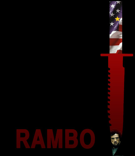
This is an early iteration of a Rambo poster I’m working on. It was harder than I thought to find an iconic silhouette to represent a movie (at least a movie that I liked).
Things I like-
- the knife- iconic enough to represent the movie (although it needs some polishing)
- the idea of the Vietnam and American flag blending to parallel the forces in the plot
- Rambo as blood on the tip of the knife. Where I doing this project in an English course, I could go into much more detail about how my choices reflect the movie.
Things that need work-
- I think it’s too complex still. Rambo may need to be black and white.
- I don’t like the font. I may write First Blood instead (also leads to a First Blood/Vampire movie mashup possibility down the road)
- The dimensions are all wrong.
I’m putting the not quite right stuff out there so anyone who might be interested can see the process and the thoughts going on. I think that’s good. I also don’t want people worrying about only posting perfection. This course ought to be fun and should allow people to brainstorm on ways to improve product together and continuously.


Add a comment