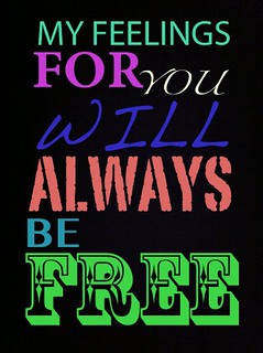
I don’t know if I did this assignment the correct way, but I think this turned out pretty cool looking. Typography is a branch of design that I haven’t really explored before until this week. It is pretty interesting, and there is actually a whole science behind what fonts, styles, etc. marketers use in advertising. Crazy.
I don’t listen to Avicii, but this song is good and I was listening to my grooveshark, and that song popped up randomly. So, I chose to use those lyrics. To achieve this look, I took a picture of blackness on my iPhone, and emailed it to myself. And then used the different fonts & colors in Picasa to write out the lyrics with. It looks pretty chic (and maybe a bit “high school”) but I dig it. Looking at it now, I don’t like the spacing of the words as much as I thought I did, but it’s probably as good as it’s going to get. Pretty simple. Worth 2 stars.


Add a comment