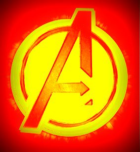
This assignment called for me to design a minimalist poster of a movie. I was watching Avengers at the time (well, had it playing in the background) and thought it would be perfect for a poster. I took the “A” symbol that you see at the end of the movie on Stark towers, which they had on Google images, and added the “duo tone” effect in Picasa to change the colors. I made it red and yellow since that seemed fitting–it is the colors of Iron Man. I really like the look of this–it’s definitely a poster that I would hang in my own room, if I were a bigger fan of Avengers–not that it isn’t awesome, I’m just extremely selective about posters that I hang on my wall as I have very limited wall space.


Add a comment