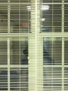
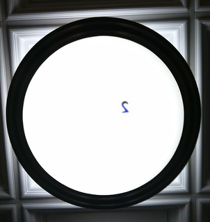
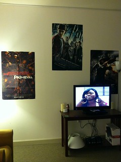
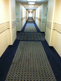
This week in DS106 in all about Design! One of our first assignments this week was too spend some time updating our knowledge on design concepts and then applying 4 out of the 10 major design elements into four photos. For my four photos I choose to to rhythm, proportion, dominance, and unity. Here are my four photos:
Rhythm:
Proportion:
Dominance:
Unity:
I took all of these photos on my Iphone and edited them on it as well. Then I used my Flickr app to upload them onto my Flickr page.
I believe that all of my photos are effective except for the dominance one. I feel as though the lighting and having more objects in the picture makes it a bit distracting from the concept that I was trying to create. If I had just focused on the main objects (as I did in my proportion picture, which I feel is my best picture) I think that my idea would have come across a lot clearer. I also wish that the I could have gotten a better shot of the continuance for the unity picture (but I can’t control the way the hall is built).


Add a comment