Design Safari
This week in DS106, we got into the principles of design, and even designed things ourselves. Our first assignment was to take pictures of things or scenarios demonstrating the basic principles (color, typography, metaphors/symbols, form/function/message, minimalism & use of space, balance, rhythm, proportion, dominance, unity). Instead of taking new photos, I went back through the plethora of photos that I possess and determined what pictures I had taken over the previous year illustrated the elements of design. I did this because last fall I took the course principles of design (taught by the art department) and I wanted to see if I had been using my previous knowledge in taking photos. And I have. WOO!
Daily Creativity Dosage
1.
- This is a photo I took over the summer that I used for the design blitz also. My mom grew these tomatoes in her garden. So big, and so delicious. So, naturally, I took a picture of them. I thought they were fitting for the World Vegetarian Day daily create project too. Shows the deliciousness of a tomato, and is a pretty picture.
2.
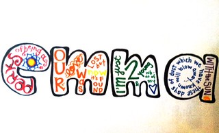
- This is what my own personal font would look like. If you look closely, you can see there are words inside of each letter. I used song lyrics and/or movie titles to try to describe myself to others.
3.
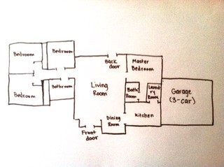
- This is the house I spent 9 of my 21 years of life–in Nevada. I can remember it from memory because I lived there for so long. It was a wonderful house, and after I moved out, my friend who had just moved back from Honduras ended up moving into it! So, whenever I go visit her I get to stay in my old house again.
4.
- The final daily create that I did was a picture encompassing nothing, a void, absence. I took a picture of an empty cereal bowl after I had eaten it. It represents nothing because there is nothing in the bowl.
Radio Show Janx
For the radio show, we are doing a soundscape of Autumn, I am going to do an amalgamation of audio assignments relating to autumn. Different assignments that I was thinking were: An Over-Dramatic Reading of a fall poem, Teenage Angst of a diary entry that I wrote during this time of the year, a commercial, and a bumper. If these things don’t sum up to 5 minutes, then, I will probably throw in another assignment, likewise, if these end up being more than 5 minutes, I will edit it down. Needless to say, I am excited to get this underway!
16 Stars Worth of Design Assignments
I was an over-achiever this week, and did 1 extra star worth of design assignments. I talk about the process of creating all of them in their individual blog posts, and also, why I chose to do what I did. I like the outcome of each of them (except maybe the Cartoon Head one). Here they are: Minimalist Movie Poster, A Place I’ve Never Been, Cartoon You, The Truth About a Movie Poster, Bad Guy Calling Card, and Typographic Poster.
Check them out, as always, love me some constructive criticism.


Add a comment