Phew, what a week. I can’t believe I made it out alive. This was a trying week because design isn’t something I am too familiar with. It was great to learn about all the aspects that go into designing something that is able to convey a story or experience with the audience.
As usual we had to do a slew of daily creates. My blog post about those can be found here: http://blog.corrigancompositions.com/week-6-daily-creates/
The tough assignment this week was completing a design safari. Basically it taught us the necessary vocabulary and skills that go along with visual design. I learned tons this week about so many aspects of design. By the end of the week I saw a different side to almost everything I passed. Seeing the different designs in each and every direction and focal point was a great experience. Here is the link to my blog post about the safari:
http://blog.corrigancompositions.com/a-design-safari/
We also had to choose 15 stars worth of difficulty from the assignment bank this week. I think I am one star short but I got to complete the assignments that I was really excited about (with one exception).
One mandatory visual design assignment was the creation of a DS106 Radio logo. For this design I started thinking about radio and all of the things I associate with audio experiences. The colors I chose are also meant to contrast sharply. Check it out!

Another assignment I completed was the re-imaging of a modern movie with classic actors instead of the current ones. I love old monster movies so I knew exactly what to do:

This is a movie poster for Twilight with Bela Lugosi, Tippi Hedren, and Lon Chaney replacing their modern counterparts. I wanted to go with black and white because it represents old movies– especially old monster movies.
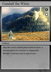
Another assignment I chose from the visual design bank was creating a trading card based on one of your favorite movie scenes.

I love how this turned out. Anything LoTR related is fantastic to me though. The text at the bottom might look a little sloppy and misplaced but I wanted to keep a genuine feel to the card. This design is meant to mimic popular trading card games where you have to put down certain cards based on their use and their values. In the top right I designated the card to be a 1 and I also put a shield up there to denote the use of the card.
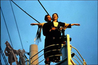
One of my favorites this week was to photoshop an unlikely person into a familiar scene.

I started thinking about the most iconic scenes in cinema and decided to totally ruin it with this quick photoshop. I slipped Captain Jack Sparrow into the scene by putting him in a familiar position on the ship.
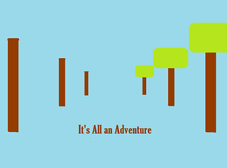
My favorite assignment of the week was to design a slogan or a life philosophy using minimalist techniques.

During the more difficult or monotonous moments in life, I always try to remind myself that everything is an adventure. By simply changing your perspective about a difficult situation, you can easily find yourself on the other side. This design is supposed to represent a changed perspective. On the left are simple telephone poles and on the right you have tall trees– both lead you down a path. I thought a lot about this assignment and I spent more time on it than I would like to admit but I absolutely love the end result.
For my part in the radio show that is due in a couple of weeks, I will be interviewing a few people about their autumn/halloween experiences. After I do these interviews I will meet with my group tocompile the interviews and also share my thoughts about autumn and the experience of the interviews.
I am sort of relieved that this week is coming to an end. I learned so much about design but I also put a lot of effort and thought into the assignments. For some of the assignments I feel like I may have put too much thought into them when they could have benefited from simpler ideas. I continue to value the evolving nature of the course in which I use learned techniques to drive new learning each week. In the coming weeks I anticipate assignments that will require some knowledge and application of design principles. Bring it on!


Add a comment