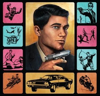
In order to help recruit a new trainer for ISIS (and the on-going space mission), I have created a series of design media.
1. Propaganda Poster
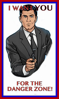
This poster corresponds with the Propaganda Poster Assignment in the design assignment repository. I created it by taking a screenshot of this picture of Archer. In Photoshop, I carefully edited out everything around him, and left only his upper body. From there, I saved the picture and opened it up in the ever-so-handy Picasa. I used this WWI poster as inspiration, and added the typography to the poster, and threw on a ‘museum matte’ boarder using red and blue to give it the patriotic touch that it needed. This poster also poses as something a little less with the color theme that you will see in the next two posters.
2. Minimalist Poster
Corresponding to the Minimalist Poster Assignment in the design assignment repository is my minimalist poster for this glorious tv show. To achieve said poster, I took the “a” from the title of the show–literally cropped straight from this picture, or a bigger version of it–and edited it in Picasa. This time, I used two features in Picasa, the ‘museum matte’ and the regular old ‘boarder’ feature. I stuck with the original color scheme, because it suits the show, and makes it more recognizable for the audience–if they have seen the show at all.
3. A “How To Archer” App
This is the icon for an app that teaches the Archer fanatic How To Archer. It corresponds with the Create Your Own Smartphone App assignment in the repository. I also got the idea from a book that was actually written for the show called How To Archer, written by Sterling Archer himself. I even used part of the original book cover in my icon, so that the targeted audience can relate back to it. Perhaps it will become the logo for the show one day–this or the minimalist poster would be cool.
This series of design assignments sets me at an initial 8 stars. More to come soon. We are on the brink of recruitment!


Add a comment