For my minimalist movie poster I choose the 1967 Godard film, Week-end. It’s one of my favorite films and one of the first that came to my mind when I thought of iconic/rememberable scenes.
Near the beginning of the film there is a lengthy single take of the protagonists (sort of) driving through a traffic jam in the countryside. The scene is extremely long, almost tortuous. Here is the link to the scene.
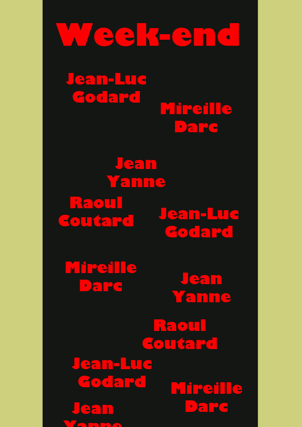
At first I tried to present this scene vertically, like a traditional movie poster would. I choose to have the credit texts (correct term?) in a jumbled, disordered, and repetitious manner, echoing the way the cars in the scene are arranged. I did not like this initial attempt though. Not only was it not that minimalistic, but I didn’t think the vertical represented scene. I was also not too happy with the color.
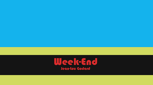
So I redid it in a horizontal. In this new version I changed the color scheme and also tried to keep it more simple. I think it was worthwhile to try a new approach; the second one is superior, I believe.
Here is the original, vertical version (the text is intentionally cutoff, btw).
And here is the second, horizontal version.


Add a comment