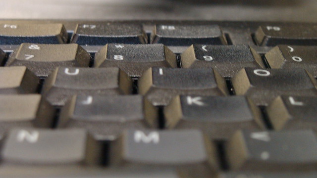
 This photo I took of the keyboard in the CPSC lab (which I spent copious hours in the past 5 weeks). Proportion is key to this photo. It gives the viewer a much different image of a keyboard than is usually seen. By bringing the camera close to the keyboard, I am able to highlight the depth of the buttons, as well as the grainy surface. The lens is so close to the keyboard that bottom 1/3 of the photo is blurry, enhancing the rest of the vivid keys toward the top.

This picture I took last summer while in Egypt is of my uncle and I. It is one of my favorites, and not only because of the memory it holds. For one the imbalance in this photo gives it so much character. Anyone looking at it can’t help but tilt there head a bit. This gives it such a carefree and exciting feel, very informal of a picture. All the colors seem so vivid too, from the tent cloth pattern, my trunks, our skintones (this photo was not edited in any way).

This was something I never noticed until I was walking around the house with my camera looking for things I never noticed before (funny when you read it out loud). This cable is being used to tie a tiki torch to the corner of my balcony rail. Not really what it was intended for I’m pretty sure, but it still can be used as rope. This picture displays its ‘rope form‘ and how well it serves its new function.

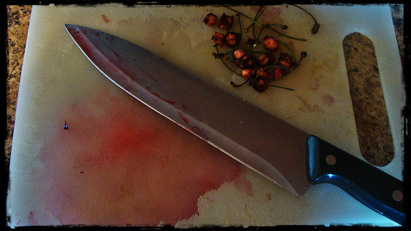
I took this photo after cutting up some cherries for my cereal at breakfast (I know the knife is huge, it was the first one I found so I used it!). The display of color here really make this picture unique. The dominance of the color red, the knife, and pool of blood cherry juice completely dominate the picture. If the stems and seeds weren’t in the picture I would assume this was something out of a scary movie! For such a tasty and wonderful fruit, the picture looks morbid and violent to say the least.
These are 5 elements of design I decided to highlight in my Design Safari!


Add a comment