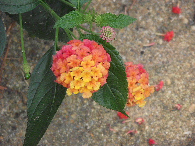
Color:
Lantana is one of my favorite plants because of the vivid colors. Your eye is immediately drawn to the colors of it, whether you want it to be or not. While orange, pink, and reds sometimes don’t go together, here they are complimentary and unite in beauty.
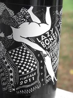
Typography:
I love wine labels simply because the graphics and design on them. I found this at Trader Joe’s and bought it because of the label. There’s something majestic in the Composition, but the typography is also interesting. It’s as though the designer tried to meld typography with the drawn element, which is fascinating. It took me about 3 times of looking at it to notice all of the written elements.
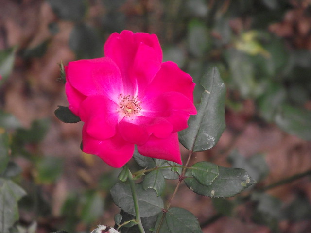
Balance:
My mom has way too many flower gardens. That said, there’s something balanced about flowers. They are pretty symmetrical, and after looking at them a while, you can feel a sense of calm. I love the brilliant pink that this knockout rose happens to be. Nature has so many examples of balance after thinking it over, too.
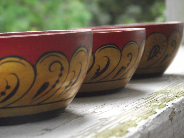
Rhythm:
These are Asian bowls that were my grandfathers. While the design slightly differs on each (handpainted?), the rhythm is remarkable. I laid them all next to each other to take the picture. I like the final product because there is a pattern. (I also used angles. Photoblitz flashback?)
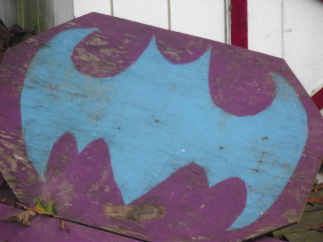
Proportion:
This image is of a batman backboard that my sister developed for hitting field hockey balls into. The symmetry is pretty remarkable considering the freehand design. To me, symmetry implies proportion, so I like this image.


Add a comment