
This week our main assignment was the Design Safari! We were asked to take photos of anything that demonstrated one of the design concepts. (color, typography, metaphors/symbols, balance, unity, etc.) I decided to take photos of shop signs downtown and apply the design concepts to them.
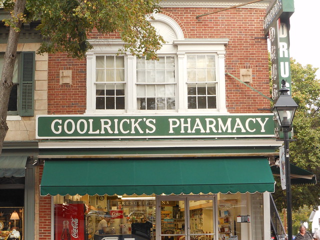
The sign for Goolrick’s Pharmacy is extremely simple. It definitely demonstrates minimalism! Even though from a design perspective it is not at all creative, it really like it. The simplicity of it gives it a vintage feel in my opinion. This vintage-like appearance really works in the location of the pharmacy Downtown Fredericksburg) So maybe not so great designs can work out if located in the right place?
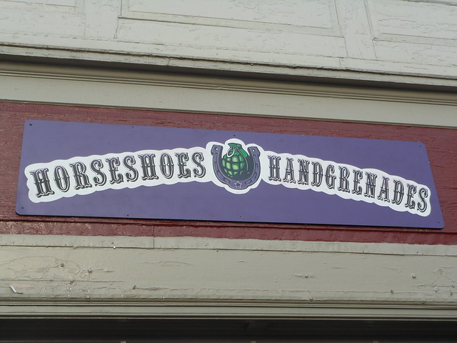
I love the use of COLOR in the sign for Horseshoes and Handgrenades.The sign for this vintage boutique really pops out at you because of the color use. There aren’t a lot of color popping signs downtown. Also, the horseshoe and the hand-grenade in the middle display unity, I love the way they come together! In addition, I noticed this showed balance. It is very symmetrical, even the two words are similar! Love this sign!
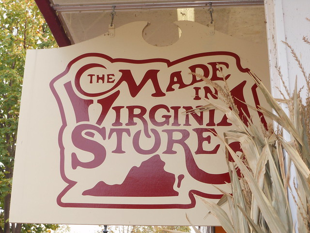
The Made In Virginia Store sign demonstrates typography and unity (or unified typography, if you will). I love the design of this sign because of the way the font of the words is all connected and intertwined. This is definitely a logo customers can recognize right off! It is as if all of the elements are working together to create a truly unique design!
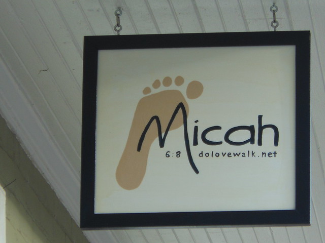
The sign for Micah Ministries displays symbolism and minimalism. The Micah motto is “walk humbly with God,” the foot symbolizes walking and the first steps you must take to get back on your feet. And it displays minimalism because the design is obviously very simplistic, but it still looks great and catches your eye when you walk by. It uses a minimal amount of space to get the message across.
This assignment really made me think about design and what makes a design good! I loved tearing apart the different aspects of design and seeing what works and what doesn’t. I never realized how much thought must go into designing before this week or how many concepts really apply to design.

Add a comment