
Design Safari
This week our main assignment was the Design Safari! We were asked to take photos of anything that demonstrated one of the design concepts. (color, typography, metaphors/symbols, balance, unity, etc.) I decided to take photos of shop signs downtown and apply the design concepts to them.

The sign for Goolrick’s Pharmacy is extremely simple. It definitely demonstrates minimalism! Even though from a design perspective it is not at all creative, it really like it. The simplicity of it gives it a vintage feel in my opinion. This vintage-like appearance really works in the location of the pharmacy Downtown Fredericksburg) So maybe not so great designs can work out if located in the right place?

I love the use of COLOR in the sign for Horseshoes and Handgrenades.The sign for this vintage boutique really pops out at you because of the color use. There aren’t a lot of color popping signs downtown. Also, the horseshoe and the hand-grenade in the middle display unity, I love the way they come together! In addition, I noticed this showed balance. It is very symmetrical, even the two words are similar! Love this sign!

The Made In Virginia Store sign demonstrates typography and unity (or unified typography, if you will). I love the design of this sign because of the way the font of the words is all connected and intertwined. This is definitely a logo customers can recognize right off! It is as if all of the elements are working together to create a truly unique design!

The sign for Micah Ministries displays symbolism and minimalism. The Micah motto is “walk humbly with God,” the foot symbolizes walking and the first steps you must take to get back on your feet. And it displays minimalism because the design is obviously very simplistic, but it still looks great and catches your eye when you walk by. It uses a minimal amount of space to get the message across.
This assignment really made me think about design and what makes a design good! I loved tearing apart the different aspects of design and seeing what works and what doesn’t. I really like applying it to shop signs to see what draws customers in and what drives them away. I never realized how much thought must go into designing before this week or how many concepts really apply to design.
Daily Creates
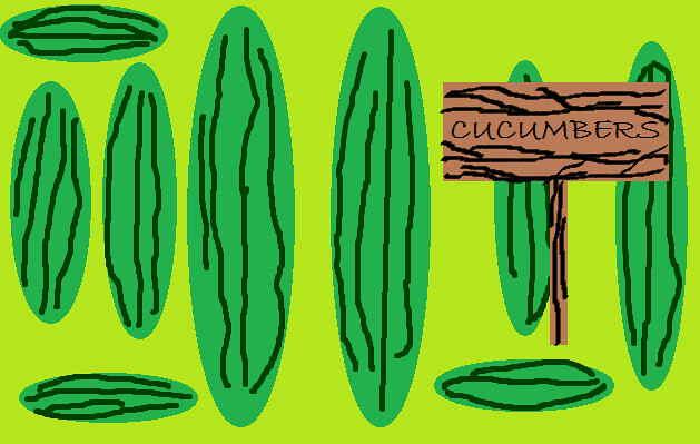
Monday was World Vegetarian Day! The daily create was to create a photo celebrating this holiday. I drew a picture of a bunch of cucumbers! They are my favorite summertime snack, they are so refreshing. We have a huge garden that loves to overproduce cucumbers.
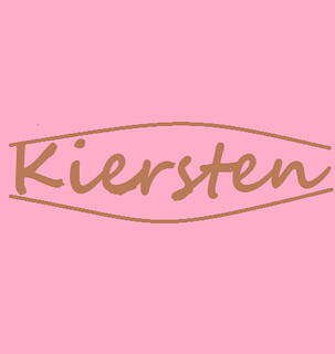
Tuesday’s daily create asked us to create our own personal font and write out name using it! I tried to create a logo with my name. I like the colors and the fact that it is very simple.
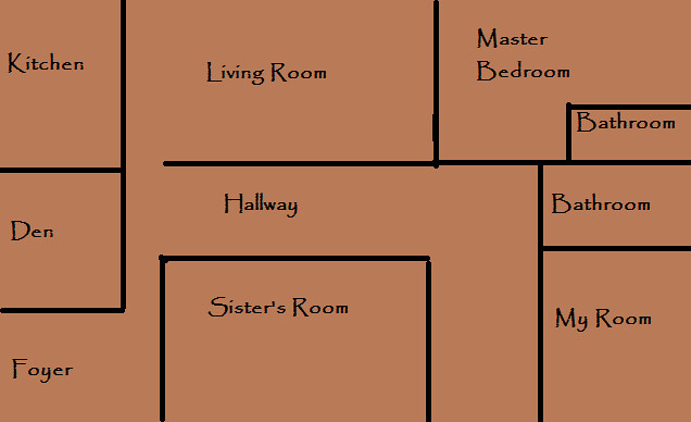
Thursday’s daily create was to draw the floor plan of the house you grew up in. This house is in the Hidenwood area of Newport News, Virginia. I lived in this house until I was 8 years old. I loved it! It was my parent’s first house so it was small and cozy. This house was also older, I feel like that made it feel more homey.
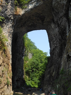
Sunday’s daily create to take a photo of a void or absence. I took this picture of Natural Bridge. I have always been intrigued by this tourist attraction because it truly is a wonderful work done by mother nature. It is a void (hole/absence) in the mountain!
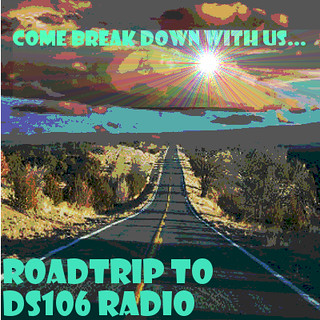
Road trippin’ Radio
Our radio show will have a road-trip theme! We will be playing a family (Dad, mom, and 3 daughters) who breakdown in the middle of nowhere.
I will be the control freak mother who plans out every aspect of the family’s trip. I will plan all the places we will go, everything we will eat, the songs we will listen to, etc. I really just want my whole family to be happy, have fun, and get closer. While I am busy controlling every aspect of my families trip, I don’t realize that I am the only one enjoying it. Everyone else would rather be doing something different. No one likes a control freak!
In the end I realize I am doing more harm than good and try to change my ways.
15 STAR OF DESIGN!
This week we were required to do Design Assignment 50 worth 2 stars, we were suppose to come up with a bumper sticker, poster, or t-shirt to advertise our shows! This must be theme specific. I decided to create a poster!
We decided on a road-trip theme! Once you listen to our show other details in this poster will make a lot of sense, I just don’t want to give to much away before you listen to us!
For more details, view my full post!
Next I completed 4 star design assignment 448, “Movie Trading Cards.” This assignment was to create a trading card for our favorite movie! I chose Bridesmaids, shocker I know. I used PicMonkey to create my trading card. I added a cute border and a few text bubbles/rectangles to make it resemble a trading card. I chose the scene where they all get food poisoning and Lillian goes outside to find a bathroom. View my full post!

Then I created 3 star design assignment 57, “Minimalist Travel Posters Based in Movies.” The instructions were “Create a minimalistic travel poster for a location in film, TV series, etc.” I decided to create one for the North Pole. I love watching Christmas movies in the winter! Elf was my inspiration! View my full post!

Next I completed “The Big Hip Hop,” this is Design Assignment 12 worth 2 stars. These are the instructions: “Take any photo from The Big Picture and overlay it with lyrics from a Top 100 song. Similar to The Big Caption project. “
I chose this photo of South Korea getting hit by a typhoon because as soon as I saw it I thought of the song “Storm Warning” by Hunter Hayes. I used paint to create this. (For more details, view my full post!)

Next is 3 star design assignment 367, “DS106 Propaganda Posters.” The instructions were “Create a propaganda poster for ds106. Use your photo editing software of choice and write a message to inspire your fellow ds106ers.” I edited a Rosie the Riveter poster! View my full post!

And finally, I completed design assignment 677 for 1 star, it is called “make a normal photo of a friend imagery of Horror.” The summary/instructions for this assignment were: “This assignment is easy and fun to do, there are many online programs that will help one to do this such as http://www.photofunia.com/. Make your friends look like victims in a horror movie.”
In honor of it being my little sister’s birthday, I turned her into a horror movie victim! Happy birthday to her, right? This was super easy, I used the zombie effect in Photofunia to create this image, it basically applies the effect for you! (Full post)

Mission Fail!
I completed this assignment wrong so I did not included it in the 15 stars. I am sharing it here because I think it is adorable! And It was my favorite this week.
This assignment is called “Where I come from.” It is design assignment 375. The instructions were “Design an animated poster for your hometown. Make sure to include the text for the name and state of your hometown.” (Mine isn’t animated, WHOOPS!)
Still cute though! (View full post!)

WEEK SIX:
Ahh. Week six was fun (but not as fun as week 5). The design assignments were no where near as fun as the visual assignments in my opinion (which is super weird.) I am not as happy with the outcome of my work this week, maybe last week just really set my standards high!
Reading the design elements was really cool and pretty helpful with my work this week. I think I focused mainly on typography and color in my work. I struggled with minimalism, I kept wanting to add more detail! I had so much fun on my downtown safari! The shop owners probably thought I was psycho.
I hate that my hometown poster was suppose to be a GIF. It is my favorite, and I really like the write up for it!
Also, our radio show planning really came together this week! I am started to really become excited about the whole thing. I can’t wait to portray a control freak mama!

Add a comment