(we’re going on a bear hunt) ![]()
This week, to introduce us to various design elements, ds106 students were sent on a Design Safari! We were given lots of examples and definitions of various design elements, and then told to keep a look out for these elements in action throughout the week.
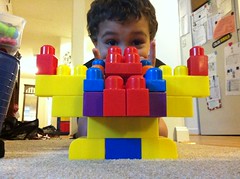
The very first one I noticed – the Balance principle of symmetry, was bound to be easy for me. OCD is nearly endemic in my family, and my poor son is no exception.
Just come near this child’s pile of blocks while he is building, and see how he reacts when you come close to one of his duplicate blocks. I can promise you, it won’t be pretty.
After this, I began to notice the principles of design all over the place. In particular, began to notice quite a bit of awesome in a familiar, old children’s story, The Story of Babar.
I realized that the illustrator of this book employed many, if not all of the elements listed within its pages. So, I snapped a few shots while I was thinking about it. Here’s a few of the elements I found there.
Continuance (a form of Unity)
This element of design draws you through or into the photo and directs your focus to a specific focal point. In this part of the book, Babar is leaving his old friend behind in the city, and we get to see her watching him disappear on down the road. It struck me as a significant moment in the book.
Dominance
In this photo, Babar is celebrating his marriage, and his coronation as King of the Elephants. Obviously, he and his new bride should be the focal point of this figure. There is, however, so much more to portray than just their own placement into power. Secondary to the new royal couple is the entirety of the wedding party celebrating and dancing all around the happy couple. Subordinate in the illustration is the landscape in the background, including the trees and mountains. (this may be my favorite kind of design element, for the record)
Minimalism (or positive and negative space)
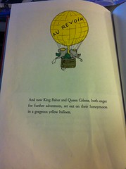
I loved how the book closed, after all of the beautiful illustrations throughout, it chose to go simple and minimal for the final page. All that matters here, is that the happy couple was going off on an adventure. So that’s all they showed. And the rest of the page is completely blank. Smart, effective, clean, and appealing. ![]()
I’ve definitely had more of an eye out for these concepts in action since reading about the concepts of visual design.


Add a comment