
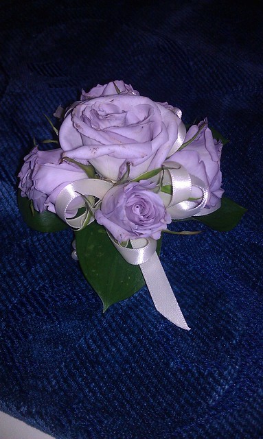
Balance is something that comes in two forms like symmetrical and asymmetrical. I went with this notion I think that I wanted a picture that is really symmetrical but when I thought about it I did not want a too symmetrical. Therefore I chose a picture that had a lot of symmetrical points but then again the longer someone looks at it there is more asymmetrical. I like the color balance in the picture I think this is a good picture for balance.
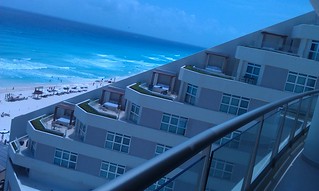
Minimalism and the use of space in this picture shows how architecture and art place the same kind of roles. This building made a big design choose when they scattered the roof and put beds on them. This small change made a big difference.
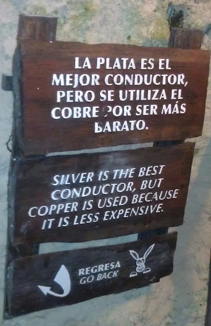
When I first heard of typography to me is just words on something. But then when I heard about it I learned that it is how the words are put on the things and how the fonts were spaced. So I chose a sign that was on wood which gave the font some texture. I like how the words are in two different languages I think it brings a different element to it.
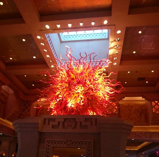
Color is important to any photograph in my opinion but going further than just what kind of colors. I think in this picture has different shades from different colors. This picture has different depths of colors and they give it a nice warmth to it. Even with the skylight above it, with the blue that is shining through it does not matter.

Add a comment