
Design is everywhere. Just like audio, and visual except design is up to each person to decide where it comes from. However, rather than to let us go off on our own tangents about what we think design is, we learned a couple of essential design vocabulary so I didn’t have to run around like a chicken with its head chopped off! Out of all of them, I choose the ones that I could find most prevalent in my day to day life.
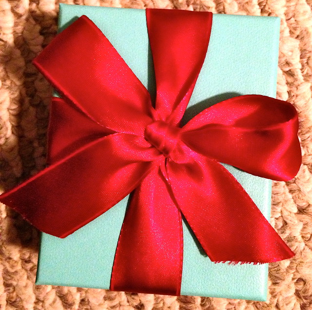
Color — it’s everywhere and in everything. Regardless if you dress yourself in all black, you cannot go a day in the world without being exposed to a significant amount of color. Which is why I choose this present that I got last week. When I think of color, I think beyond just something that pops but the contrast in it and how that makes it even more unique. That’s where this present comes in, the Tiffany blue is perfectly in contrast with the bright ribbon, which stands out even and the color pops even more so. It was the perfect example to imagine color.
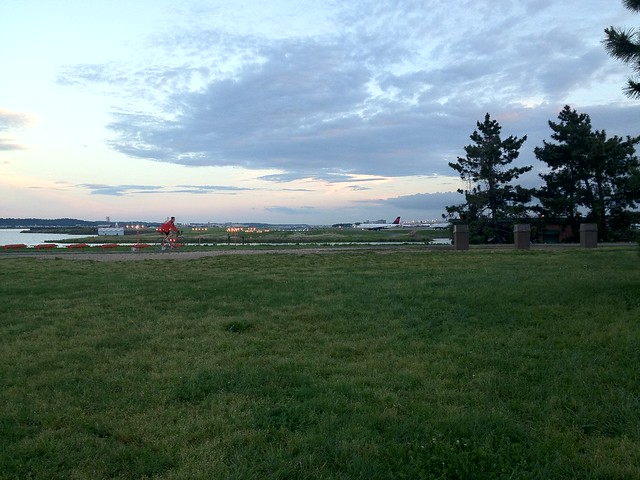
For those of you who have never been to an airplane park, I suggest you do so on the next beautiful day. That is how I got this image, at a park this pass week in my hometown. It was exactly what I wanted for balance, especially since there was an even balance between the grass, open fields and even the sprinkle of trees that are off to the side. It showed an excellent amount of balance especially since it was able to add a little bit of everything in order to not overwhelm the image with a center.
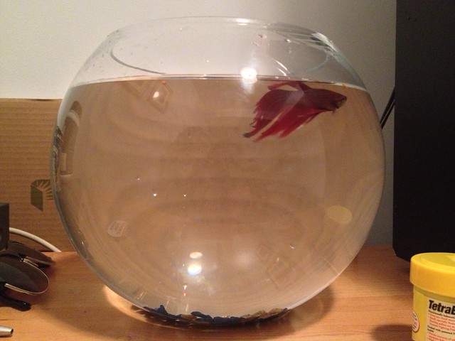
Little fish, big bowl, what better way to show proportions than to show the opposite? My fish, Charlie, hates it being in his big bowl, which is weird considering most would enjoy the extra space. The bowl itself also had a significant role in showing the proportions, because since it’s so round, you’re able to see more into the depth of it and Charlie appears to be even smaller. Proportions also has to do with embellishing things, to a certain degree. Dimensions play a pretty big role with proportions too, especially since the bowl gives so much depth to the image.
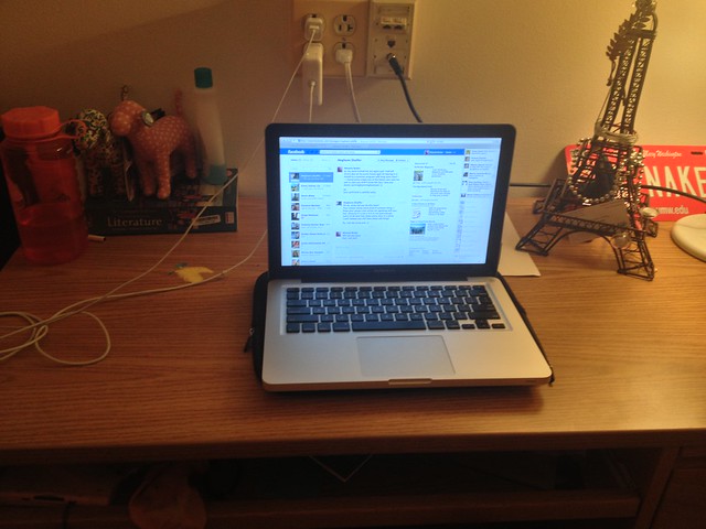
I attempted to understand the minimalist perspective but as I sneak peek’s at other posts, I see I might be error’d in my ideas. Well, oh well, you live to learn, right? I’ll tell you what I thought in the hopes I’m not totally wrong. I took the minimalist theory as taking different small things (i.e., lamp, laptop, etc.) and putting them on one common space (desk) to give the contrast of size, which is why I used the three to really emphasize size among them.

Add a comment