
Design is my second favorite part of ds106, right behind photography so I was excited when I realized that this was Design Week in ds106. I spent more time on design assignments than I thought that I would, but it was worth it.
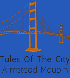
I started off the week by downloading GIMP after struggling to open some files in Photoshop, and used it on the six assignments from the assignment bank that I did this week. I did the three star One Story, Four Icons assignment for Priscilla Queen Of The Desert, Taking Woodstock and Les Miserables but no one attempted to guess them. I also did the three star Minimalist Travel Poster, the three star Minimalist TV/Movie Poster, the two star Bagman Campaign Poster, the four star Movie Trading Card and the three star Minimalist Book Cover assignment, which I created.
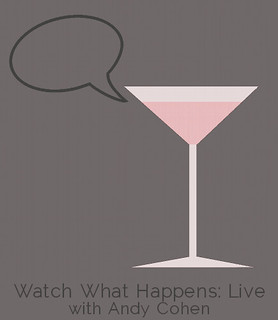
In all, I ended up doing 16 stars worth of assignments this week. Most of my work was with minimalism and it was a good mix of working with photography and straight up graphics. I was surprised at how easy the Movie Trading Card was to do. Once I was able to make my own template from a preexisting trading card that I found, I was able to just plop a picture in there and add a quote. I was also reminded of how important color was this week when I consciously made the decision to make the drink in the martini glass for my Minimalist TV/Movie Poster to emphasize that the show is a little flamboyant and by using the pink, I made it look more like a girly cosmo and less like a martini.
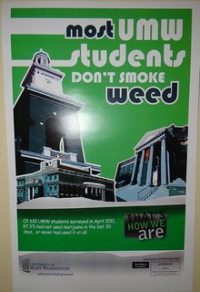
I also did the Design Safari, focusing on posters that were hanging up in my dorm. I’ve always hated the That’s How We Are campaign on campus, and while I was working on the Design Safari, I finally figured out why. The posters emphasize things that they shouldn’t, for example, their poster on marijuana usage emphasizes ‘most’ and ‘weed’ and makes it look like ‘most students smoke weed’ when that really is not the case. I also did three daily creates this week, two of which were design based.
I got only two comments total from other students this week. This may be because commenting was not required but I wish it was since I have been commenting on other’s blogs and really enjoy getting feedback on my work and I just haven’t been.

I designed this logo for Digital Dynamite, my radio show team by modifying preexisting ASCII artwork, but my group was rather confused by it and because not all of my groupmates have submitted a logo, we have yet to decide on one, which we will hopefully be doing tonight. A writeup of our progress can be found here. We have been using twitter, canvas and a google doc to varying degrees of success to communicate. We are planning on doing a series of stories about how we each did something ‘dynamite.’

Add a comment