
I liked #tdc1880 as a design assignment, so I’m going to treat it as one. I did it as a TDC already, but my effort was pretty lame. I originally wanted to do something with the picture of the mandrill (#7) because the shape and symmetry of the image looked like an album cover. I didn’t have a good idea for it though. I thought about playing off of 70s funk band Mandrill, but that seemed too obvious. I liked the red nose though, so I figured I’d highlight it, kinda like the Splash the Color assignment. I used the Select->Color Range function in Photoshop to select the red and copy it to a new layer. I adjusted the Fuzziness so that it was getting mostly just the nose and brow.
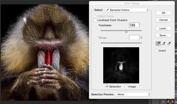
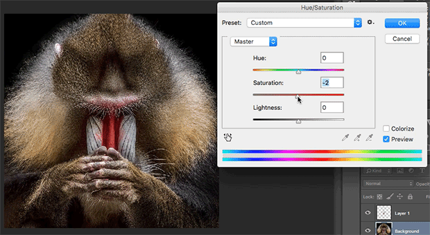
Then I went to the background layer and used the Image->Adjustments->Hue/Saturation function to desaturate (make grayscale) the rest of the image. I liked the way that came out. Manually selecting around the red of the nose would have been tedious, and the result would have been less smooth. I never would have been able to isolate the red in the brow otherwise.
Manipulating the image like that and highlighting the red nose gave me an idea – Rudolph the Red-Nosed Mandrill. I felt like it should have a techno vibe, although I’m not sure why. I looked for a typeface to reflect this and found OmegaForce by Iconian Fonts. I liked that it had upper and lower case, sort of, and thought I could make use of the various decorative variations.
I haven’t seen the Rudolph Christmas show since I don’t remember when, but I occasionally watch Raging Rudolph (YT) and The Reinfather (YT) around Christmastime, so I get them mixed up. I titled it Player Gonna Play to take the reindeer game aspect into gangster territory. I centered all the type to go with the symmetry in the image. I put the type in white to go with the grayscale image, and added a drop shadow that picks up the red from the nose. I reversed that formula for the title of the album.

Back when LPs and CDs were a thing, they would sometimes have stickers on them promoting the hit song. So I added one, playing off the Reinfather theme. It weakens the design, yet at the same time feels a little more authentic to me, reflecting the way commerce tends to ruin art.
I like the way it came out. The colors and the layout give it a sense of unity, and the italic type gives a slight sense of motion. And as I was working on it, I found a five hour and seventeen minute Best of Mandrill video on Youtube. There goes the rest of my day.

Add a comment