This was to do 10 stars worth of content from the Visual page.
The assignments that I completed are:
Wiggle Stereoscopy 3-star
Thought/Issues etc: As you can see the image moves at about a billion FPS. If the image was more precise on the point of rotation (or if it moved how I set it up) then it wouldn’t be so disorienting and uncomfortable to look at. 3-4 things occurred with this assignment. I created it in gimp (as with all of the other pieces for the overall). I initially created a .gif that was a picture of the 4-seasons and had it rotate between each every 1/2 – 1/4 second, (made multiple versions) before I posted, I decided to look and see if I had the rights to do so. Well, as you would have guessed seeing that the image is not up, that I do not have the rights to post a modification of it.
http://fc09.deviantart.net/fs70/i/2011/287/e/a/4_seasons_wallpaper_v2_by_dawn42-d4csk5b.jpg
Above is the image that I worked with initially. I figured out how to work the animation process of gimp, which is much simpler then what I remember from photoshop. There is a animation tab, so very simple to use. Works with parenthesis and a call timer of milliseconds ei. (200 ms) which you have the option to over-rule while doing the saving of the project. The problem is not with the program or post production, but when you upload it online, it ignores the frame swap, so had I been steadier or more consistent the 5 or so images that I used may have worked and been smoother generating a cool 3D effect of my GFs head, which is now a crazy thing, that shows my futon (as a couch) more 3D then her. Oh well, the effect came through, but not perfectly.
Splash the Color 2-star
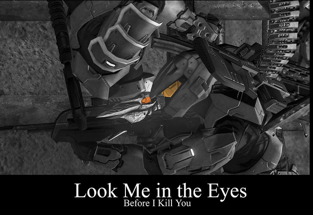
Thought/Issues etc: This was easy for me. I found an old image that I had generated while playing one of my games of Halo 3 long ago, and had turned into a demotivational poster then, cropped it down, desaturated everything, but a selected area, which I used the Free Select Tool using nods on all of the straight pivot points and used the click + shift to select both and inverted selection.
Demotivate Yourself 2-star
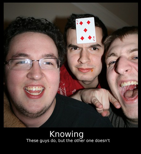
Thought/Issues etc: I had the opportunity to upload a few images from when a couple of my buddies came to stay with me, and well, it is easy to see why this was such a good candidate for this project/concept. I did a greater select of the area, cropped to selection (to emphasize) the subject, then I created a new file with greater dimensions then the original image. Followed this with some quick text work, and enjoy!
Everyday Object 2-star
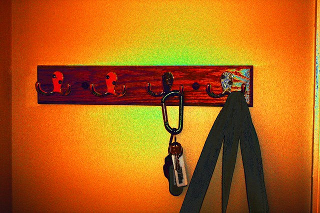
Thought/Issues etc: This was surprisingly difficult for me; in part because I am still learning gimp, another because I have been so far away from photoshop for some time, and selecting or finding an everyday object. I chose the coat rack, because everyone has some form of it, and I ended up selecting a few filter options and played with color options eventually settling on a few level adjustments and an increase in the overall saturation of the image. Not perfect, or exactly what I was looking for, but 45-an hour of playing with something that I could have done in 10 to 20 minutes I had to cut myself off before I got behind on my exam study schedule and/or made myself late on turning this in.
Colorize Your World 1-star
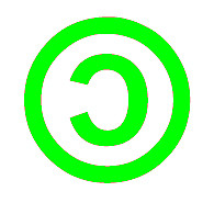
Thought/Issues etc: Simplest one, after I settled on something I (believe I) can edit. I took the creative commons logo, and used the ‘magic’ wand tool and selected the outer dead space, followed with a shift click of the inner dead space, inversed election, made a new layer, filled the selected areas with a color I selected, flattened exported and uploaded.


Add a comment