At a minimum, provide an example of at least four of the concepts listed above. Share all your photos on Flickr and tag them designblitz.
In addition, add a link to your Flickr photos by editing the assignment document within the proper concept areas, under the heading “Found Examples.” Make sure you identify yourself by name or twitter handle! (ME: @dayeseye )
——————————————-
Okay part two.
Before I get started showing you some of the images I wanted to mention when I was doing this it was amazing to see how many of the images fall into MANY categories. I guess I knew that, but it really dawned on me while I was working on this. Here are a few of my observations.
——————————————–
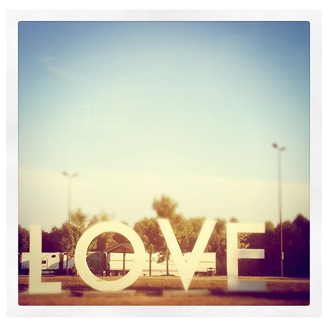
Here it is…minimalism. This is one of the sculptures along I-95 here in Virginia at the rest stops. I know, sounds great right? Well, THEY ARE. Okay, the rest stops are just rest stops, but the signs/sculptures are awesome.
Huge.
White.
Simple.
Totally. Effective.
————————————————
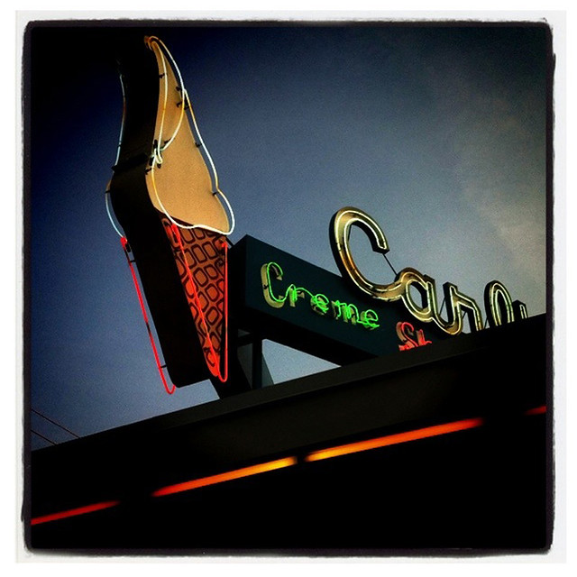
This is the sign on top of Carl’s Ice Cream. They just re-opened the 15th.
Onward. This is my image for typography. The letters are cool and retro, probably original to the business. It is simple and harkens back to drive-in, diners and poodle skirts. Love.
————————————————
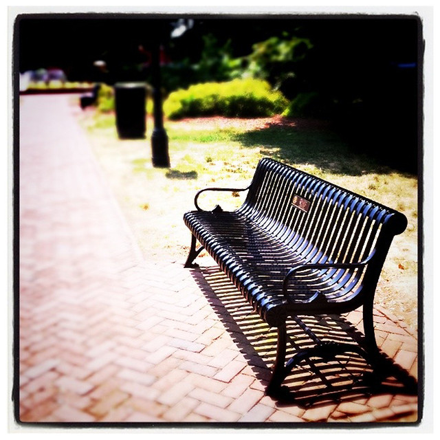
Balance in this picture is more than the lines on the bench. If you look it is the bench, light posts, bricks and greenery. This is Hurkamp Park downtown, a lovely little place to sit a spell.


Add a comment