At a minimum, provide an example of at least four of the concepts listed above. Share all your photos on Flickr and tag them designblitz.
In addition, add a link to your Flickr photos by editing the assignment document within the proper concept areas, under the heading “Found Examples.” Make sure you identify yourself by name or twitter handle! (ME: @dayeseye )
——————————————-
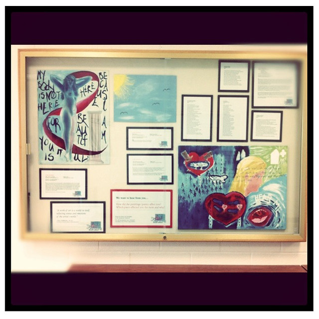
This display case is a nice representation of proportion. Setting up these cases takes time and an eye for design. Sure, you could just smash everything right in there, up against each edge, but really? Really?
That would look like crap.
Symmetry, negative space, and colors that lead the eye add to the proportions in the case.
——————————————–
Dominance. THESE LADIES WILL DOMINATE YOU!
Okay, their logo is pretty sweet too. The face is the major image, the round shape encircling her includes the other pertinent information. It’s also a pretty simple design, effective, and fun to look at.
——————————————–
You can check out all of my interpretations on flickr. Go. Now.


Add a comment