REVIEWS:
The Despicables
Quality of audio sound -e.g. is the volume appropriate? are the levels even? Is the sound clear, and free of noises not needed (e.g. mouse clicks, background)
Some the the volume levels were off. I noticed that it kept getting louder and softer. Most of the sound was pretty clear, I did notice it becoming muffled or static at times though. I also noticed a few clicking sounds. I’m sure some of it was inevitable though.
Quality of audio editing – use of effects, transitions, are the edits clean?
The effects were good, I wish there were more of them though. The edits were pretty good I heard a few mouse clicks and the volume could have been more consistent. Other than that the editing was good, I know its not easy; it takes a lot of patience!
Use of sound effects- how are they used? Is it effective?
I liked the sound effects! I think the volume was a little off for some (too loud or not loud enough). I really liked the cat sound effect it was unexpected. And the Halloween and Fall effects were awesome I loved how thematic it was.
Use of music- how is it used? Is it effective or distracting?
I liked how songs were played it made it feel more realistic! There was one song about half way through they was awful though I had to fast forward a little because it was seriously painful to listen to. Other than that one song (if it can even be considered a song), the music choices were great!
Does the show have a structure? Is it cohesive or does it feel stitched together?
The shows structure seemed to be callers being interviewed about fall/Halloween. They did a good job with the structure you could tell they put thought into it. I think the sound issues disrupted the flow of it though. It reminded me of an early morning show.
Does it tell a story effectively? Is there a sense of drama, unknown?
It tells multiple stories that all stick to one main theme. I didn’t really feel any sense of drama, the callers and hosts didn’t seem to enthusiastic about the show and at times it sounded like they were reading a script. It could have been dramatic with more enthusiasm.
If you would star this radio show, how many stars out of five would you give to the show?
I give it 3 stars. The sound issues really bugged me and it was hard to enjoy the show because I was constantly adjusting my volume. This show struggled to keep my attention.
I am not trying to hurt anyone’s feelings! I know it was a difficult assignment, I am just trying to give my honest opinion.
RoadTrip Radio!
Quality of audio sound -e.g. is the volume appropriate? are the levels even? Is the sound clear, and free of noises not needed (e.g. mouse clicks, background)?
I think that there were a few times the sound got a little quieter but for the most part I think the volume was pretty even! Also, the sound is clear it is easy to make out what everyone is saying.
Quality of audio editing – use of effects, transitions, are the edits clean?
There were a good amount of sound effects and there was usually a bumper or a transition tone in between “scenes”
Use of sound effects- how are they used? Is it effective?
Although it didn’t really sound like we were actually in the places we said we were (IMPOSSIBLE). I think the sound effects definitely show a fair effort and gets the point of where we are/what we are doing across nicely. The sound effects were a lot of fun to choose! We tried to add in plenty so that it felt more realistic. I think they were effective!
Use of music- how is it used? Is it effective or distracting?
We only used music in the bumper, commercial, and a few times as a transition. I do not think we overdid it. The music in the commercial helped set a hillbilly mood for Bill’s auto shop, the commercial in the bumper sounded AWESOME, and the transition music was only a second or two each time. Overall, I think it was very effective!
Does the show have a structure? Is it cohesive or does it feel stitched together?
Yes, I think the individual inside stories and thoughts of the characters really helped to pull our show together and added more structure. I really like the extra detail it added that would not have been present with just the dialogue. I am sure there is more we could have done to bring it together a little more, but I am happy with the way it turned out.
Does it tell a story effectively? Is there a sense of drama, unknown?
Again, I think that the use of dialogue as well as the individual monologues really came together to tell an effective story. The monologues added a dramatic effect in my opinion.
If you would star this radio show, how many stars out of five would you give to the show?
I give it 4 stars. There is always room for improvement, but we are only amateurs at the radio shows.
Web Assignments:
Columbus Sailed the Ocean Blue.
This is 3 star web assignment #712, “What They Might Have Done in Social Media.” The assignment read:
“Too bad Facebook was not around for most of history! Use the Fakebook tool to make a Facebook profile for a historical figure and make a fake tweet for the same character using the Twister tool. See for Abaraham Lincoln the example of a fake facebook profile and what he might have tweeted.
Make sure what you create is coherent with the person’s background, and explain what it might have meant for that person to use Facebook and twitter “way back then”. Include screen shots and links to what you created, and elaborate on what their use of social media might have been like if it existed for them.”
I decided on Christopher Columbus as my famous person. I don’t really have any special reason for this other than I knew a bit about him and felt comfortable with the knowledge I had.
This assignment was a lot of fun! (Silly, but awesome)
On Columbus’ Fakebook, I added 5 friends. The King and Queen hired him to go on this voyage, they are his cyber friends so that they can track the events of the voyage and easily communicate with him. Vinecent and Martin were the captains of the two other ships. They are his fakebook friends just in case they get split up at sea or need to communicate from ship to ship. And Leif Ericsson was a viking that Columbus met, they are friends so that they can keep in touch and hopefully meet again.
On his page I posted a status right after he left for his journey, when he arrived at his destination and once he arrived home.
The tweet is pretty self explanatory! Columbus though he had gone around the world to Asia, but he actually discovered North America.
This assignment was pretty neat. I have never hear of twister or fakebook. Fakebook really seemed very similar to facebook!! Both sites were easy to use, I like that!
American Eagle Through the Years!
This is 2 star web assignment #115, “Way Back Time Machine.” The assignment was:
“Using the Way Back Time Machine website on Internet Archive, take screen shots of a favorite website overtime. Then, look at how the website has changed for better and worse. Blog about what makes a website effective and how that changes. See some examples of sites like McDonald’s and Best Buy as they looked in 1996 https://www.msu.edu/~karjalae/internet96.htm?hoho“
I decided to use the American Eagle website!
I decided to use screen shots from 2000, 2001, 2002, 2004, 2006, 2007, 2008, 2010, 2011.
2000 and 2004 are extremely simplistic, but not in a good way. In a very boring way. They are just not aesthetically pleasing at all. I liked 2001 and 2002 much more, but they seemed to change for the worse in 2004. 2001 and 2002 just seem a little less simplistic, but definitely still not very modern.
The 2006 and 2007 screen shots definitly show improvement. There is a better color variety and a better layout. It is a little more complex than the layout from previous years. 2007 even has a video clip on the home page.
2008 is probably my favorite screen shot! I love the vintage look with the bright colored wood pieces being used as the background! I think it is a much better use of space also, over all I think it looks awesome!
2010 and 2011 look pretty different than all of the previous years. It definitely looks cool, but not for American Eagle. I really liked the beachy, vintage look of 2008. It looks too modern now, it isn’t as bright and fun as it was.
(I did not take a screen shot of the site today because the homepage is a slideshow; therefore, a screen shot would not be the same, AT ALL!)
I think that American Eagle has probably always been an effective site. It was probably on track with other websites at the time and changed as time and technology did.
This assignment was really interesting! I had no clue there was a site that achieved shots of other sites in the past! Very cool ![]()
I used Hackasaurus to make UMW top in the entire world! I just deleted MIT and penciled us in instead ![]() Also the link should go to the UMW site now instead of MIT! Who knew riseing to the top could be so easy?!?
Also the link should go to the UMW site now instead of MIT! Who knew riseing to the top could be so easy?!?
AHHH. Top school world wide, I wish! I would love to say I graduated from MIT one day (NOT GUNNA HAPPEN). But I guess now UMW is the new MIT.
So, fellow EAGLES how does it feel to go to the top university?
Once again ds106 has blew my mind! I had no idea this type of hacking software even exsist! I found it awesome and hilarious!
I did not embed this in my summary because it is HUGE and my summaries are already LONG! Check it out in the original post though! Proud to be an EAGLE ![]()
DAILY CREATES!
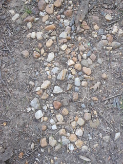
This was an extremely simple daily create, I actually laughed when I read this one because of how random it is. I took this picture in the UMW amphitheater.
I had to walk through many rocks before I reached…
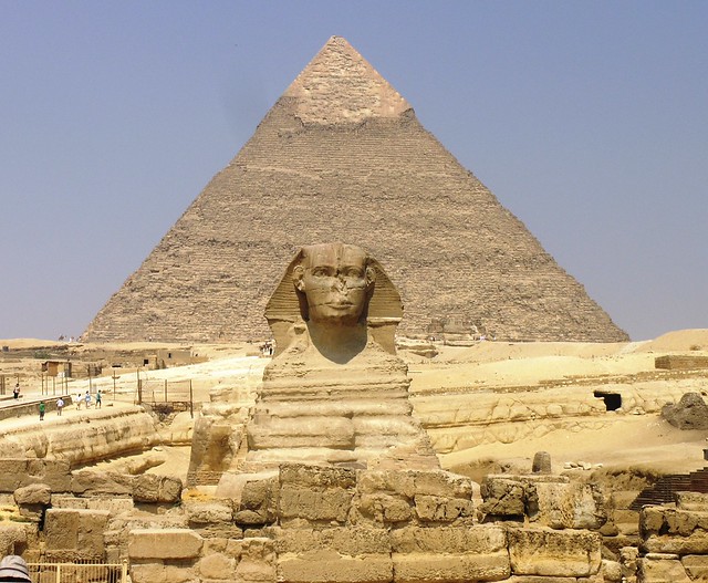
Does the Shape of the Egyptian Pyramids offer Power or Not? Show us in a photo.
This was an interesting one that kind of makes you think. I guess the shape does offer power it is somewhat unique and the point on top could be like a thorn on a rose (for protection aka power?)
…this beautiful, powerful pyramid. It was so…
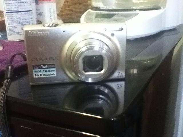
Prized posession: Take a photograph of the thing you own of which you are most proud.
I took a picture of my Nikon Cool Pix camera because I LOVE IT! I take it everywhere with me, and it takes fabulous pictures! ![]() I got it for Christmas last year.
I got it for Christmas last year.
…unique and magestic that I had to take a picture of it using my most prized possession.
In the description area of my photos on Flickr, I added the link to the next photo (aka. sliver of this short story)
I liked this weeks twist to the daily create assignments. It is kind of like what I have been doing with the titles of my daily create blog post titles. (Connect all the creates!)
REFLECTION!
This week was really cool! I discovered a lot, such as way back time machine, hackasaurus, X-ray goggles, fakebook, and twister. I honestly had NO CLUE any of that even existed! This really makes me wonder what else there is to discover! My favorite part of this week was hacking the top universities list to make UMW number 1 in the world! I felt like I was a true computer hacker! ![]()


Add a comment