In the The Non-Designer’s Design Book, William outlines 4 basic principles for design. These are below.
- Contrast: avoid elements that are merely similar; make them very different.
- Repetition: repeat visual elements of the design throughout the piece.
- Alignment: every element should have some visual connection with another on the page.
- Proximity: items relating to each other should be grouped close together.
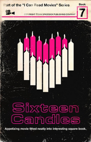
For today’s assignment I will be using these principles to analyze one of the I Can Read Movies covers.
The picture I chose is below;
What’s compelling about this picture is the positioning of the the candles. The candles are forming a heart. While, I have never seen this movie, I can assume from the cover that it might be a romantic comedy or a romantic drama. This cover also goes straight to the point. The movie is called 16 candle and it shows 16 on the cover.
Williams concepts are very visible in this piece. The repetition of the candles is seen. Contrast can be found in the candles on the top in comparison to the bottom and also the background. Bright colors are used to make the candles the focal point on this cover. The alignment is perfect. Everything is centered yet connecting. Nothing is oddly placed or strange to the eye. Proximity can also be seen in the closeness of candles.
Overall, William would be proud of this cover


Add a comment