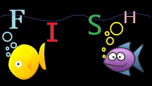
This remix combination was great! Since the original assignment had very specific outlines, it was fairly simple to make sure I did the opposite. The original assignment said to use one typeface, no colors, no graphics… a.k.a. very plain. To me, the opposite of that means to use multiple typefaces, multiple colors, and multiple graphics. So that’s what I did using Paint.
The original assignment can be found at this link:
The original assignment requests no graphics, so I decided to use a couple. They’re very colorful as well, which just makes it a double whammy. I also used multiple typefaces, when the original assignments asks for only one. The typefaces are not exactly communicating the word like the original assignment asks. The word is just spelled out in these different typefaces. Finally, I used many different colors to oppose the original assignment. They also make the remix a little fun; everything needs some color!


Add a comment