
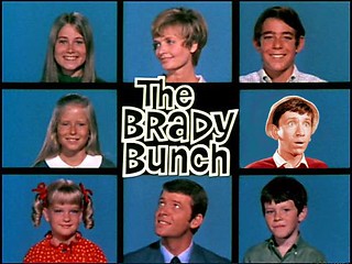
This is such a great design! It is based on famous sitcoms with a twist. The design is in balance created by the squares. No matter which way you look at it, 3×3 all the way around. The design is centered around the title of the show, which is where most of your attention is focused. Yet, the design is symmetrical and in proportion. The pattern of girl on one side and boys on the other with the parents creating the connection supplies the rhythm of the design as well as the unity. The bold blue creates a solid background for the characters to stand out against. Normally, people scan over the faces and recall names, yet here you find surprise. Gilligan has replaced a Brady. This replacement creates a connection between the two sitcoms. The alteration blends so well with the design that someone actually has to look to find what is different.
http://assignments.ds106.us/assignments/ds106-design-review/

Add a comment