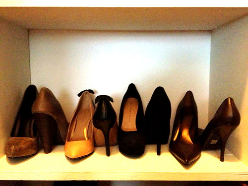
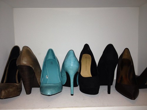
It took me a few days to ponder about the designblitz. I had to first think about which elements I wanted to do and if I could do them effectively (or ineffectively to prove a point). I first started by reading the assignment document and looking at a few examples. However, the examples didn’t really give me any good ideas. There were definitely some cools ones, but no inspiration came from them. So I just randomly started taking pictures. Some I liked, some were trash.
The first picture that I took that I really liked was the one for color. It says in the document that color is really supposed to catch my attention. Well, as I was walking down the sidewalk I slipped off the side. It was a bit embarrassing, but I noticed the bright yellow that should have been my warning. I decided that was going to be my color picture. From there out I started noticing these elements everywhere. When I went into my closet to do a bit of cleaning I noticed my shoes were arranged in a rhythmic pattern. I also noticed that I had a bright pair of blue shoes. I decided to test color out again and put the bright blue shoes with my other neutral colored shoes. I included both color pictures, however I like the sidewalk one better because it really is meant to draw your attention (could also be function). The next picture came to me easily. As I was reading through the document I came to the section on function. It is supposed to be of an object that conveys its meaning or the opposite of what is supposed to do. I have many wine bottles being used as flower pots sitting around my apartment. Technically, they aren’t supposed to hold flowers but they sure do make a cute flower pot. The last picture I had to search for. I wasn’t sure what element to do, but as I was walking down our hallway I remembered our wall art. We have these inspirational quotes all over our apartment also. This one happens to be my favorite, not only because of the pretty font but because of it’s meaning. I used this picture for typography.
Most of these pictures I uploaded to pixlr and adjusted the hue and saturation and color balances. But my iphone takes such good pictures that nothing else really needed adjusting.
The next step is to add my examples into the assignment document!


Add a comment