
When reviewing the list of design elements I tried my best to conceptualize them through examples in my house, and that’s primarily what I ended up taking pictures of to serve as examples.
The 4 representations of concepts I liked the most were the following:
COLOR
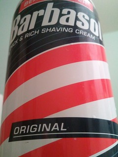
On a general level, I have always been fond of this brands color scheme. The contrast of cool(blue) and warm(red) and the way that the intertwining red and white suggest a professional shaving product, as it mimics the iconic signs outside of barber shops. The white also evokes “clean” imagery.
MINIMALISM / USE OF SPACE
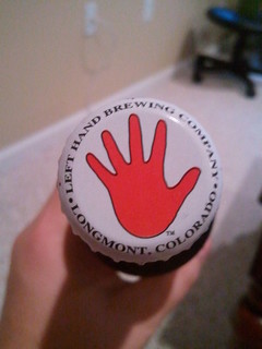
I love this logo. Its simple, easy to interpret and I feel like it makes you take a second look at the product, which is the primary purpose of a logo. It fits and can be understood on something as small as a bottle cap but can be scaled up for larger advertisements.
FORM / FUNCTION / MESSAGE
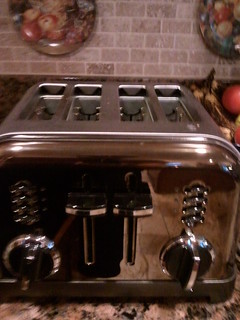
“Thermostat – 2 folk theories of how they operate- (1) timer theory: how long the device stays turned on; (2) valve theory: how much heat/cooling comes from device. Actuality- it is an on/off switch. Designs give no hint to functionality, so users form their own theories.”
In the resources on the google docs page, I read the above passage and my toaster (any toaster really) came immediately to my mind. My entire life, I thought that the knobs on the front of toasters controlled intensity (increasing/decreasing how how the coils were). But the other day, I read online that they in fact controltime. There really isn’t anything about my toaster that would indicate their purpose, I’ve just always assumed I had it right.
BALANCE
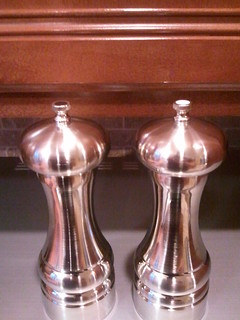
Recently got some new salt and pepper grinders and I like how, apart from the dots on top, they’re identical. The symmetrical balance and smooth curves makes them aesthetically pleasing.

Add a comment