
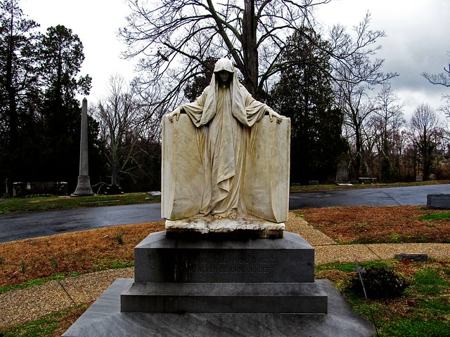
I’ve been aiming to improve my photography skills all week. I have had my camera on me at all times (and a heavy supply of batteries…). By Saturday, I was taking photos at Hollywood Cemetery and started being a bit more picky.
I originally wanted hundreds of photos of the Monument to the Confederate Dead at Hollywood Cemetery in Richmond. I anticipate that most of my photos won’t work, so if I take hundreds, one or two are bound to work right?
NO!
I need to start being pickier. So I wanted to talk about some of the things I learned this week from the tips we were given here.
All of these photos (even the awesome looking Monroe Hall one) were taken by me.
Foreground and Shadows
What not to do:
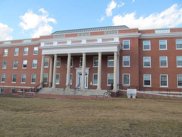
What’s wrong with this photo?
Well, let me start by saying I focus on the beautiful blue sky far quicker than I do anything else in this photo. The first problem is the lighting. There are no shadows on the building, which makes it rather boring. It seems flat, static, and uninteresting.
The second problem is the foreground. There barely is any!
What to do:
Compare that last photo with this one.
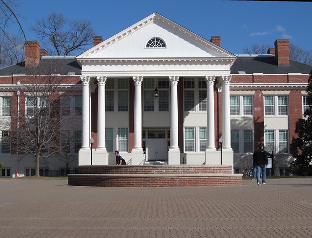
So much better, right?
Not only are there shadows that compliment the building’s architecture, there are people moving in the photo. While I admit the right two people (looks like one, though) are blending into the shadows, this photo is still better for the people being there. It shows how grand this building is.
More on Lighting and Depth
At Hollywood Cemetery, I took a picture of a seal commemorating the Confederate dead.
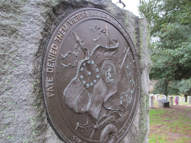
Oh god, the horror! The only thing good about this photo is the background with the Confederate graves. The emblem/seal looks flat. There’s no difference between the edges and the flat parts.
Luckily, I realized how horrible that photo was and took another, this time on the other side of the seal.
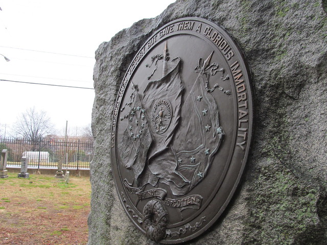
Completely changes the image. There’s so much more depth in this photo–maybe not a depth of field per se, but the shadows of the emblem really show up here. The light (what little there was on a rainy day) really shows the lettering and pictures.
Rule of Thirds
I have played with this Rule of Thirds all week. I really got to test it at Hollywood Cemetery, though.
So let’s take a look at a photo that follows the rule.
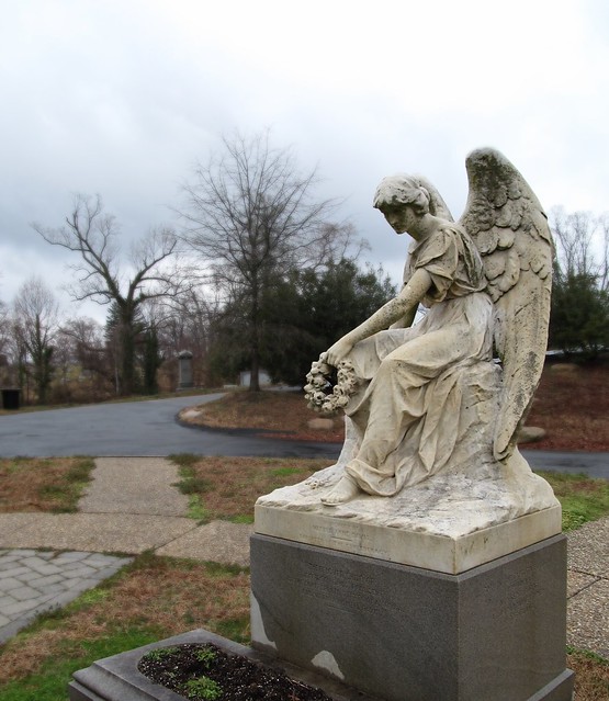
Her head aligns with the upper-righthand intersection. Her body follows the rightmost vertical line.
It makes this photo more interesting than it would have been, especially at the angle I am taking the photo from.
Here’s a photo that breaks the rule.
I filtered this photo out (contrast, shadows, vibrance, saturation were all enhanced) for my Hollywood Cemetery project, that’s why it looks so dark and dreary.
She’s centered in the photograph. I can’t believe I did that by eye, but according to Photoshop, her face is almost exactly center.
But this is when you don’t have to use the Rule of Thirds. She would look strange off center, to me at least.

Add a comment