
“Rhythm”
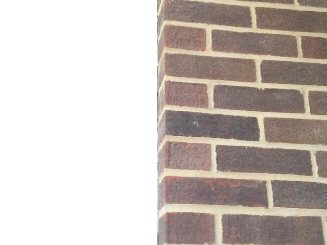
What better to capture the concept of Rhythm than a brick wall? In my opinion it encapsulates the concept in multiple levels. First the pattern of the bricks themselves repeating over and over, this is the main way in which it captures the idea. The next is the variation in color, they vary to a degree, but it stays so close in color as to barely make any difference. The next Rhythmic portion of a brick wall is the mortar itself, you were just to look at the pattern of the mortar you would find a very intricate grid like pattern that further brings the wall together. For these reasons I think that any old brick wall captures the idea of Rhythm very nicely.
“Unity”

The pattern in this ceiling surrounding the chandler expresses Unity in a number of ways. First off each layer of the design roughly forms a circle. So we basically have repetition of concentric circles. This only forms the bases for unity, however the ceiling goes on to do more than that. The brush strokes area clearly visible and they each form a almost another circle going around the circumference of each circle. Also notice how it looks as if each stroke was formed moving in the counter clockwise direction. This embodies motion in which all of the components are moving in the same direction which furthers the idea of all of these components forming together to create a single piece in unity.
“Balance”
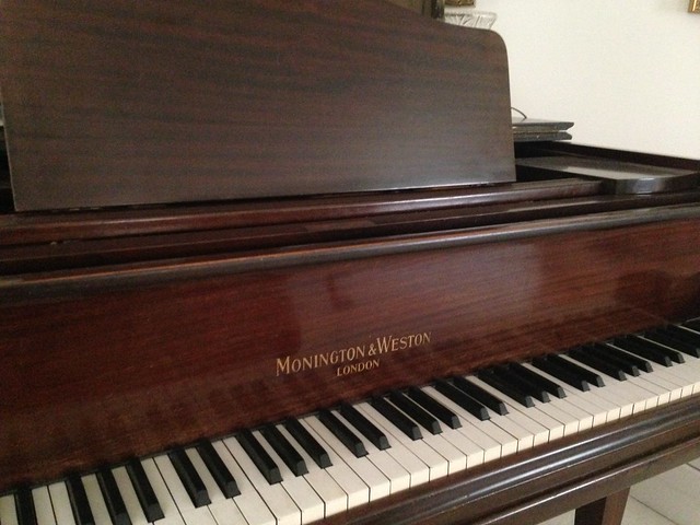
I think that a piano, especially a grand piano (the one pictured is only a baby grand) captures balance quite nicely for numerous reason. First off for the piano to stand up it has to be actually structurally balanced. The next compelling part of the piano is the keys. They chose the classic white and black, spaced in a very balanced.
“Proportion”
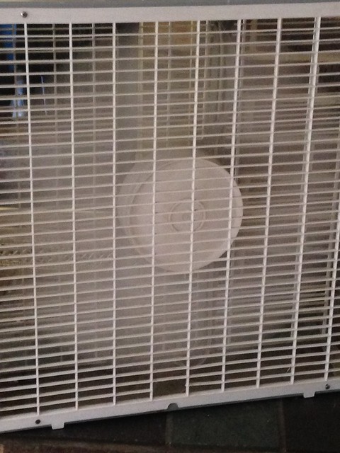
To begin we can see concentric circles forming again within the fan, the moving blades and the piece in the middle that hols the blades. Then covering both of these circles with a rectangular grid like pattern, that in a way mirrors the structure of the whole fan itself. I view the little sub-rectangles as a deformation of the whole square shape of the fan, in this way the proportion is very evident.
Out of all of the assignments I have completed so far I have found this to be the most difficult. I think that is because its more about critiquing the art rather than creating it. You have to be consciously aware of all of the guiding principals that make art great, instead of just going along trying things until you think it looks good. I think being able to really judge art takes a very high degree of skill. Of course anyone can look at a piece of art and say “yes I like it” or “I hate it”, but i think it takes way more knowledge to be able to express exactly why one reacts in the fashion that they do. Looking forward I am going to really focus on trying to identify the qualities in design that each piece of art I view employs, and more than that I will attempt to isolate my emotional response.

Add a comment