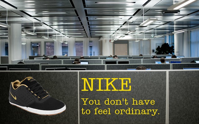
The purpose of this assignment was to remix the Free Advertising design assignment with the Mood Swap remix card. The assignment is exactly what it sounds like: take the mood of a submitted assignment and completely flip it. I chose to remix Nick Antonini’s Nike advertisement.

I know we’re supposed to incorporate the original work, but this was very difficult given the nature of the assignment. So I kept much of the layout the same, but changed the font and background image. I tried to make the advertisement go from exciting to as dull as possible. To make the changes, I first opened Nick’s image in Paint.NET. I then added an image of the shoe as a layer (I found the shoe using google images). I selected the white background behind the shoe using the magic wand tool, and then deleted it. I then found a picture of cubicles on flickr, and added that as a background image. For the font, I googled “free office font.” This was not a good idea. All of the results were for Microsoft Office. So I searched for “the office” font, and found some forums that directed me to Teletype. I googled this, then found a free download. I tried to keep the text similar to Nick’s, but thought an office-type font would work better than the space invaders style.
Nike Ad Remix
Posted by Jack Mulrey
April 15, 2012


Add a comment