
Here we go, folks.
All right, so I haven’t been able to post any updates about this project because, well, there haven’t been any. I’ve been too busy with other stuff and this is the first chance I’ve gotten to actually just sit down for any significant amount of time and do stuff for this class. But hey, such is the life of a college senior in his last semester.
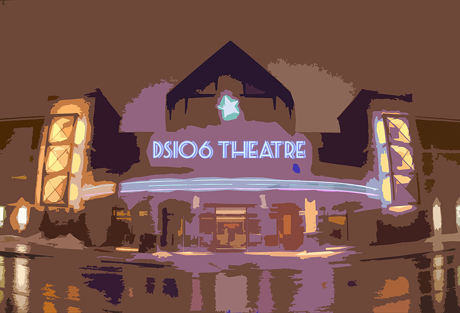
I really liked making my Shaun of the Dead minimalist poster, so I decided to just make more minimalist movie posters and a DS106 theatre (That’s right–”theatre.” We’re fancy here.) to post them in. Originally, the plan was to make the movie posters, then the theatre in the same style, then have the posters on the wall outside the theatre. Well, I ran into a roadblock or two.
Click for a bigger version.
The first roadblock was that it would’ve taken forever to make the movie theatre in the same simplistic style as the posters. I got maybe 1/4 of the way in and realized I was only 1/4 of the way in and decided to just take the easy road, cut out a few steps and use Photoshop’s “Cutout” (Eh? Eh? “Cut out”? Oh, whatever, it’s 4am and I think it’s funny.) filter. It still looks kind of cool, I guess, but nowhere near as cool as it would’ve if I had been working on it for weeks like I should have. That’s just honesty.
The second roadblock was that, even though I downloaded the picture at ridiculously big dimensions (over 3000px wide) the shot was taken from far enough away that there was no point bothering to post the posters on the building. They’d just end up too small to appreciate. So I didn’t bother.
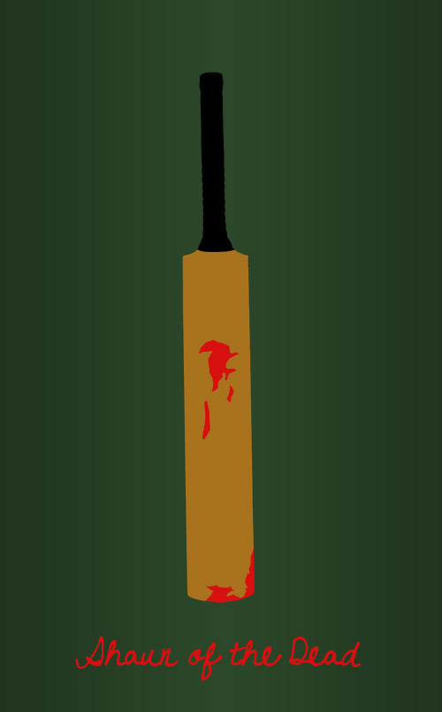
But the posters are still pretty good. The first one is my Shaun of the Dead poster. Yep, using it again:
Click for a bigger version.
The cricket bat is so integral and iconic to Shaun of the Dead that it was an easy choice to make it the focus. I dressed up as Shaun for Halloween last year and made sure to order a cricket bat from eBay that looked just like it, then painted blood on it by cracking red gel ink pens on it. Dedication. I think the dark green is a good shade for a zombie movie, almost sickening, and the red type in that cursive was just too perfect.
I like this one a lot, but I’ve eclipsed it in later ones. Originally, I thought about just having my final project be a whole series of Shaun of the Dead posters. I mean, that is my all-time favorite movie, so why not? But then I figured that I should give myself a challenge and pick different movies.
The next choice for a minimalist poster was obvious then:

Click for a bigger version.
The Fast and the Furious. Duh. I just love that whole series, and I figured it’d be really cool to tackle as a minimalist poster. I had ideas like “two cars at a streetlight about to race” or “one car getting chased by the cops in the background,” but eventually settled on this smoke idea, which was a bad idea. Not just because those other ideas are way cooler, but because smoke is super hard to do in a minimalist style. Mind you, it’s not as hard as drawing in more cars, so that’s a plus.
Just doing the one car was hard enough. I took a picture of an actual car, then started layering flat colors over it, one by one. Body, then windows, headlights, etc., just one on top of the next. It was satisfying to make, but took some real time. It only really started looking good as I started adding gradients to it though; the flatness was actually throwing it off before.
Oh, and those divets in the front were pretty tough, too, at least conceptually. The car looked super weird without them, but I wasn’t sure how to convey it. Eventually I figured it out, and along with the subtle lines near the bottom of each side of the front bumper used to indicate the curvature of the bumper, those divets are the parts I’m most proud of with this. Those stripes are pretty snazzy too, though.
And the background was tough in the sense that I just had no idea what to do with it at first. I was thinking about having a road (and even drew one in) but it just never looked right, so I scrapped it and just used big text. Always gets the job done, and allowed me to forgo putting a traditional title anywhere, which I actually like a lot.
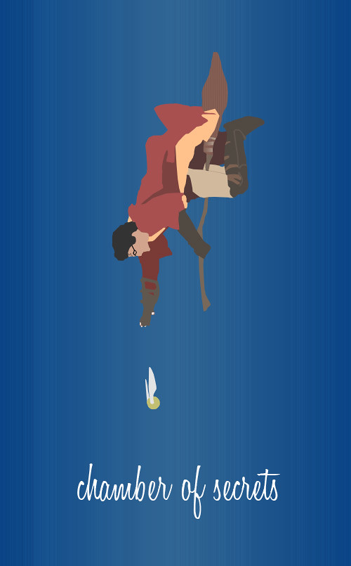
From there, I took a magical turn:
Click for a bigger version.
This was a toughie in a lot of ways. At first, I didn’t even know what to do with Harry Potter. I thought about just having a face with messy hair, glasses, and a scar and no other features. I thought about the Sorting Hat on a stool. I thought about a wand, resting on a table or something. Then I thought of the Snitch and Quidditch and how awesome those chapters are.
The next difficult part was finding the right images. Finding a side-on picture of Harry with his arm outstretched that clearly shows his whole body was way rougher than I thought it’d be, but I got it. The Snitch was pretty easy by comparison. Then came the logistical problems.
I realized that it wasn’t going to work horizontally because there’d be too much space at the top and bottom and not enough space in the middle. I thought about flipping the whole poster. Then I thought about how dumb a sideways poster would be. Then I decided to just make him hurtle toward the ground. He does that a lot anyway, so it fits, and it looks cooler and more distinctive anyway.
The background was a problem in the sense that I just had no idea what to do with it. I had ideas like having a crowd, or a tower, or the whole Quidditch pitch in the background, but they all proved too distracting, so I just made some motion lines to help imply movement and called it. Probably for the best, honestly.
Now, coloring in Harry and the Snitch was obviously the biggest challenge, mostly because it was just so time-consuming. I think I nailed it about as well as I could have though. It’s clean and attractive and clearly Harry Potter. The Snitch looks great too, which is a relief because it proved way harder than I would’ve thought. There are lines on the Snitch that I thought would be necessary, both on the ball and on the wings, but coloring everything over was the right decision. So smooth.
Finally, putting in the name was tough. Originally, I had all the full movie title arranged sideways around Harry, intended to imply movement, but instead, it just looked like the poster was supposed to be sideways too, so I scrapped it. Turning it to a normal orientation helped, but I needed a new font and had trouble arranging the big title. In a total accident, I hid all the layers of the text but “chamber of secrets” and thought it actually looked great like that. My roommate agreed, so I kept it like that. You don’t really need the words “harry potter and the” to get that it’s a Harry Potter movie. This is way classier.
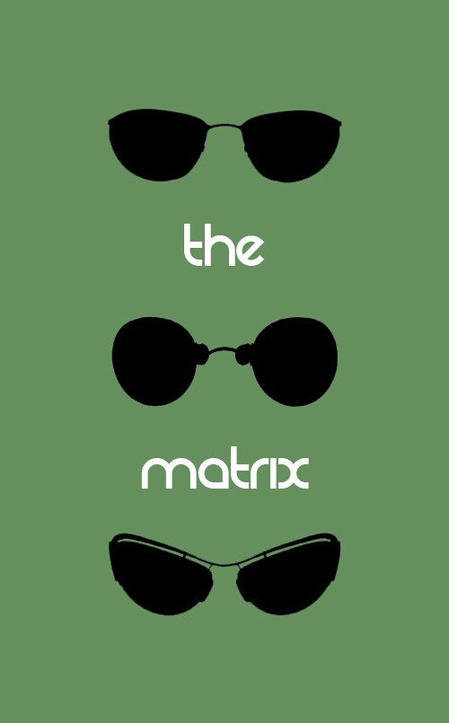
And now for the last one. The one that’s the simplest and quickest to make, but the one that I’m most proud of:
Click for a bigger version.
I like this one the most because it best embodies what I feel is the true spirit of a minimalist poster. It takes something iconic from the movie and separates it out into it’s own thing, and it’s a little bit of a riddle, too, as a result. The Shaun of the Dead one is also like this, but not to this degree.
Originally, I thought about just having Morpheus’s sunglasses, then having the reflections of his hands holding the red pill and blue pill in each lens. That seemed kind of complicated, especially in how to fill up all the space in the poster. But, in arranging Morpheus’s sunglasses, I had a burst of inspiration and decided to just use Neo’s and Trinity’s as well. Everyone in The Matrix has such cool and distinctive sunglasses that I felt confident people would recognize them.
In fact, I almost thought about leaving the title of the movie off to drive that point home further. But I think the font I chose looks really nice, and it blends in so well that I don’t mind this poster not being a cryptic riddle anymore. It just looks… right.
But I also really like how flat this one is compared to the others. That’s a true minimalist poster for you. Three colors. No shading. Plain. Simple. Clean. This one is definitely my favorite, both in conception and execution, which is great, given how much quicker I made it.
Oh, also, I picked green because, you know… The Matrix. Like everything was green.
But yeah. That’s my final project. I wish I could’ve started earlier and done more posters or done the theatre right, but I’m still happy with what I have. I just had so much fun making them that it would’ve been cool to do more. Which—you know what?—is probably a pretty good sign.

Add a comment