
The Principles of Design (DesignBlitz)
1. The Color of a Bar
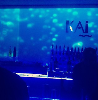
- I turned 21 this summer, so naturally, I went out to the bars. This place was particularly cool–downtown Richmond, if you wanted to know. There were not a lot of people in it (weird) because check out the color. SO BLUE. I felt like a mermaid, lost out at sea. Probably why I remembered it so well. This demonstrates color by setting a mood (a lost at sea, or ‘sad’ maybe) and is particularly monochrome (blue mostly, specifically at night). Very cool design.
2. The Typography (or Form/Function/Message) of a Bumper Sticker
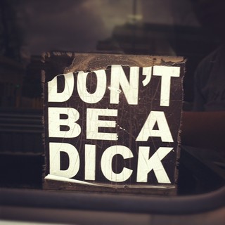
- But seriously. Don’t be one. Pretty straight-forward message, which is why it can go in the form/function/message category, but also the typography of the bumper sticker lends itself to the typography category. Since it is a bumper sticker, it utilizes an easy-to-read font, and spaces the words out, and the kerning is wide too so that people can read the message from their car.
3. The Metaphors/Symbols (or Typography) of a Parking Deck
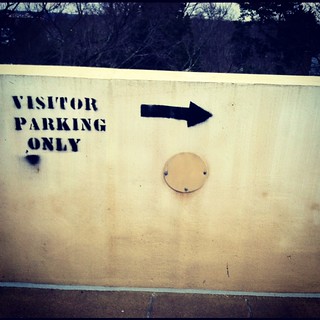
- The arrow is a symbol used to show where the “visitor parking” is located. It’s effective because it simplifies a complex idea (showing people where they can and cannot park if they are a visitor) and simplifies it down into a single symbol with some words next to it
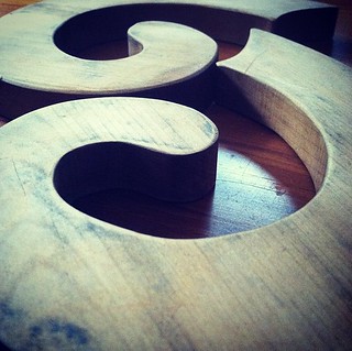
4. The Minimalism of a Fire Hydrant
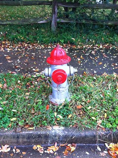
- It’s not something you usually notice because, well, it’s a fire hydrant, but they are so superbly minimalistic that you don’t notice it. Think about it, a fire hydrant is there for function, and function only. Thus, it is not designed to be a beautiful or complex thing, it is designed to be efficient, and easy to access in an emergency. Fire hydrant = minimalistic.
5. The Balance of a Fountain
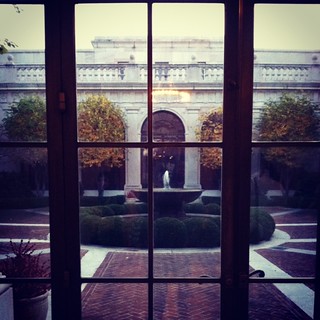
- The window panes emphasize the balance of this photo, as well as illustrate the symmetry of the fountain beyond them. The picture is symmetrical in that the trees on either side of the fountain are the same in number and in distance apart from each other. The pattern in the brick around the fountain is also evenly balanced.
6. The Proportion of Dictionaries
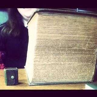
- These two dictionaries represent proportion. The little dictionary emphasizes the immensity of the big dictionary. Likewise, the big dictionary emphasizes the petiteness of the small dictionary. Together they contrast each other and effectively illustrate the concept of proportion.
7. The Dominance of a Flame (and a Tomato)
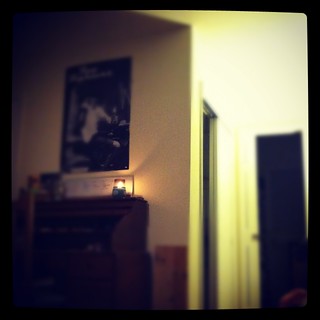
- What’s the first thing you noticed about this picture? The clarity and brightness of the flame, I hope. Because that was the point of this picture, to place emphasis on a single aspect to draw the eye towards it. Thus, depicting the principle of dominance via the use of emphasis.
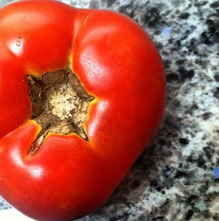
- Toe-may-toe. This photo illustrates dominance because of the richness of the color of the tomato. When you look at this, the tomato is the first thing you notice because the color of it says “Hey! Look at me!” I guess it helps that the tomato is the dominant aspect of the photo, but regardless, if you walked into a kitchen and this tomato was on the counter, how likely is it that your eye wouldn’t be drawn to it?
8. The Unity of Hot Pads
- These are hot pads that my mom has at her home. She got them when we lived in New Zealand, and they have always fascinated me because they fit together as a whole, but can also come apart (as pictured above). They display the idea of unity by both being able to come apart and fit back together. Moreover, the picture as a whole, is unified by the underlying wood, and is simultaneously broken up by the hot pads–the wood unites, while the different shades of the wood break up the photo.
Rather than take new photos for my design blitz, I went back and looked through my old photos to determine which ones exemplify the principles of design. These are what I came up with. These are all pictures that I have taken over the last year, none of which were consciously taken because they illustrate the principles. However, the fact that I have taken a design class before (last fall semester, intro to design principles) shows that I have indeed utilized the concepts that I learned in that class (and refreshed my knowledge of in this class). I think the fact that I end up taking classes that are artistic by nature says something about me as a person (or anyone that takes classes such as these, even though it is a gen ed requirement)–that we, as humans, like to create.

Add a comment