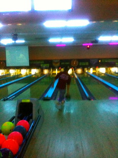
color – Colors can do so much for photography. They can emphasize a certain part of a picture. Colors can even set a mood. If a photo has a lot of oranges, yellows and reds the photo is warm. And, if a photo has more blues and greens it is described as cool. Even the lack of photo can tell a story or emphasis emotions.
The neon color of the bowling balls draws your eye straight to them.
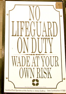
typography – This could almost be summed up as the artistic design behind written words. Someone’s bubble hand written can portray a childish, giddy expression. Different fonts on the computer each have been made with thought and design.
metaphors/symbols– Something seemingly simple that stands for a much greater thought. They can help us relate things we don’t understand to what we do. Symbols can be a universal understanding of an object or concept (symbol for hearing aid).
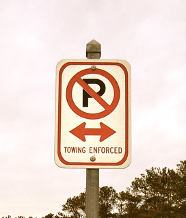
minimalism & use of space – This is basically the concept that less is more. Using something so simple to get your point across. But, in a way that is seemingly very clever.
form/function/message– Being blunt. When your photograph explains itself. The point you are trying to show is literally in your picture.
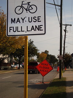
Can you ride in the lane or not?
balance – This comes from perceptions of life around us. We see something in a certain way based on facts we already know. Something looks balanced because of its structure. Or, it is that everything with in the picture is equal.
I would say this is an example of a picture off balance.
rhythm– The repetition of something to create a certain understanding. It can also be the repetition of a theme. Objects that go together because of what they have in common.
proportion– The spacial relationship of objects to one another. How things must be placed or designed in order to function.
proportioned for protection
dominance – What sticks out in your photograph.
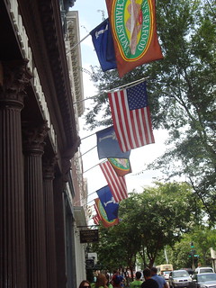
unity – Many things all being joined by a similarity.
All represent something different, but the theme of flags is repeated.




Add a comment