The design safari was a pretty cool assignment to complete. We had to carry our cameras around with us this week taking pictures of things that we thought portrayed major design elements such as color, typography, balance, rhythm, proportion, dominance, etc. Once completed we chose four pictures that represented atleast one of the major design elements and upload them onto flickr where we tagged them with designblitz. By tagging it with designblitz, it allowed for all the pictures taken for the design safari to be easily located in one region of the internet. Once the pictures were uploaded onto flickr, we had to place the URL for each of the four photos under the category it fulfilled in the ds1-6 Finding Elements of Design google doc page, accompanied with our twitter handle. Below are the images I chose to use to represent a few of the major design elements and their stories behind them and a small description of the major design element.
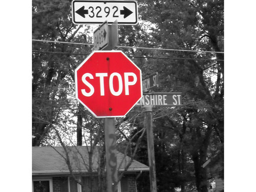
Color: STOP! color splash.
The use of color helps to create a mood and draw attention toward the theme of the picture. I was walking around my neighborhood this weekend and thought that it would be cool to use a stop sign, to express the color aspect of a major design element. To bring out the color of the stop sign more, I used the program gimp to create the image. I began by taking the color image and cutting out the stop sign area. I than copied it into a new page and then went back to the original image and changed it to black and white, once it was in black and white I went to the new page I created with just the stop sign in it and I recopied the stop sign and pasted it as a new layer to the old image that was now black and white. It resulted in this image….
After the image was created I saved it as a .jpeg on gimp and exported it to be uploaded to flickr. Once it was uploaded onto flickr I tagged it with the following tags: designblitz, color, designsafari, and ds106. Once it was uploaded onto flickr I copied the URL and created a new bullet point under the category color in the google doc. and typed in my twitter handle, @ashstegemiller, so people were aware that was my image.
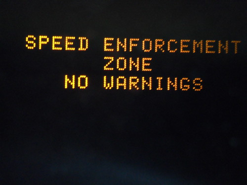
Typography. I’m pretty sure that was a warning…
Typography is the way in which letters are portrayed and how they help to reinforce what message they are trying to convey. I was driving home and this sign was pretty hard to ignore. I instinctively took a picture because I thought it was ironic that it was warning you that it was a speed enforcement zone, yet saying that it was not going to give you warnings….. As for the typography aspect of the image, I think it being in all caps helped to draw attention to the message. To share the picture I uploaded it to my computer than onto fl
To share the picture I uploaded it to my computer than onto flickr. I tagged the picture with the following tags: designblitz, typography, designsafari, ds106, and cliche. Once the image was uploaded to flickr I copied the URL and pasted it into the google doc under the typography section,on a new bullet, next to my twitter handle @ashstegemiller.
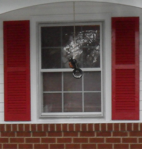
Balance: Balance
Balance as a major design element, is a way in which an image compares to other things in the picture or in its surroundings. Many times balance is thought of to be symmetrical or asymmetrical. I used my houses window frame to show balance. The red frames on the outside of the window aren’t overpowering the image and are symmetrical in the image. They add a bit of color to the image and help to dress up the window.
The image was downloaded from my camera to my computer then placed onto flickr. It was then tagged with the following tags: balance, ds106, designblitz, red, and designsafari. The URL was than copied and pasted onto the google doc. under the Balance section, on a new bullet, next to my twitter handle @ashstegemiller.
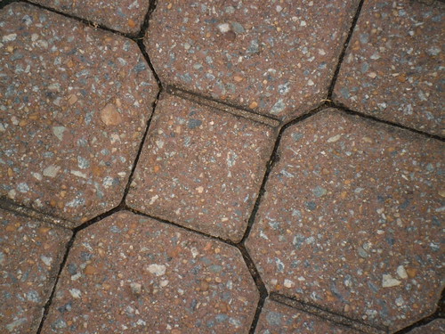
Unity: Unity
Unity is when objects in a picture helped to bend each other to make an overall image while still keeping it’s own identity. I was walking down campus walk the other day and looked down noticing the pattern on the ground. I noticed that the stones used to make the walk way were all the same shape or similar shape, yet some stuck out more than others. This related to unity because together the stones created a pretty pathway to walk on yet certain stones stuck out and had its on personality in a sense, while still maintaining the unity of the walk way.
The image was downloaded onto my computer than added to flicker where the following tags were applied: designblitz, designsafari, ds106, and unity. Once the tags were applied the URL was copied and pasted into the google doc. under the Unity section, new bullet, next to my twitter handle @ashstegemiller.


Add a comment