This week has been all about design. Until you have to do it yourself, you don’t realize how much design goes into simple images, ads, posters, logos, etc. This week we had to brush up on our knowledge of design by completing a design safari. I had to choose four categories from a list of design vocabulary and capture an image that represented that element of design. This was the list I had to choose from. The ones I found this week are underlined:
- color
- typography
- metaphors/symbols
- minimalism & use of space
- form/function/message
- balance
- rhythm
- proportion
- dominance
- unity
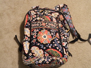
Color was kind of an interesting one to tackle during the week because you can make an argument for almost everything you see. Even things in nature seemed to be perfectly designed in terms of complimenting and contrasting colors. One thing that I did find was a Vera Bradley pattern that has a lot of “neat color stuff” going on.

Rich, pale reds and blues are set on top a saturated blue that almost looks black. The contrast in color and saturation allows you to see more of the design. Even in a small thumbnail you can see the intricate pattern. I thought this was an excellent example to show the value of color design.
Next I found an image that had an interesting typography. Typography is basically the font and how it is used. I chose the Nalgene logo.
The font used to say “nalgene” represents the company perfectly. The font displays an almost earthy quality; the letters seem to embody the forms found in nature. The grounded font conveys something all by itself. I read it as “gets along with the earth.”
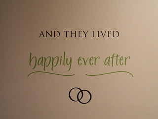
Next was metaphors and symbols (and maybe some more typography) from this image:

The fairy-tale text could warrant a blog post by itself but the eyes are drawn to the rings below.The rings here are tied to the idea represented within the text. The rings represent a permanent bond that will last “ever after.” Symbolically and typographically, this wall decor is a one-two punch of design. <- That might be the worst sentence of all time.
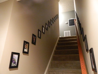
I like to save the best for last in my blog posts and this week is no different. When I read the information about rhythm in the assignment I immediately thought of the stairwell in my house. I gave myself a few days with the camera to find something that might represent the idea a little bit better. At the end of the week I find myself wanting to post the picture of my stairwell to represent rhythm.

The perfectly spaced pictures that seem to follow a perfectly diagonal line is a perfect representation of design rhythm. The consistency and cleanliness of the design leads your eye naturally up the stairs. To me this is the perfect embodiment of rhythm in visual design.


Add a comment