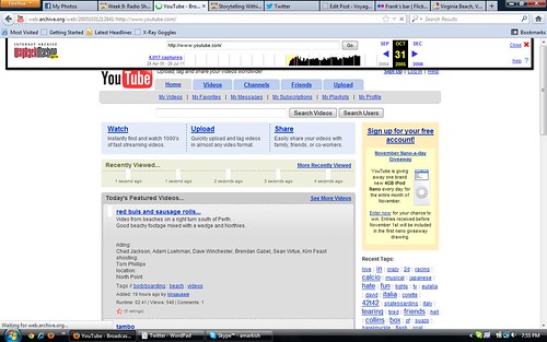
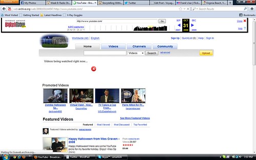
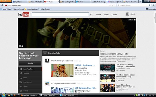
In the Assignment Way Back Time Machine, I used the Internet Archive’s Way Back Time Machine to analyze how YouTube has changed through the years.
Originally, YouTube was very basic. Not too much main page advertizing made the page seem less clustered than today’s YouTube. The simpleness of the website’s look in 2005 is relieving compared to the new site. You can see exactly what you want to accomplish as far as searching for videos, signing in, and browsing trends right away, because the website is simple and the features pop out more. The site was not as flashy as it would become.

Skipping ahead to 2008, YouTube has developed and become the biggest online video sharing website in the world. The icons and logos have been redesigned giving it a fresher look. They are no longer using trends, but rather just recommended videos for easier browsing. The site looks clean and trimmed, giving it a professional look and user friendly. 
Now on to today’s Youtube. Advertizements are the biggest things on the page. After you see around the ads, a lot of what used to be user friendly is now hidden in a failed attempt to look more user friendly but also trim down the site. One of the more irritating things is there is no immediate place to register for YouTube. You can only find Sign In buttons. Unless you are already registered with YouTube, I can see this being frustrating. Besides the disregard for usability, the site does look trim, flashy, and modern.


Add a comment