
While the Fandom Princess was out in the town with the Prince one afternoon, Ghost had a plan to do absolutely nothing around the castle. This was interrupted, however, when he was strolling around the 5th floor corridor and saw a group of first year girls using special inks and brushes to paint on the stone castle wall! Ghost barked when he approached them, and the girls just laughed.
“Ghost, we’re working on an art project. Don’t worry, we have permission. Come look,” a girl with blonde hair said, motioning for Ghost to come closer. He tilted his head and walked over, sat down next to the girl and looked up at the wall. He couldn’t tell the difference between all the intricate designs painted on the wall, but he noticed the colors, and after staring at it for six seconds, he barked and wagged his tail in happiness. The girls cheered and each took turns giving Ghost belly rubs as they secretly designed a small picture of Ghost in the corner of their mural.
Design techniques are something that we see quite literally everywhere, but I hadn’t noticed it until we had to do this assignment this week! I merely had to look around my room for 10 minutes before I noticed that almost everything I had had a certain pattern, or design, that made it what it was. It was neat to think about the thought process that goes into designing something. When people design and structure things, they do it for so many different reasons– appeal to a certain age group, gender, taste, etc. It made a bunch of sense that most of the things that I owned all fit together in the taste that I like and am familiar with as far as design goes.
Anyway, that my little bit of a reflection on Design, but this week, we had to do this thing called a designblitz, where we took a look at some of the specific elements of design (such as Color, Unity, Symbols, Typography, etc) and take a picture to prove that we understood the concept behind the element and why it was important to design. So, without further ado, here are the four that I chose to focus on and my examples/why I chose them!
Color
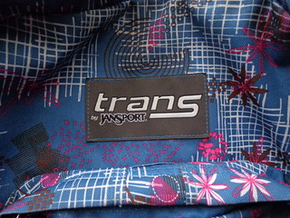
Color, as demonstrated in this article, is a powerful tool when it comes to design principles. Depending on the color scheme of a design, it can effect the mood and overall outlook of the piece. Because of this, I decided to take a picture of my back pack because it has a very dominant color with only certain hints of other colors to accent the blue. The two mesh together very well, and to me anyway, seems to gear towards someone who not only would like the color blue, but who is warm, sassy, open and friendly. All those things are conveyed merely through the color scheme that the bag highlights!
Balance
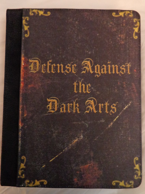
So, with Balance, the way that a design is arranged will determine some of it’s properties, like what exactly the design is trying to do. As this website article quotes, Balance allows us to judge our ideas of physical structure and see how it exactly applies to the design in question. For this reason, I chose to use my iPad cover. I had it actually specially designed (on Etsy!) so that the text in the middle was a different book title, however, the design balance in the corners and the layering/positioning of the text is all on the designer! I think the way he did it is ingenious and so natural that it looks like a real old fashioned book cover!
Dominance
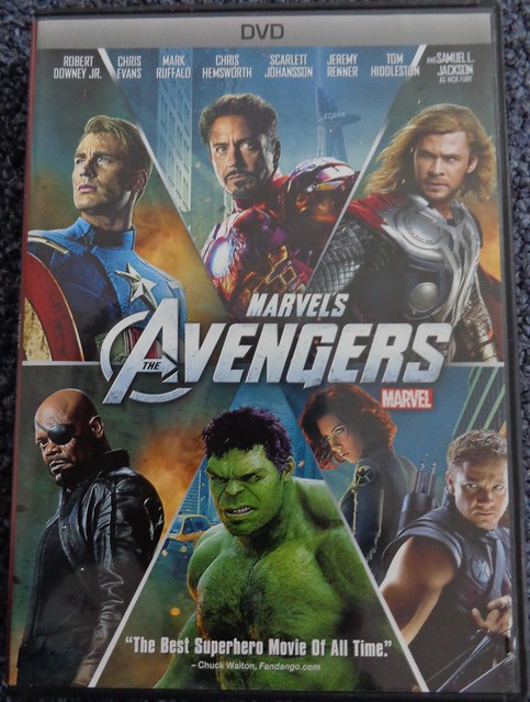
As stated, Dominance relates to everything visually to add weight to the design. It plays a large part in focusing where the eyes go when they first look at a design and what is the dominant focus to all of the design. For this principle, I used The Avenger’s (such a good movie) DVD cover. Notice how the title is smack in the middle, with the superheros around it being proportionally placed and highlighting the title, which is the main focus.
Unity
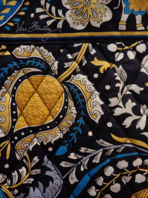
Unity involves a lot of different parts of a design working together in order to add to the overall view and perception of the design. With unity, it is important that each part not only go hand in hand with the main idea, but also hand in hand with the overall concept of the design. For this concept, I used one of my very own Vera Bradley bags. I only took a picture of a section of it, but that’s because in just this one chuck, the theme (Ellie Blue) is emphasized as all different Vera Bradley bags are. Each design is unique in it’s own.
With that completes my Design Safari, something that I had a bunch of fun doing and learned a lot while working on this assignment! It really opened my eyes to how designs influence most of the things that we have merely in our own room and how they can really enhance products and art.

Add a comment