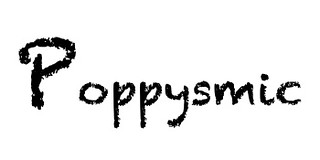
The assignment was to take a word and emphasize, with just the font. No frills, no bells, no whistles. Instead, use the size to manipulate the way it would appear. I picked poppysmic (poppysmic: produced by smacking the lips) to stress for this assignment. I used Didot, a sort of rough font because I envisioned chapped lips smacking against each other in order to achieve this sound/movement. Than, to further embellish it, I capitalized the first letter to show that’s where the emphasis lies in the word. Visual plays a huge role in the assignment, but visual in the raw and simple form. This was also possibly my favorite, mostly for its simplicity. A two ?’s assignment.


Add a comment