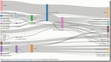
 “Sankey diagrams are a specific type of flow diagram, in which the width of the arrows is shown proportionally to the flow quantity.” Wikipedia.
I first came across Sankey diagrams by (the OKFN’s latest School of Data’s contributors ;) Tony Hirst in d3.js Powered Sankey Diagram. Subsequently Bruce McPherson showed how to create Sankey diagrams from Excel also using d3.js.
Having collect some survey data for Analytics and Institutional Capabilities at #cetis13 (here’s a copy of the form) we were looking for a way to take us beyond the Google Form reporting and gaining extra insight. In particular I was interested in trying to see if there were any relationships between the multiple choice questions. Using a Sankey diagram seemed like a possible solution and my colleague David Sherlock quickly came up with a modification of Mike Bostock’s Sankey example to accept a csv input (I’ll link if/when it gets written up).
Seeing this I thought it might be useful to make a wrapper to generate Sankey diagrams for data stored in a Google Sheet. The solution was relatively straight forward, using the Google Visualisation API to get the data in the right shape for d3js. An example of the prototype is here
There’s no interface yet for you to select a spreadsheet, sheets, columns etc but you can take you Google Spreadsheet ‘publish to the web’ and then add the following data to the url.
- base – http://hawksey.info/labs/sankeysheets/?
- key – spreadsheet key
- gid – sheet number
- tq {optional} – spreadsheet query – lets you select the columns of data (either see official documentation or use Tony Hirst’s query builder) eg tq=select%20B,C,K
- title {optional} – chart caption
- fontSize {optional} – label font size (eg fontSize=12px)
- splitby {optional} – defaults to split comma seperated values eg splitby=%20|%20
One of the issues with this solution is you might not want to make all your data available. To get around this I’ve written a Google Apps Script that lets you use a custom formula to preformat the data. To see this in action this Spreadsheet contains an example. The formula is in cell A1 and uses the format =setSankey(datarange, cols , separator)
- datarange – sheet/cell reference for source data eg ‘Form Responses – Edit’!A2:D Note must start with column A
- cols – comma separated list of columns to use to generate a chart for eg “B,C,D”
- separator {optional} – used to split multi value cells defaults to “, ” eg ” | “
To use this in your own spreadsheets open Tools > Script editor and copy the code from this gist. Here’s an example url using pre-processed data. My main difference is the addition of the &output=1 to the querystring.
Obviously creating your own querystrings to render the data isn’t ideal and it would be relatively straight forward to create a UI wrapper similar to the one used in EDGESExplorer, but it’s something I reluctant to do unless there is enough demand. The other consideration is the question – does the sankey diagram provide useful insight for the type of data or is it just more ‘damn lies’.
It would have of course been nice to write a Google Gadget to include this in a Spreadsheet … but Google are discontinuing those :(.


Add a comment