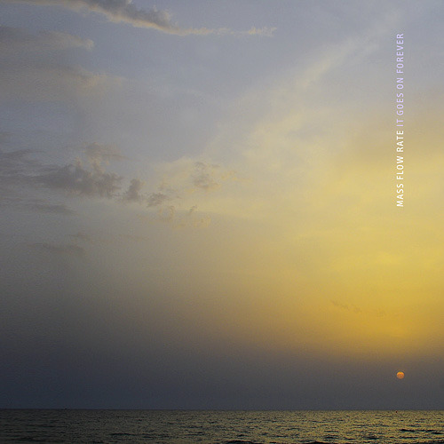
 I took a look at the Albums Without Sound blog and was very impressed. The idea for the project was really cool, and I like that he set standards for it so no matter what the image, article, or quote was, he had to make it work. My favorite album cover was Album 361: Mass Flow Rate – It Goes On Forever. I think this one caught my eye because it reminded me of summers on Lake Michigan, where sunsets look very similar to this one. I also like the simplicity of the design. The album title and band name font are small and simple, so it doesn’t distract from the photo, as it seems to be the central focus of the album cover. I also like how the album title’s font color is very similar to the color of the sky, it makes it blend in slightly and it feels like a play on words… because the sky actually goes on forever. Funny how that worked out.
Albums Without Sound
Posted by bridghi
March 27, 2013


Add a comment