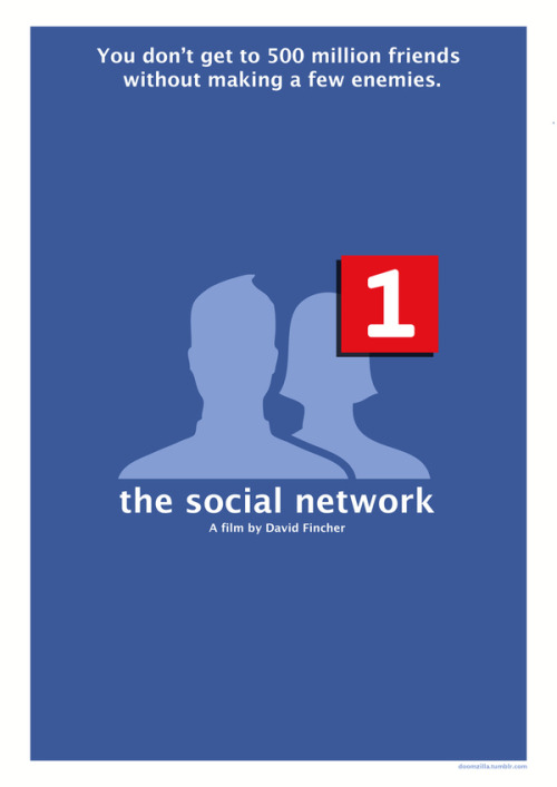
I found this example of minimalism online, a movie poster for the film The Social Network. It caught my attention because all it is is the Facebook “friend request” logo, and so it makes it clear that the movie is about Facebook. The image of a friend request also ties in nicely with the line, “You don’t get to 500 million friends without making a few enemies”, which is basically the plot of the movie. It incorporates a key point from one of Williams’ chapters, that is, repetition in the colors: the background is blue, with white text and the red friend request. Not only are the colors repetitive on the poster, but they’re repetitive of what colors are on Facebook, so it helps to reconnect the viewer back to the focus. I also think it’s funny because for the most part Facebook itself maintains a minimalist design. I can’t exactly pinpoint what else about this image really grabs my attention, but I see this and I’m drawn to it. Maybe just because it takes a visual from my daily life and tries to make it art on a poster.


Add a comment