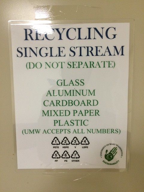
This recycling instructions poster follows the typography concept. Having all capital letters means this is rather important and that you should follow the rules listed. You can also tell how serious they are by the font they chose. Would you take a set of instructions seriously if they had Gothic font or something like Comic Sans? I know I would definitely not.
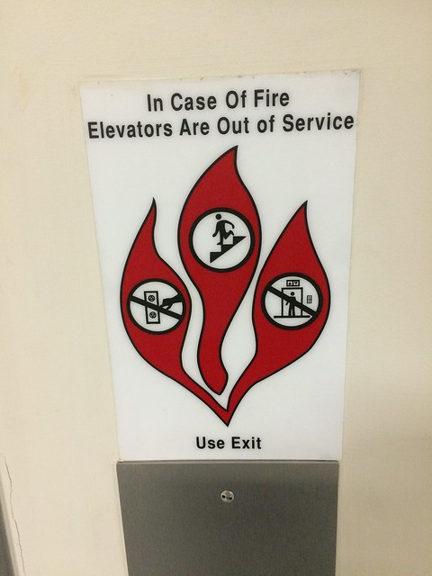
The fire safety instructions follow the metaphors and symbols concept. As you can see, the instructions show a set of stairs, elevator buttons, and inside the elevator with the latter two crossed out. These instructions use symbols of what we use daily to help us understand what to do when there is a fire emergency. We are only allowed to used the stairs and should never use the elevators when exiting the building .
This image of the Eagle Landing and office building represent the concept of balance. They are almost symmetrical in a way. The way that they are equally spaced apart are just about the same height supports that and helps the two buildings to stand out. It would be rather strange to me if there was only one of these buildings.You can’t really have one without the other here. They may not be fully symmetrical, but they definitely are not asymmetrical.
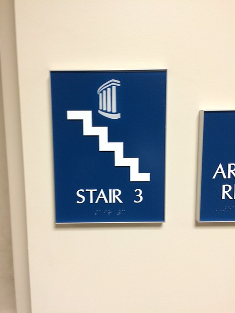
This image of the Stair 3 sign represents the concept of color. You can see that this sign has a majority of blue with the white being used for the stairs and letters. The dark blue helps draw the viewers attention to the image of the stairs because it helps the white stairs stand out. If the white didn’t stand out, then a person would have trouble figuring out what floor they are currently on. Especially someone who had a little more than too much to drink.
I’m sure I could have found better examples of these concepts, but bad examples work to. I hope you enjoyd my images and feel free to compare them to yours in the comments.


Add a comment